How to build standard components for your Design System
Curated list of articles to build the best possible components:
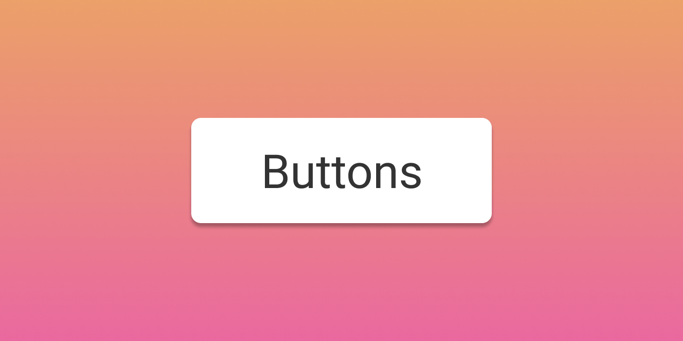
Buttons
The most iconic element of a design system.
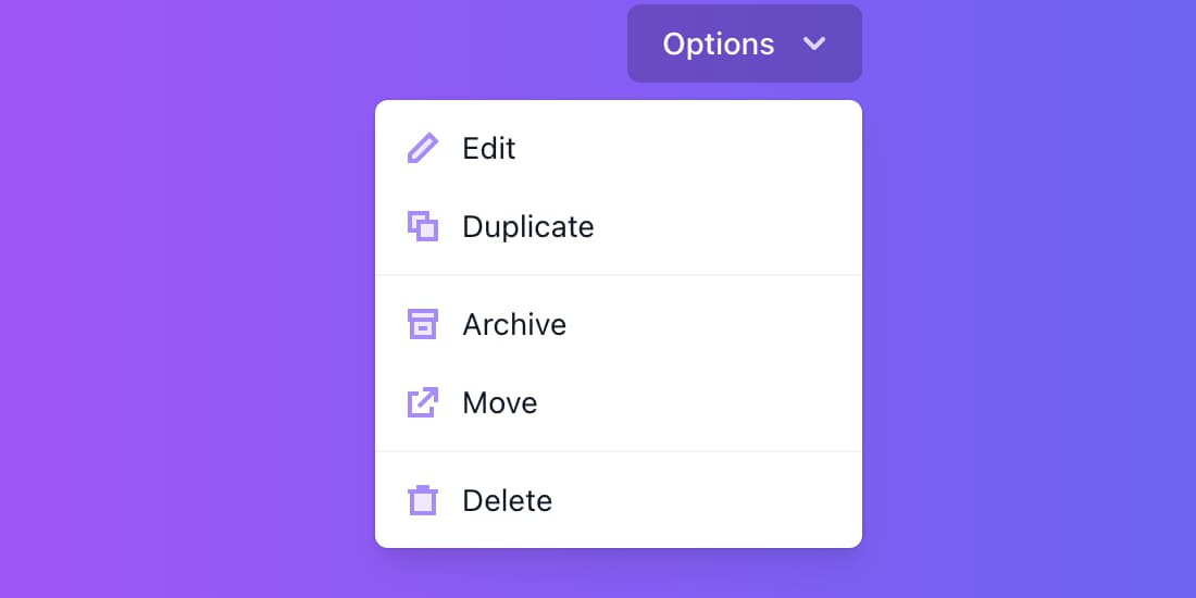
Context-menus
They have many names : pop-up menus, dropdown menus or contextual menus.

Cards
A container element for a wide variety of content.
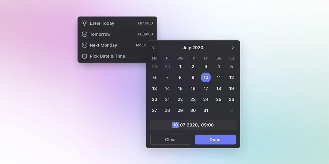
Date and time pickers
An input element that will help the user easily select a date or time.

Scrollbars
Bring your design system to the next level with custom scrollbars.
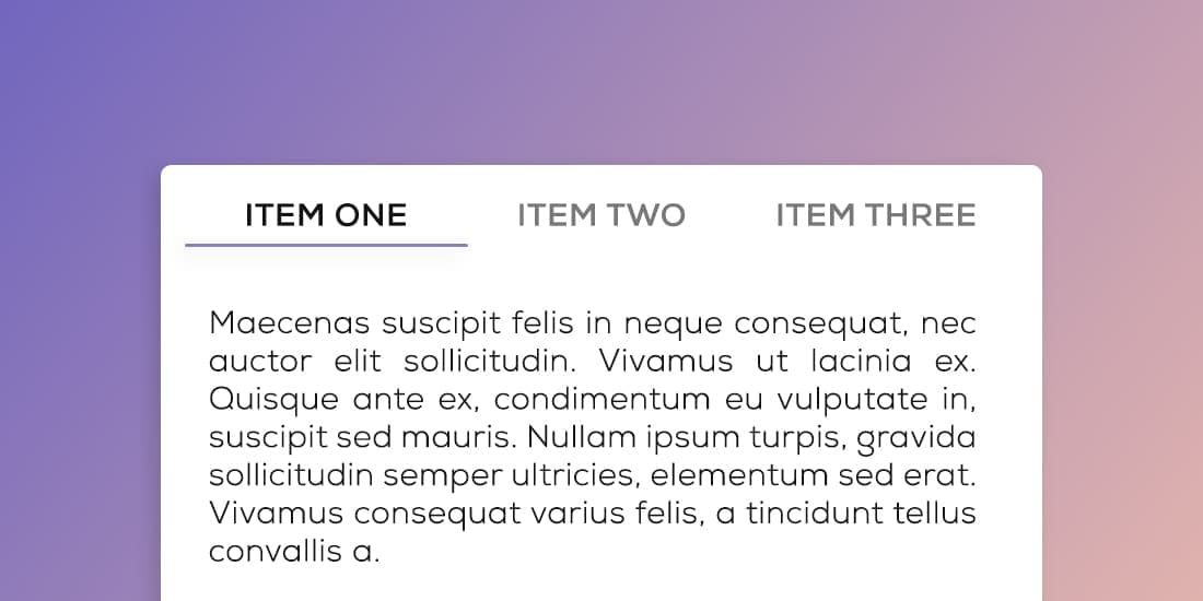
Tabs
An essential in any design system, they take many shapes and forms.