Best SolidJS component libraries for design systems
The component libraries on this list are accessible and can be styled to match your brand and your design tokens.
| Accessibility mandatory | |
| Customisable style |
Composition primitives
These libraries are the lowest level you can get. It's lower than unstyled components. You compose primitive to build the component you need.
Zag (beta)
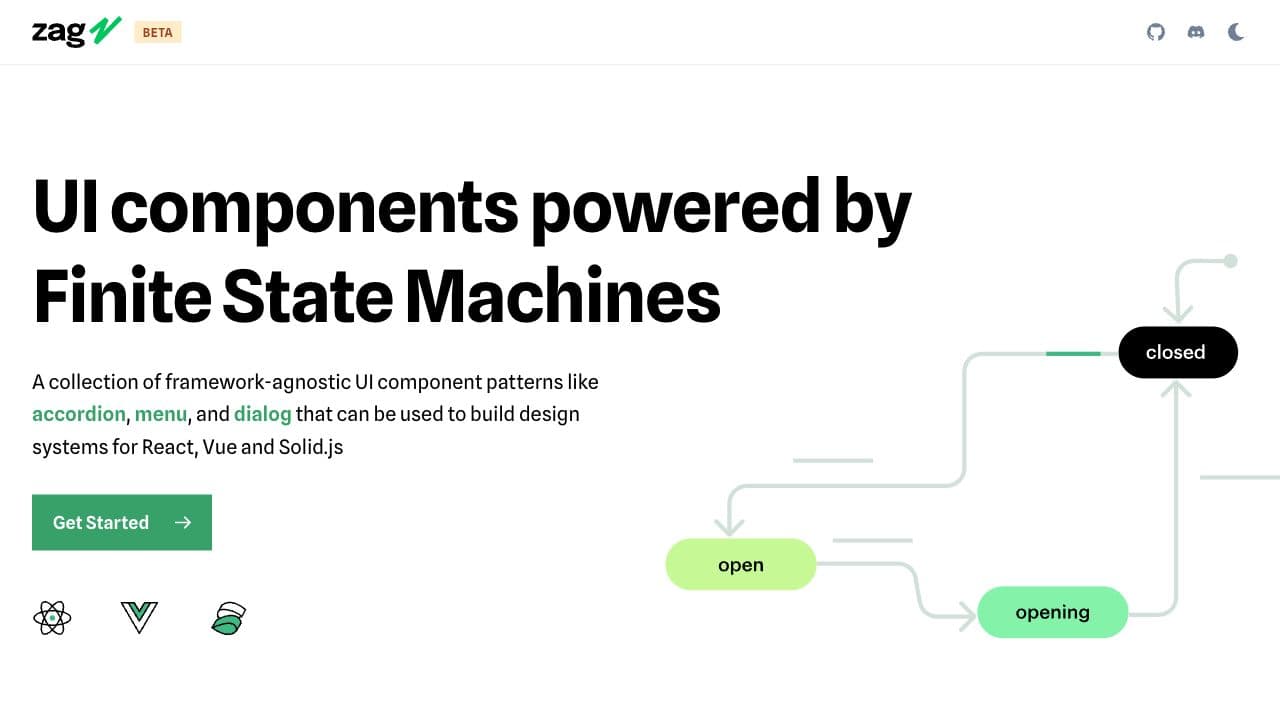
A collection of framework-agnostic UI component patterns that can be used to build design systems for React, Vue and Solid.js
Features
- 20+ components
Solid Aria (ALPHA)
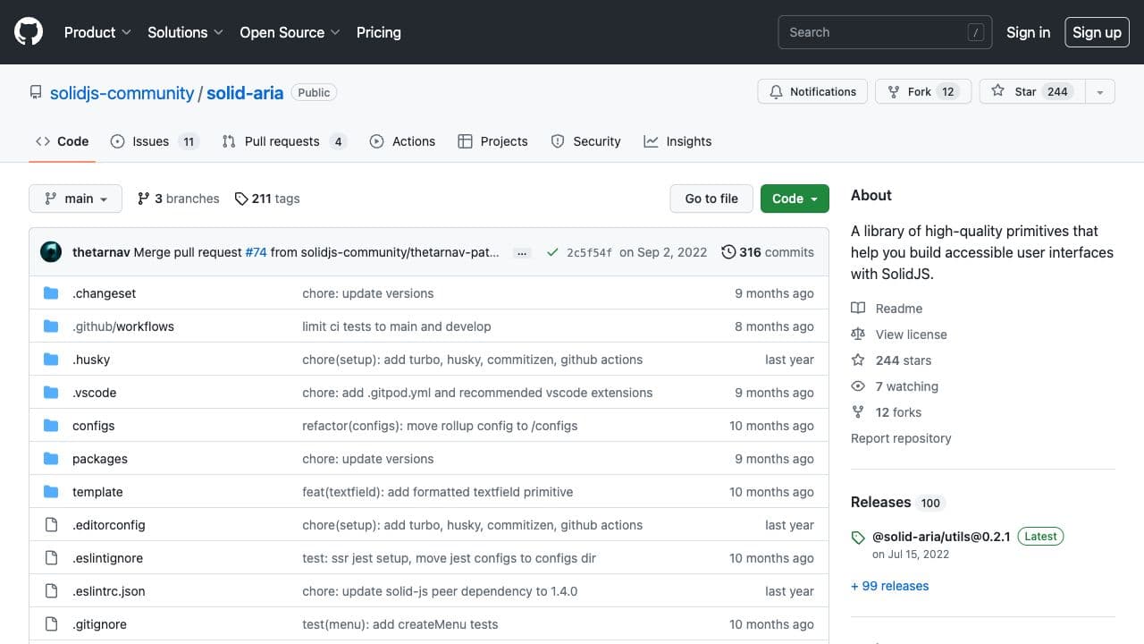
⚠️ Early stage and not ready for production. Solid Aria is a port of React Aria for SolidJS.
Features
- 10+ components
Unstyled components
These component libraries bring unstyled components. You bring your own tokens structure and apply your styling on top of the pre-build components.
Kobalte
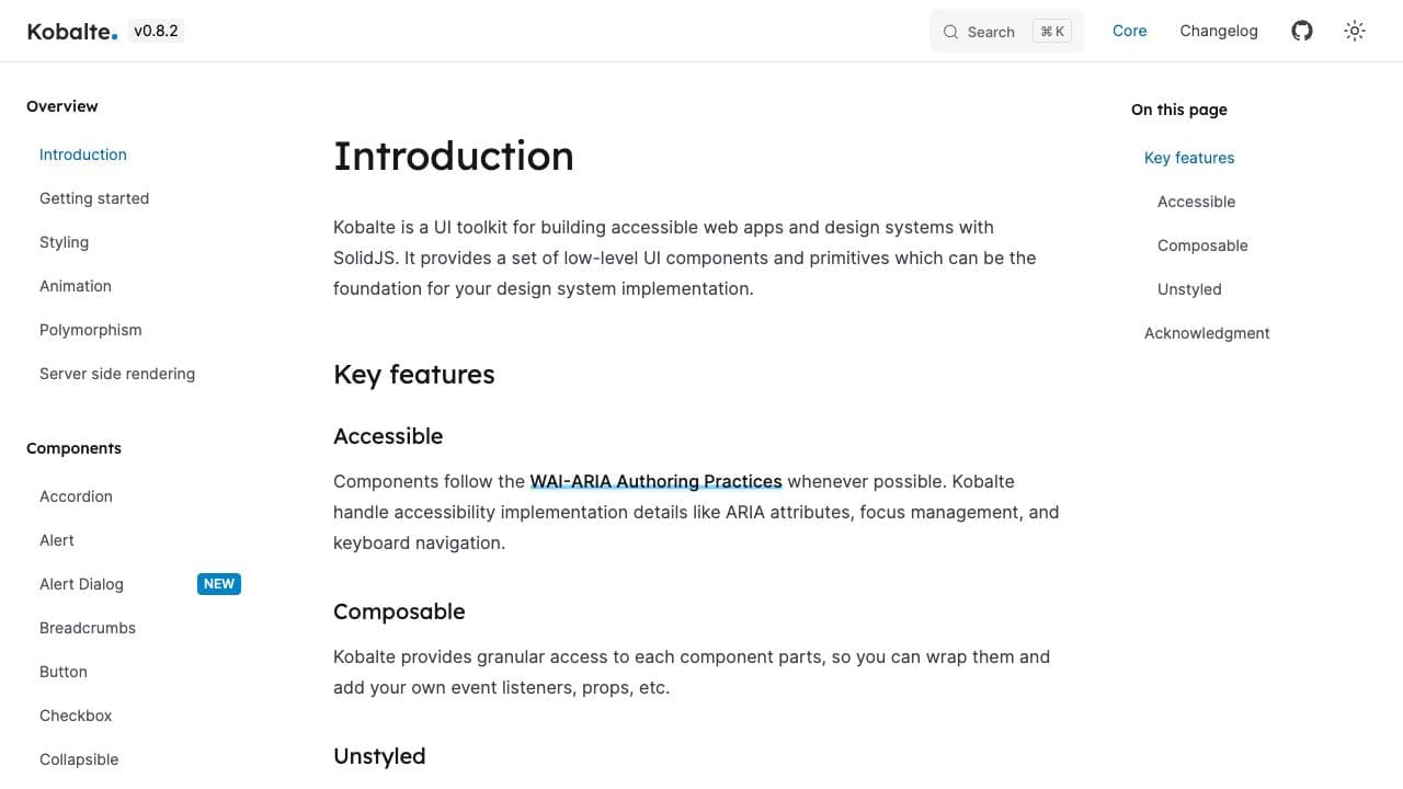
By the author of HopeUI, Kobalte provide low-level primitives for building accessible design systems. Inspired by Radix and React-aria.
Features
- 20+ components
Fully styled components
These component libraries are fully styled components ready-to-use. Most of them have a sophisticated theming systems with more or less design token granularity. Get the library you like, tune the styling through their theming system and go.
Hope UI
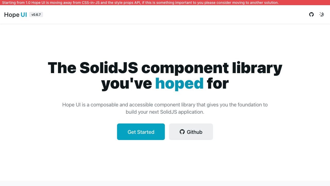
Hope UI is a composable and accessible component library for Solid JS. It has a large selection of components and a theme system.
Features
- 40+ components