Best Vue 3 component libraries for Design Systems
The component libraries on this list are accessible and can be styled to match your brand and your design tokens.
| Accessibility mandatory | |
| Customisable style |
Composition primitives
These libraries are the lowest level you can get. It's lower than unstyled components. You compose primitive to build the component you need. The best example in Vue is Zag(beta) that provides composable primitives and state machines to create accessible components.
Zag (beta)
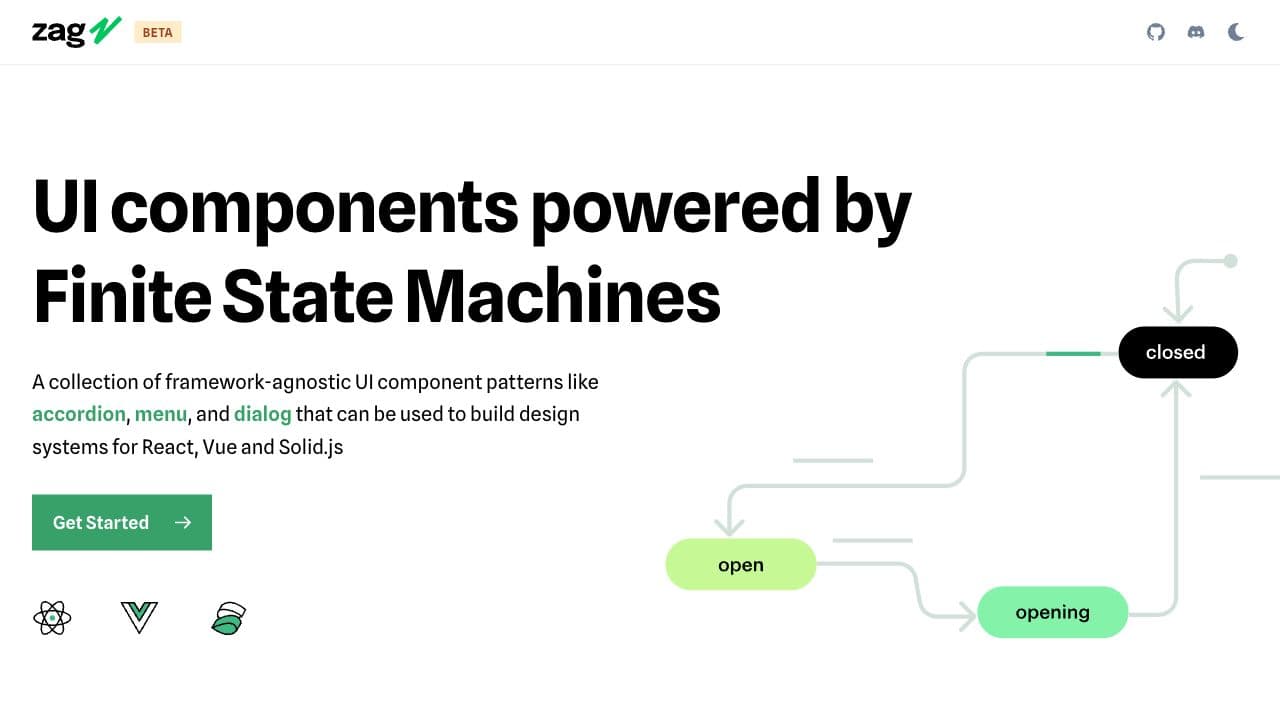
A collection of framework-agnostic UI component patterns that can be used to build design systems for React, Vue and Solid.js
Features
- 20+ components
Unstyled components
These component libraries bring unstyled components. You bring your own tokens structure and apply your styling on top of the pre-build components.
Headless UI
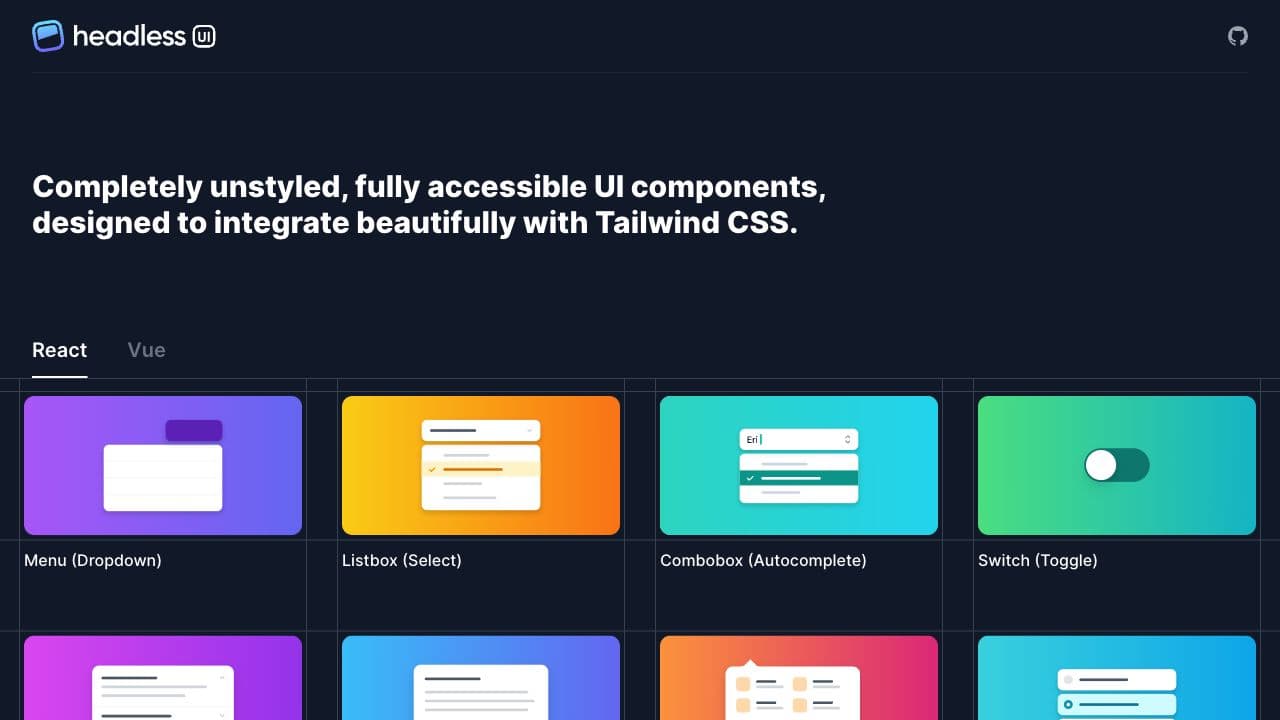
Headless UI is made by the team at Tailwind Labs. It's a set of unstyled components ready to be styled. Intended to be used with Tailwindcss, it can also be used by any CSS utility solution. (Also available for React)
Features
- ~10 components
Fully styled components
These component libraries are fully styled components ready-to-use. Most of them have a sophisticated theming systems with more or less design token granularity. Get the library you like, tune the styling through their theming system and go.
Vanilla Components
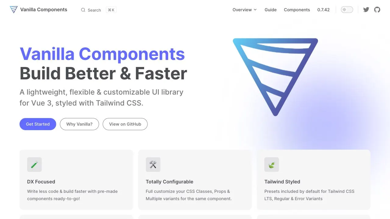
Vanilla Components is a lightweight, flexible & customizable UI library for Vue 3, styled with Tailwind CSS.
Features
- 20+ components
Vue DevUI

Vue DevUI is a relatively large component library based on DevUI Design. Includes 7 themes out of the box.
Features
- 55 components
Inkline
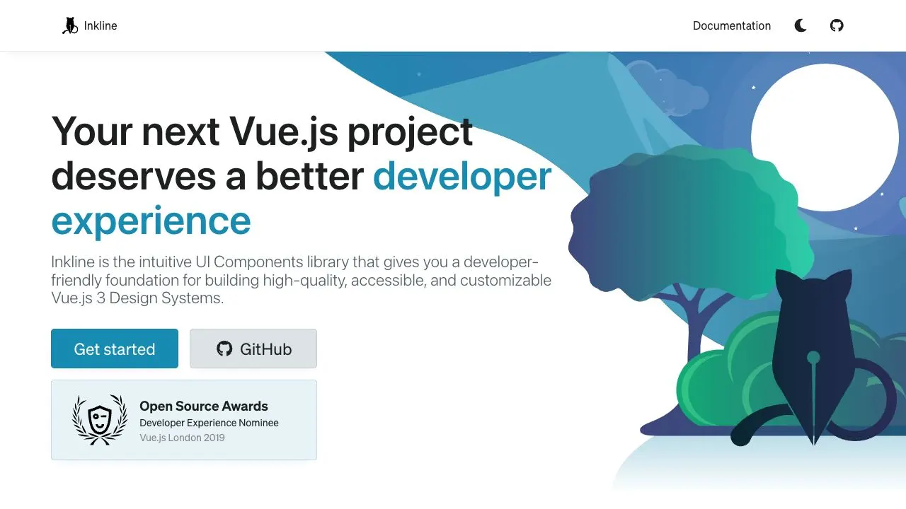
Inkline is a developer-friendly foundation for building accessible components. It includes design tokens and utility classes.
Features
- 20+ components