Best Svelte component libraries for design systems
The component libraries on this list are accessible and can be styled to match your brand and your design tokens.
| Accessibility mandatory | |
| Customisable style |
svelte-headlessui
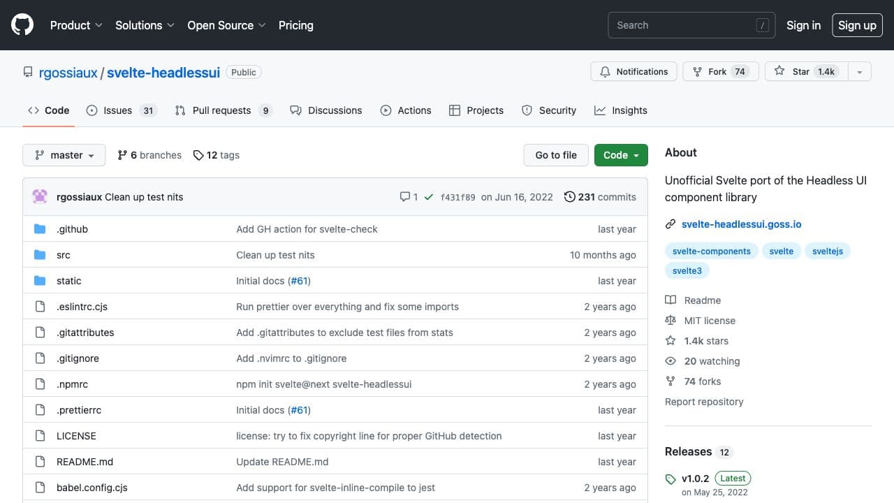
`svelte-headlessui` is an unofficial, complete port of the Headless UI React component library (https://headlessui.dev/). It contains fully accessible, feature-rich, unstyled UI components. It's still young but it's the only option providing unstyled components for Svelte.
Features
- 10+ components
Attractions
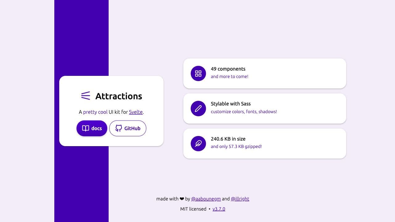
"A pretty cool UI kit for Svelte." Attractions provides accessible components that are customizable through Sass.
Features
- 30+ components
Carbon Components Svelte
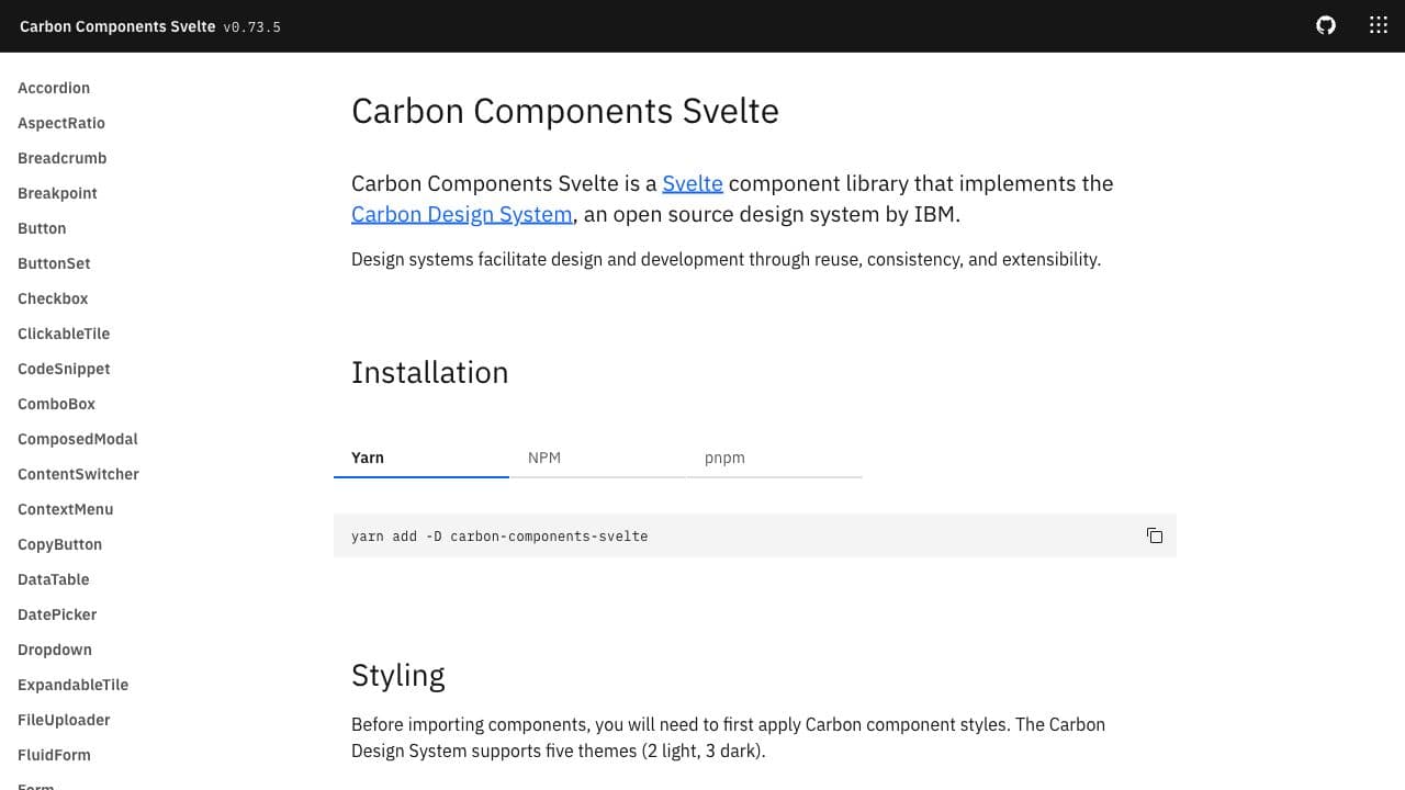
Carbon Components Svelte implements the IBM's Carbon Design System. Fully themable. Themes can be switched at run-time to also provide dark/light/contrast modes.
Features
- 50+ components
Svelte Material UI
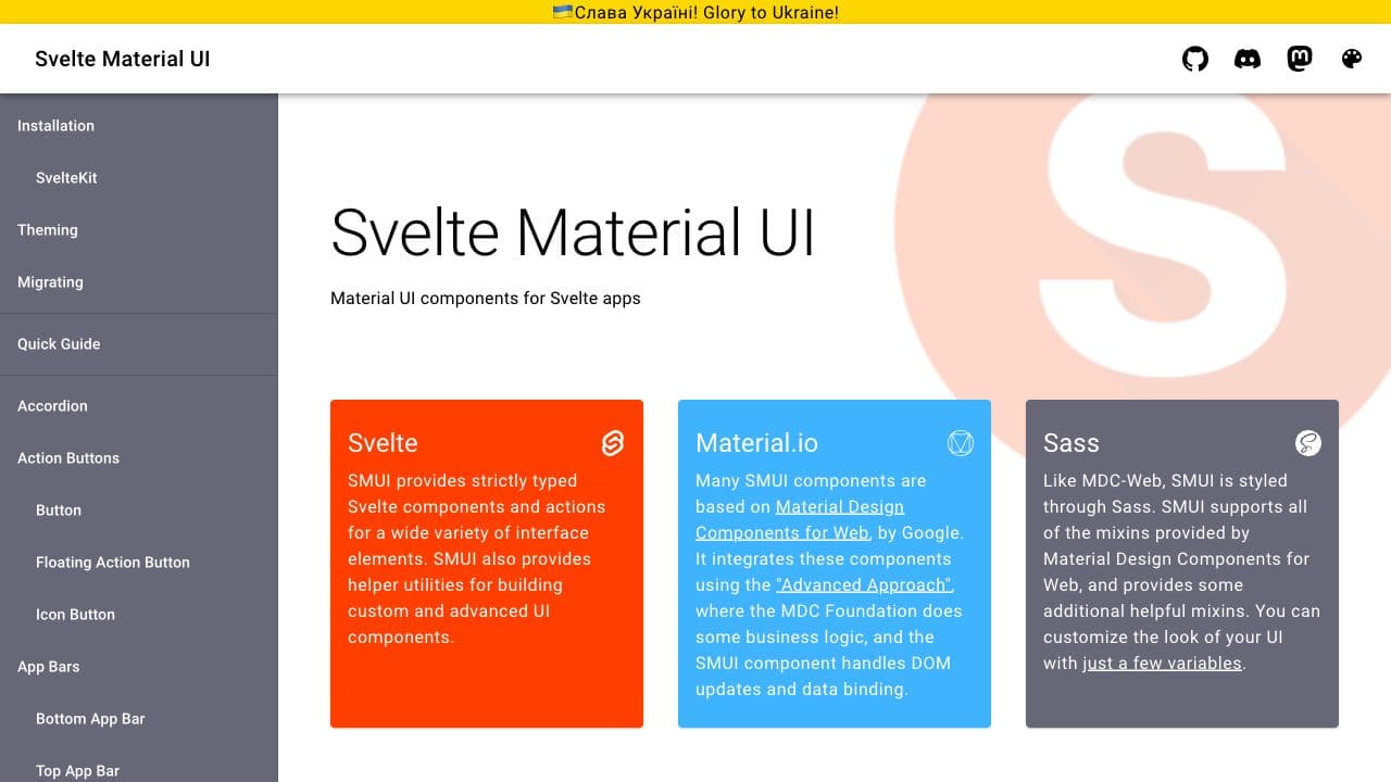
Also known as SMUI. SMUI is based on Material Design Components for Web, by Google. Themable through a few set of Sass variables.
Features
- 30+ components
Skeleton
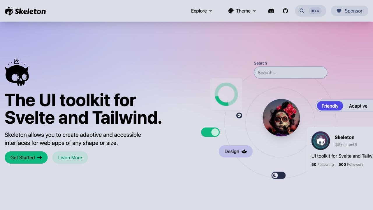
Skeleton allows you to create adaptive and accessible components with both Svelte and Tailwind. Currently only available for SvelteKit.
Features
- ~30 components
Mentions
Smelte
Smelte is an interesting component library using Tailwindcss but has inferior accessibility keyboard support.