Best React component libraries for design systems
The component libraries on this list are accessible and can be styled to match your brand and your design tokens.
| Accessibility mandatory | |
| Customisable style |
Composition primitives
These libraries are the lowest level you can get. It's lower than unstyled components. You compose primitive to build the component you need. The best example is React-Aria that provides composable primitives to create accessible components.
react-aria
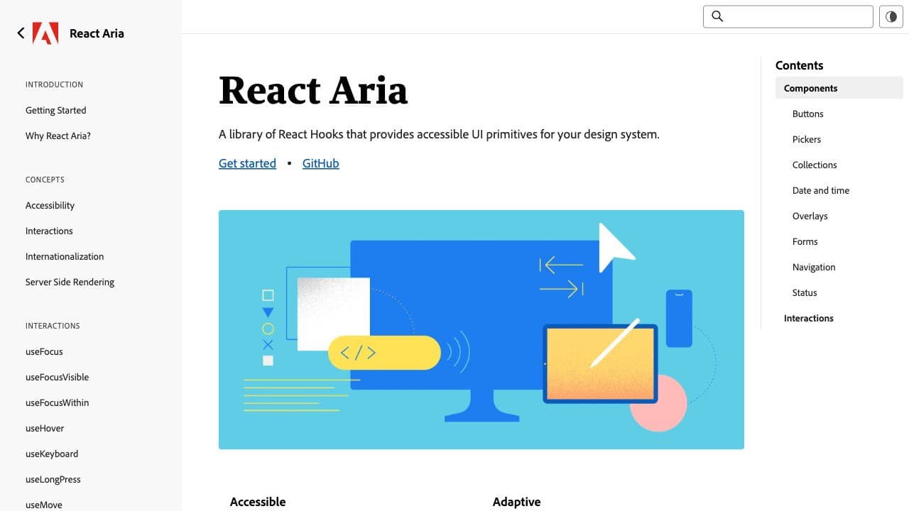
React Aria doesn’t implement any rendering or impose a DOM structure, styling methodology, or design-specific details. It provides behavior, accessibility, and interactions and lets you focus on your design.
Features
- 30+ hooks
Downshift
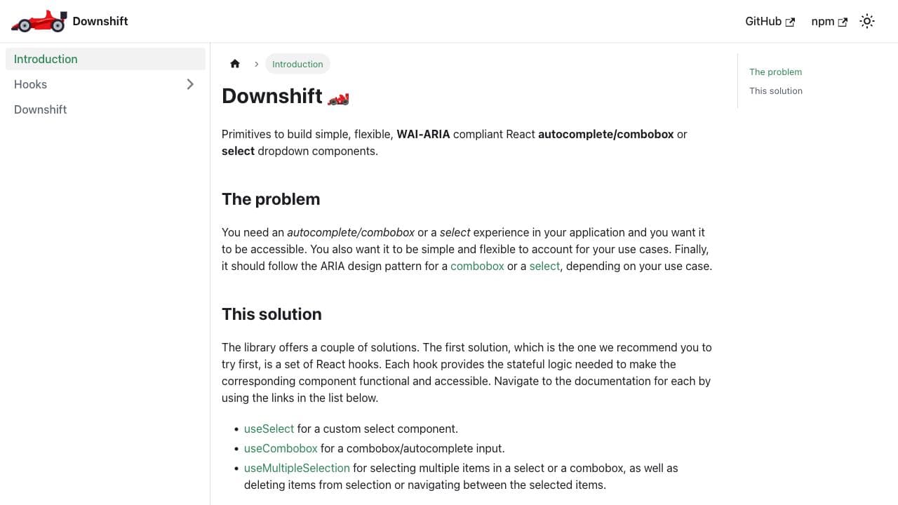
Primitives to build simple, flexible, WAI-ARIA compliant React autocomplete/combobox or select dropdown components. Made by Kent C. Dodds, so it's well tested.
Features
- Only select, combobox, and multi combobox components
Zag (beta)
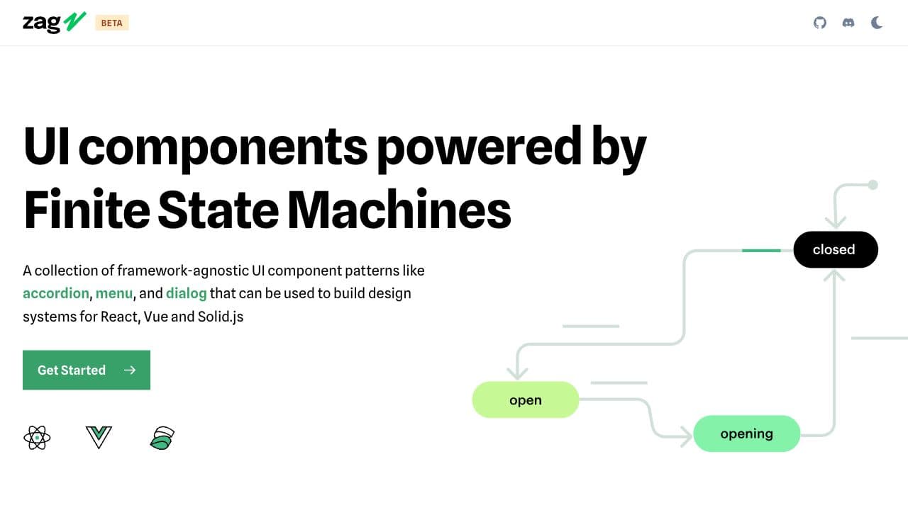
A collection of framework-agnostic UI component patterns that can be used to build design systems for React, Vue and Solid.js
Features
- 20+ components
Unstyled components
These component libraries bring unstyled components. You bring your own tokens structure and apply your styling on top of the pre-build components.
Nir Ben-Yair wrote a great article about React Unstyled Components and why you should use them.
Radix
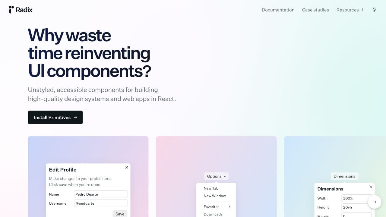
Radix Primitives is a low-level UI component library with a focus on accessibility, customization and developer experience.
Features
- 15+ components
React Aria Components
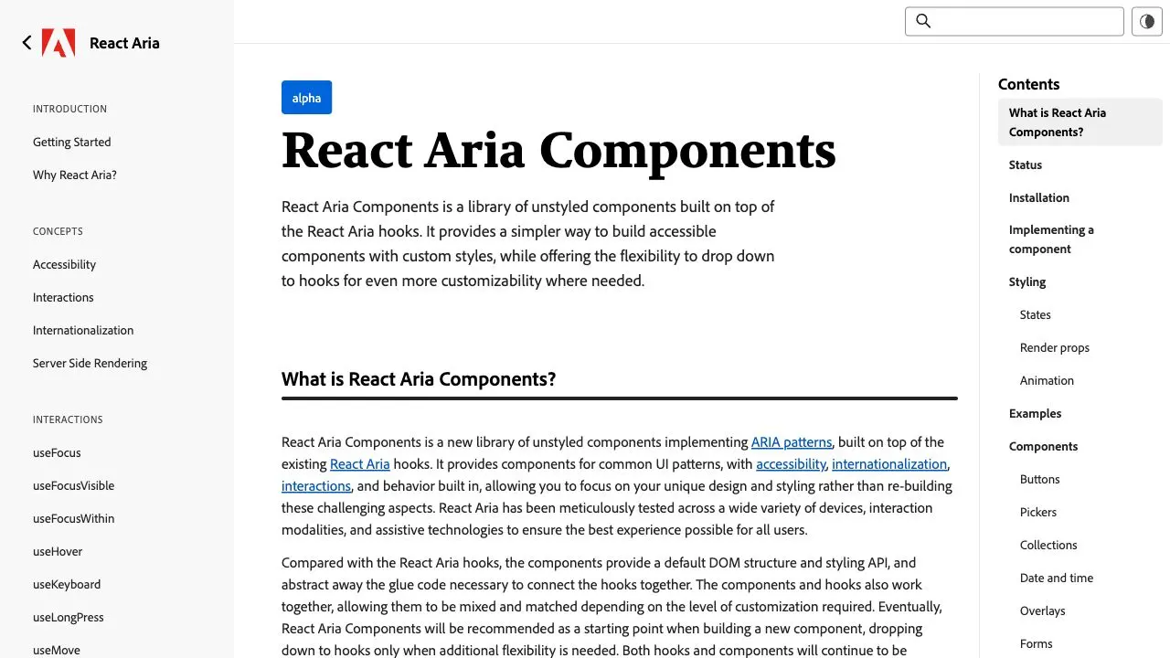
React Aria Components is a library of unstyled components built on top of the React Aria hooks. It provides a simpler way to build accessible components with custom styles, while offering the flexibility to drop down to hooks for even more customizability where needed.
Features
- 30+ components
Reach UI
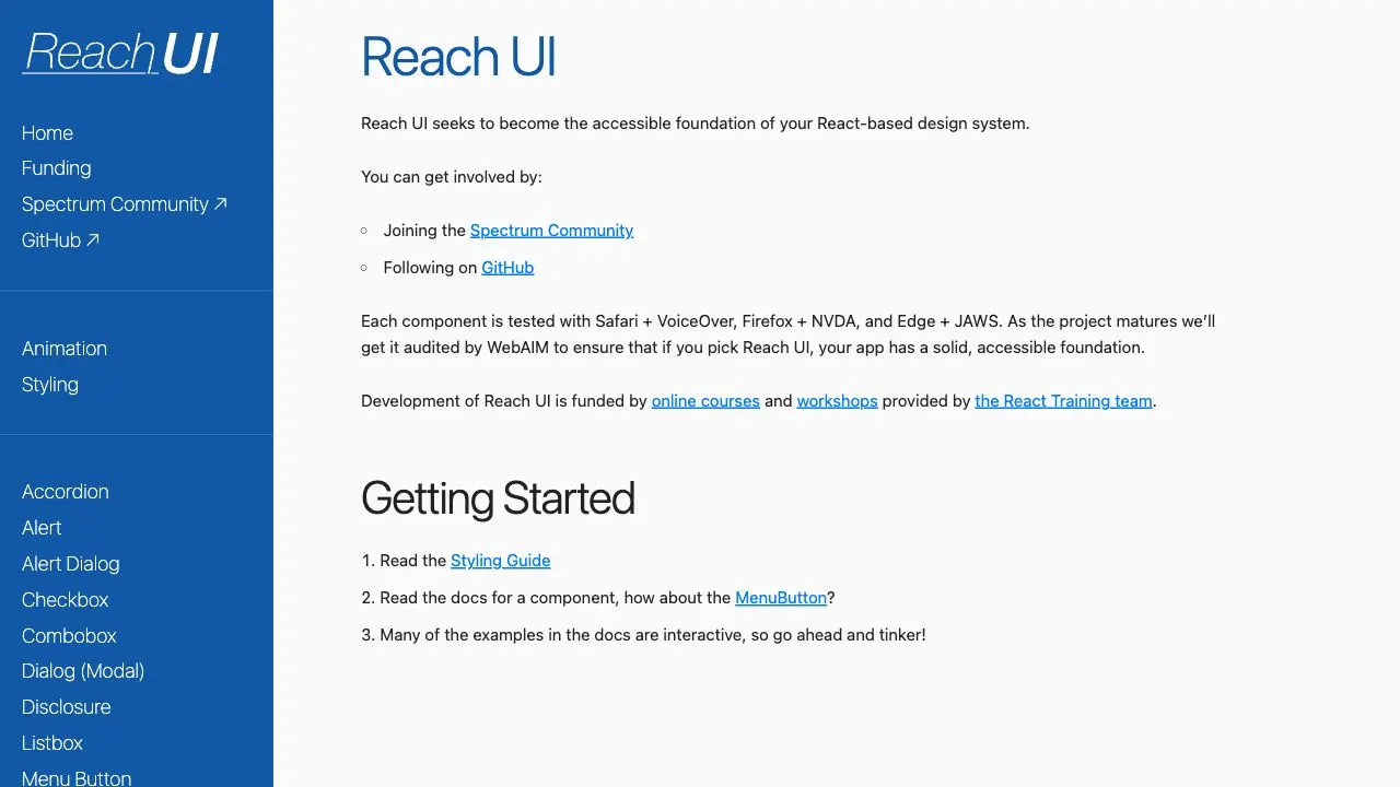
Reach UI seeks to become the accessible foundation of your React-based design system.
Features
- 15+ components
Headless UI
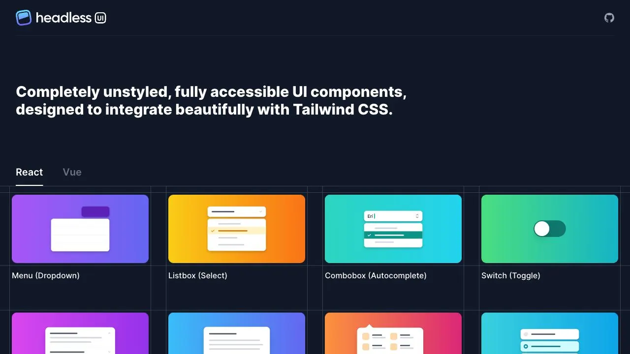
Headless UI is made by the team at Tailwind Labs. It's a set of unstyled components ready to be styled. Intended to be used with Tailwindcss, it can also be used by any CSS utility solution. (Also available for Vue)
Features
- ~10 components
Reakit
Reakit are unstyled components focusing primarily on accessibillity. Components are ready for customization.
Features
- 20+ components
Ariakit
Ariakit is an open source library that provides lower-level React components and hooks for building accessible component libraries. Succesor of Reakit.
Features
- 30+ components
Fully styled components
These component libraries are fully styled components ready-to-use. Most of them have a sophisticated theming systems with more or less design token granularity. Get the library you like, tune the styling through their theming system and go.
Base Web
BaseWeb is an extensive React component library developed by Uber. It has a good extensibility APIs to make it your own.
Features
- 50+ components
MUI
One of the most popular React component library, MUI implements Material Design from Google.
Features
- 40+ components
NextUI
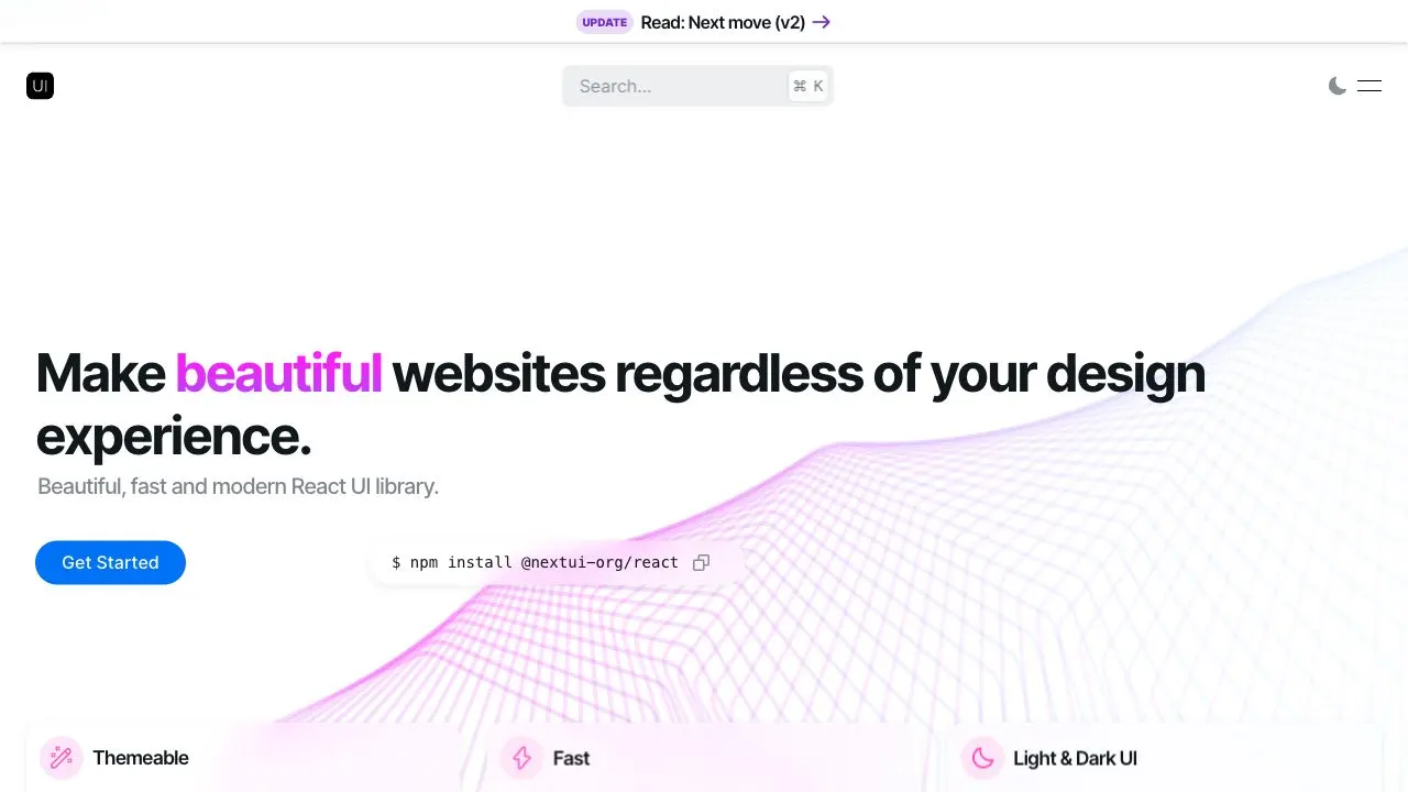
NextUI is a beautiful and modern component library powered by Stitches+GeistUI and inspired by Vuesax.
Features
- 20+ components
Mantine
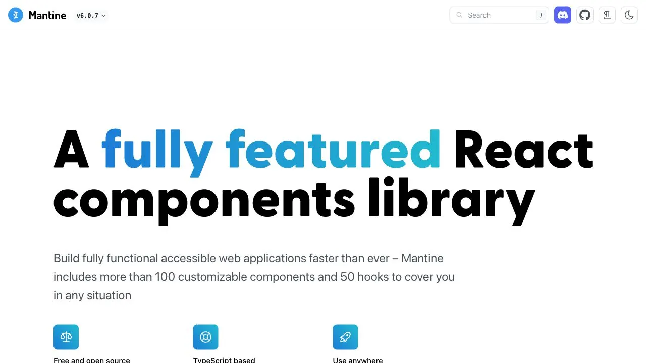
Mantine is an extensive component library with 120 customizable components combined to a sophisticated token architecture. It's an impressive piece of work.
Features
- 120 components
Geist UI
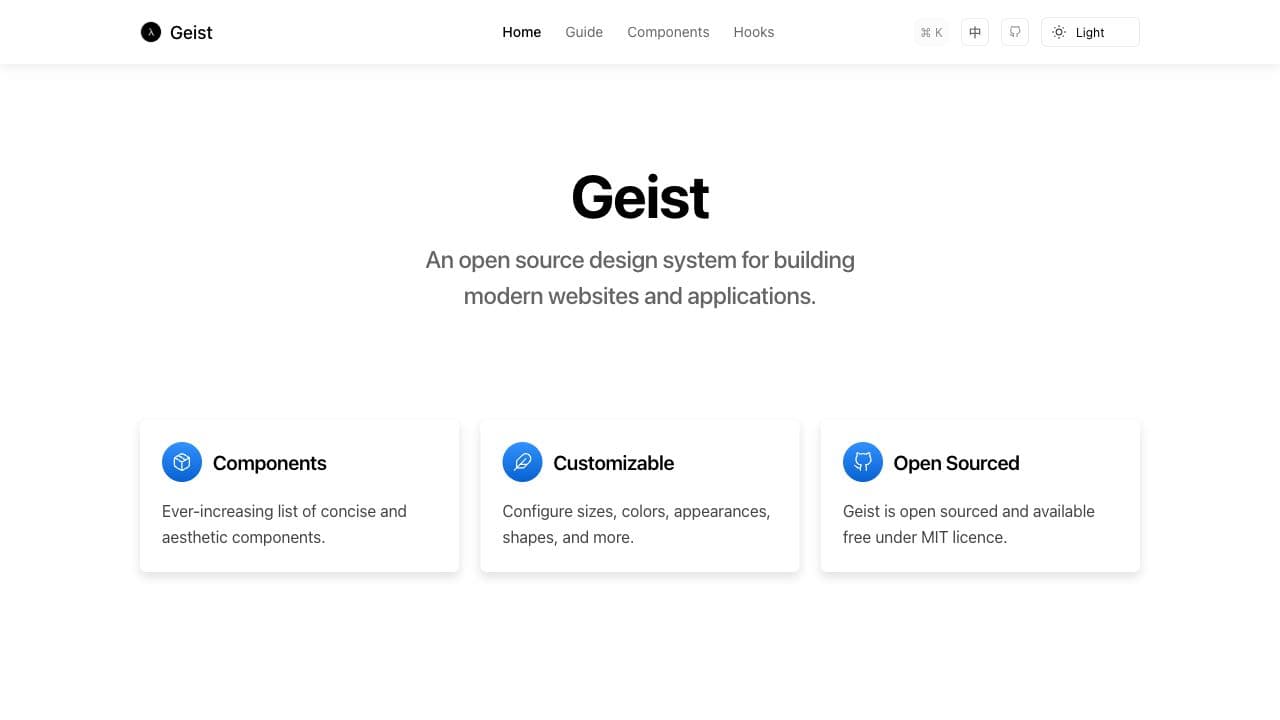
Geist UI is an elegant and beautiful React component library with Geek style, inspired from Vercel design system.
Features
- 40+ components