Best tools for design kits
Here are the best tools for designers to build and maintain design kits:
 Figma
Figma
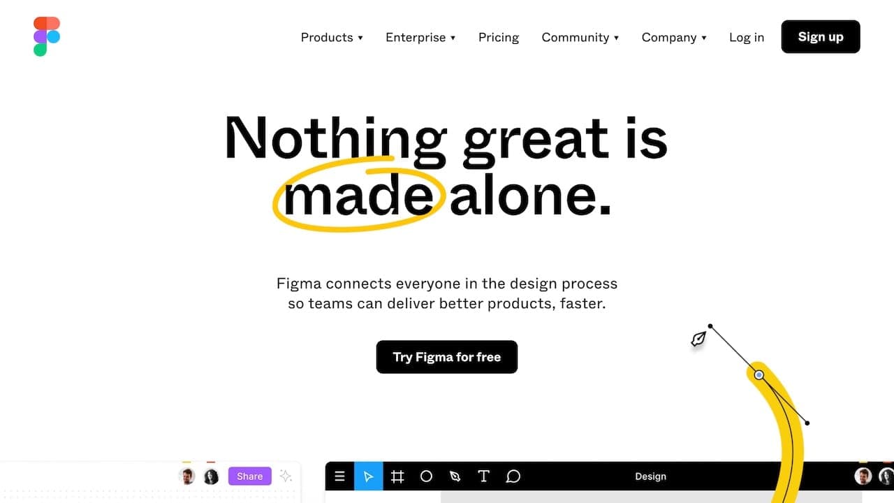
Figma is a collaborative vector graphics editor and prototyping tool used mainly by designers to make UI and UX designs of mobile and web products, as well as graphic design work. Launched in 2015, it's a web-based software but it is also available for macOS, Windows and Linux as a desktop app.
Figma is taking the design industry by storm due to its real-time editing features, its cross OS nature, good prototype interactions and the management of component libraries like no other.
Figma’s features can be extended thanks to a wide variety of optional plugins that can be easily installed when needed.
In comparison to its competitors, Figma includes features of 3 separate softwares designers previously would have to manage (design, prototype and cloud storage) for a much more affordable price. It's main disadvantage is the limited offline options being that it's a browser-based platform.
Key features for design kits
- Design system features (shared component library, basic set of tokens, component documentation)
- Web-based
- Prototyping
- Mobile prototype preview with app
- Collaborative with live editing features
- Large community
- Plugins
- Integrations
 Framer
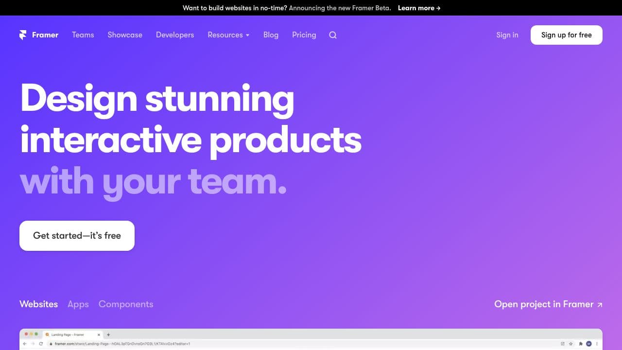
Framer is a design and prototyping tool that was launched in 2013. In contrast to its competitor, Framer has the ability to design interactive prototypes of websites and applications with production components and real data.
The transitions, code-based components and overall control of the prototype is what makes Framer stand out.
Key features for design kits
- Strong prototype features with code generated components
- Design system features
 Sketch
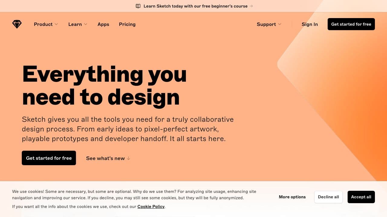
Sketch is a vector graphics editor released only for macOS. In recent developments sketch offers a browser-based experience, with limited features: commenting and viewing files only.
With Sketch the UI and UX of mobile and web application can be easily designed and prototyped, as well as graphic design work. It also has a component library capability like Figma however it can't be easily maintained in a central location, for that the design team will need a third party software such as Abstract or Dropbox.
It is also possible to extend its features with the installation of plugins. The files are normally shared with developers to inspect the design files in order to extract measures and color values. Sketch had the first-mover advantage when it was launched in 2010 and when it received Apple's Design Award two years after its launch.
Key features for design kits
- Intuitive and fast
- Design system features (component library, basic set of tokens)
- Prototyping (requires plugins for more advanced prototyping)
- Mobile prototype preview with app
- Third-party plugins
 Adobe XD
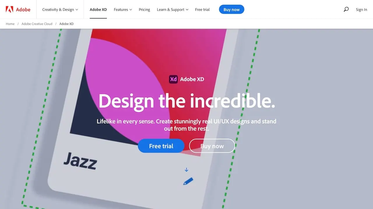
Adobe XD is a vector-based software for the ideation and execution of UX and UI designs of web and mobile apps. It was released in 2017 by Adobe Inc as a way of maintaining its relevancy in the Digital Product Design industry since many designers moved from Photoshop and Illustrator to the more relevant tools. For those who are active in other Adobe products, like Adobe Fonts, it's easy to sync everything. It also has the option for a collaboration if the document is hosted in the cloud.
Its prototyping features is pretty advanced in comparison to Sketch and Figma, and it's an application available for both macOS and Windows.
Key features for design kits
- Easy to use
- Prototyping
- Mobile prototype preview with app
- Design system features (component library)
- Integrations: Trello, google sheets, Airtable and more
 story.to.design
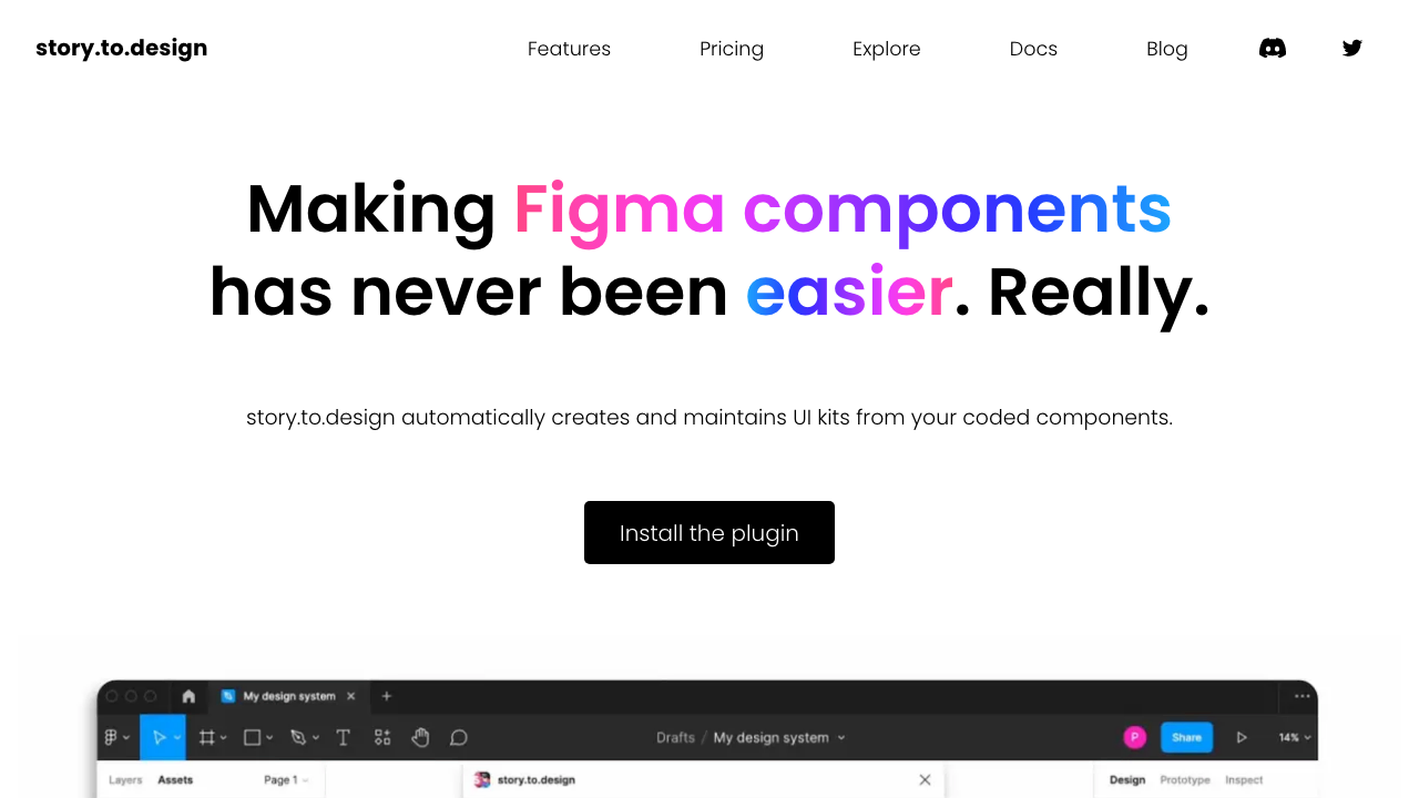
story.to.design is a Figma plugin that automatically generates and updates a full UI kit from your component library code. It works with Storybook or Backlight, taking all stories and bringing them into Figma as a design UI kit. story.to.design also supports Figma variants, so there’s no need to maintain thousands of variants manually; they are automatically generated and updated when needed. Maintaining both design and code in sync is no easy task. story.to.design was created to make this sync easier, allowing designers to focus on real design work, as opposed to manually updating their UI kits every time there’s a code change.
Key features for design kits
- Automatic generation, no manual work
- Easily installed with Figma, no additional tool required
- Design system features (sync component library code with design)
- Integrations: Backlight and Storybook