Color systems for design systems
Color systems are complete color palettes created with visual consistency and accessibility at their core. Designing accessible color systems for contrast is already challenging but you may be seeking balance (lightness and saturation) too. See Radix color Balance tests.
Hereafter are some of the best color systems. Use them, learn from them or get inspired by them.
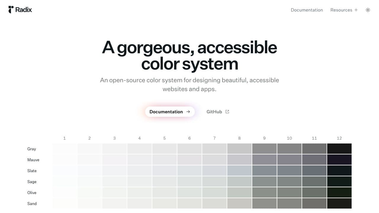
Radix Colors
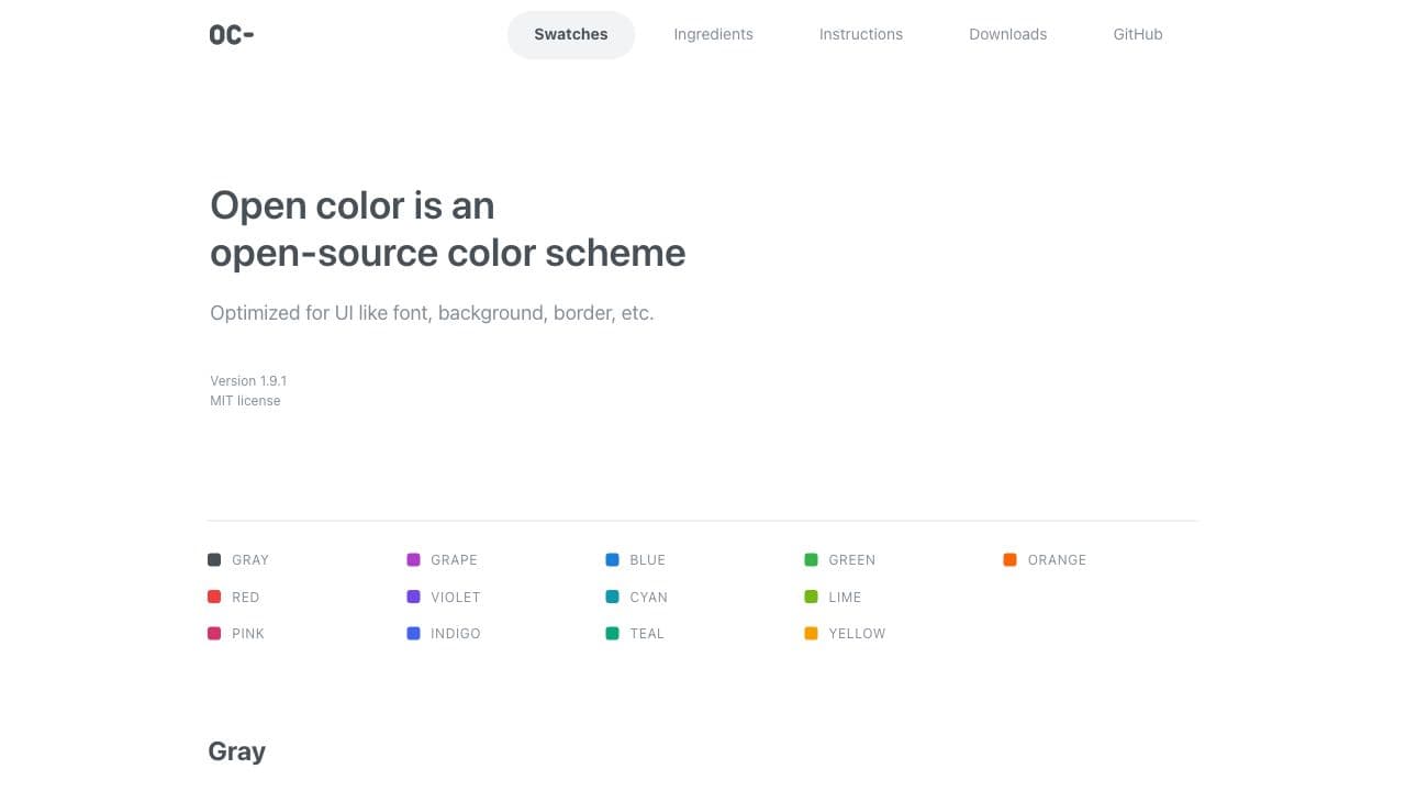
Open Color
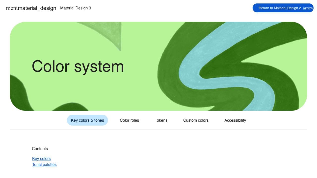
Material Design Color System
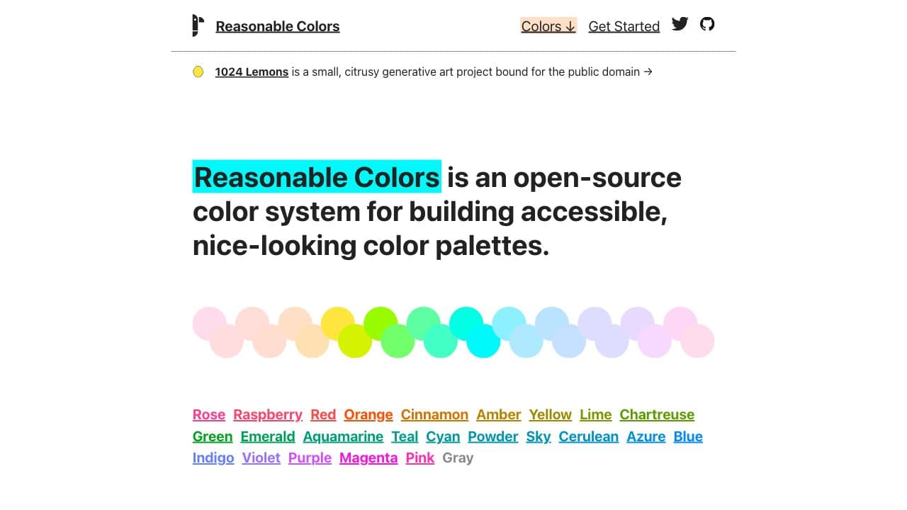
Reasonable Colors
Best tools for color systems
Leonardo (by Adobe)
Leonardo is a one-of-a-kind tool for creating, managing, and sharing accessible color systems for user interface design and data visualization.
Primer Prism (by GitHub)
Primer Prism is a tool for creating cohesive, consistent and accessible color palettes.
Additional resources
Designing accessible color systems
Achieving the right contrast with color is challenging, especially because color is incredibly subjective and has a big effect on the aesthetics of a product.
Build a design system from 0 to 1: color system
In this article, Miaomiao Liu helps us achieve the mission of creating a color system that clearly explains color roles, color relationships, accessibility evaluations and Tokens.
Reinventing Adobe Spectrum's colors
Adobe’s design system, Spectrum, hadn’t changed its colors since 2013. This blog post explains Spectrum’s method to updating their color system that supports over 100 products.
Color & Contrast
Color & Contrast is a complete and interactive guide to both explore and learn about the theory, science and perception of color and contrast.