How to build a Tab
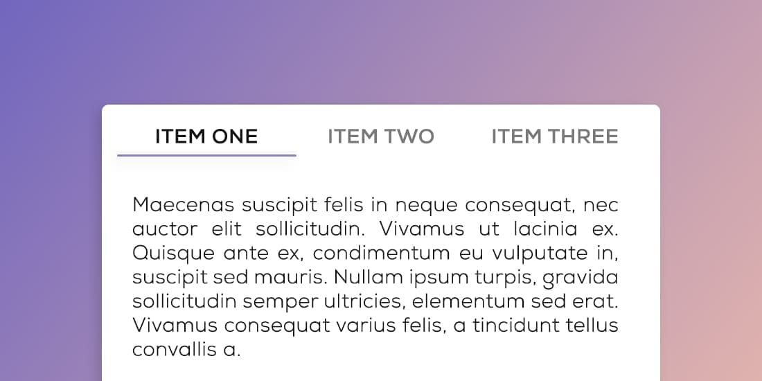
Tabs allow users to navigate between different panels, helping to reduce clutter on a page and fitting more information into a smaller space. A tab component is usually made up of 3 parts: the tab button itself, the tab panel with the content to be revealed and the tab group that arranges all tabs at the top.
These articles are a good starting point for building the tab component:
Building tabs in Web Components
David Darn goes through how his team built tabs in Web Components for Nordhelath’s design system.