Best design system documentation sites
Learn and get inspired by this curated list of design system documentation sites.
(Ordered alphabetically)
Atlassian Design System
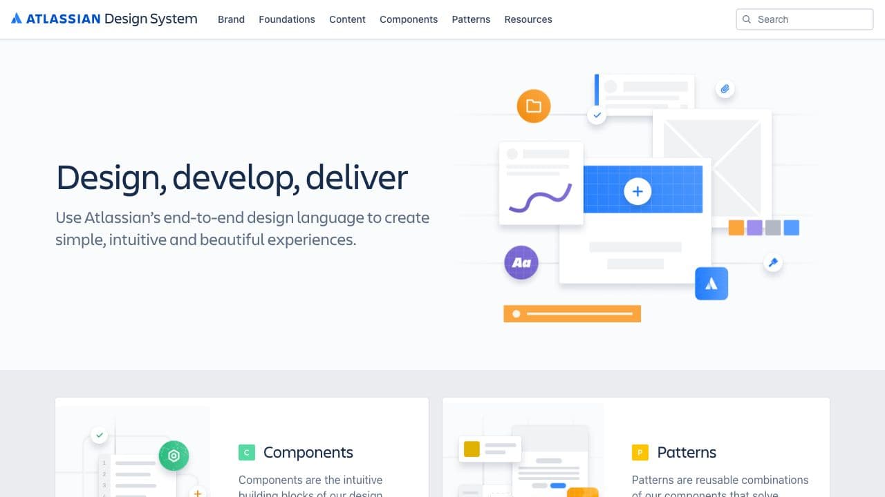
State of the art design system documentation. Atlassian is a multi-product brand backed by this single design system. Amazing work.
Auro
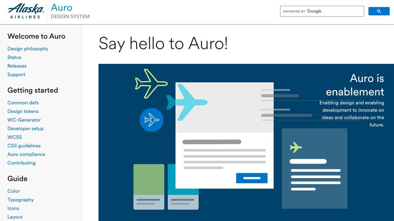
Auro, Alaska Airlines' design system, is very technical oriented but doesn't forget to cover UX writing. It also contains an extensive 'Status' page with component status and open issues. A very open design system in Web Components with React and Svelte examples of use.
Backpack
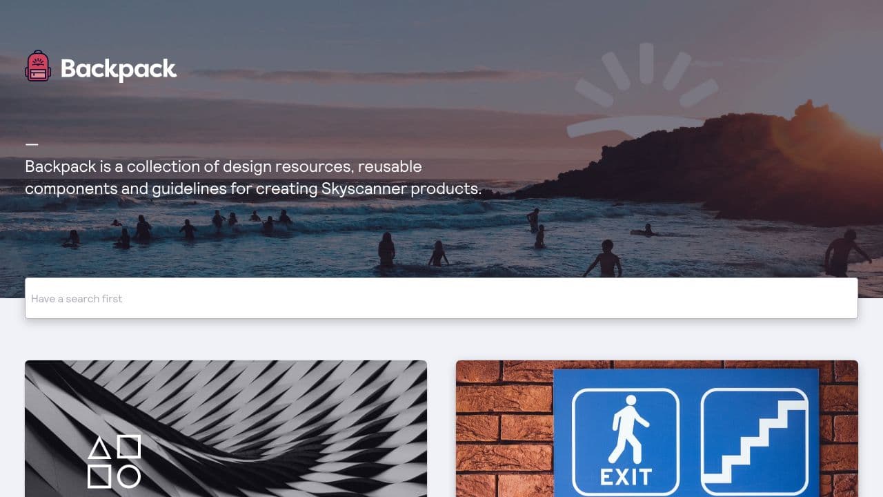
Backpack is Skyscanner's design system. The landing page goes outside of the usual layout without large and visual cards. It also greets you with a large search box in the middle of the page. They clearly value search here on top of navigation. Something to explore.
Canvas
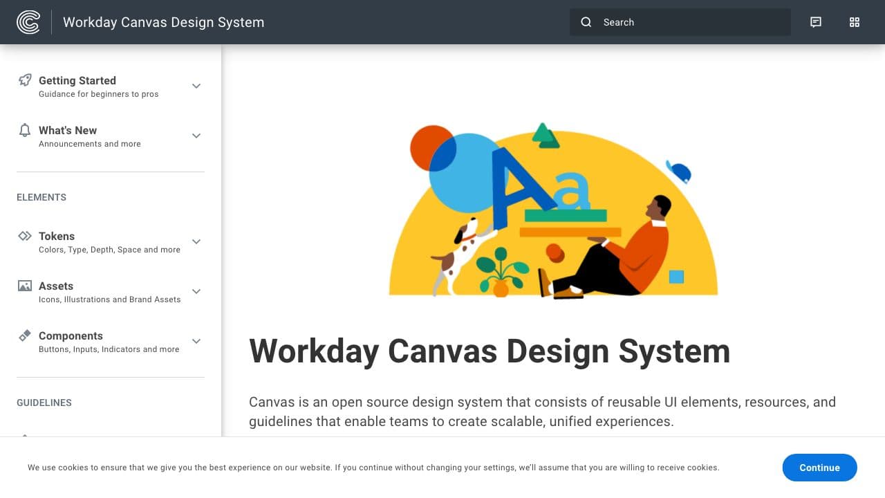
Canvas is Workday's open source design system. It may looks simple at first but this design system is packed with details on all aspect of design systems - tokens, content design, accessibility, patterns, globalization, assets and more. An impressive achievement.
Carbon Design System
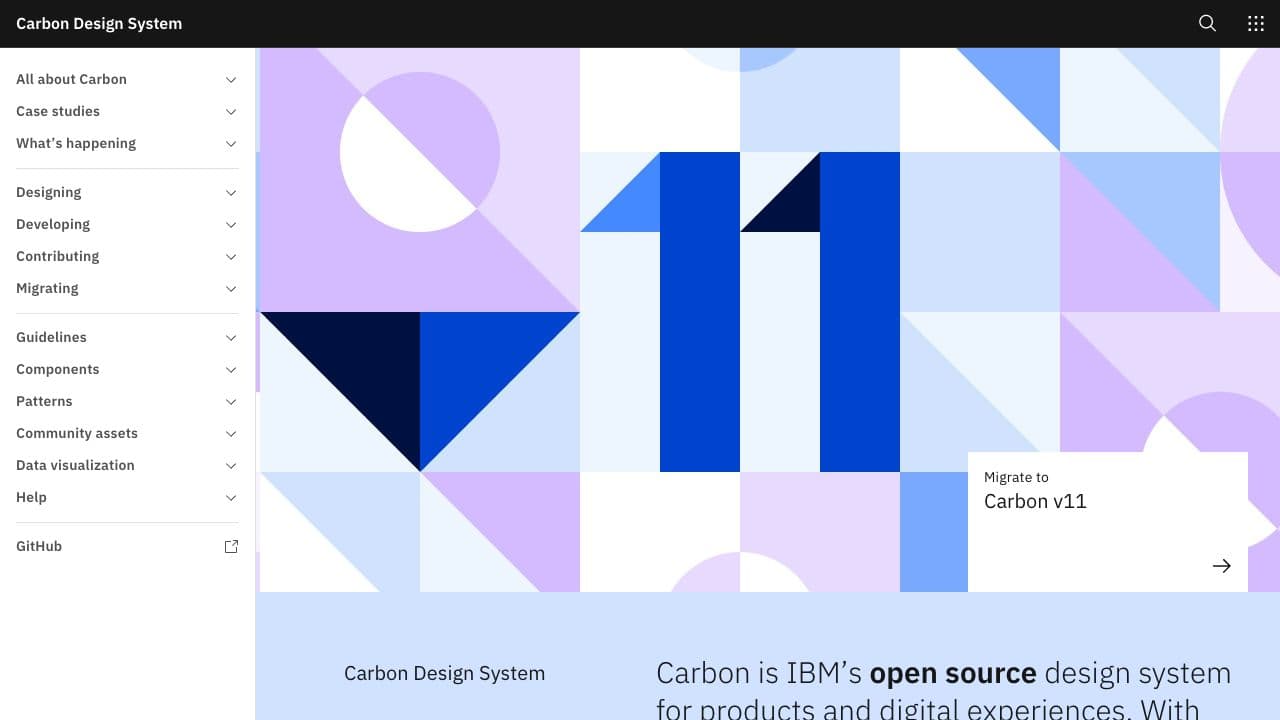
Carbon is IBM’s open source design system for products and digital experiences. With the IBM Design Language as its foundation, the system consists of working code, design tools and resources, human interface guidelines, and a vibrant community of contributors.
Clarity Design System
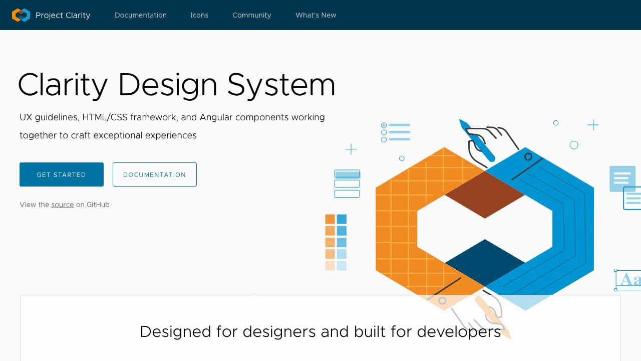
Clarity is an open-source, enterprise-focused design system with a core design principle of inclusion.
Cloudscape
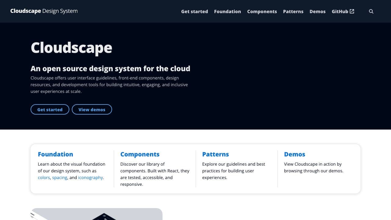
AWS's design system powered by React. This documentation site has a rich coverage of patterns and demos with very practical examples. Probably better than a thousand words. Great inspiration.
Comet
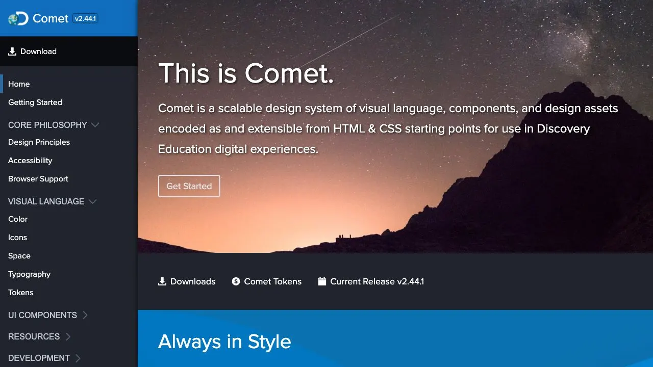
Comet is Discovery Education’s design system. It is a scalable design system that includes visual language, components and design asstes, which are encoded as and extensible from HTML and CSS. Comet starts with their core philosophy around design princples and accessibility, and then goes on to their visual language, UI components and resources. The Comet documentation site also offers several downloads that make it easier for designers and developers alike to incorporate Comet into their daily workflow.
Decathlon Design System
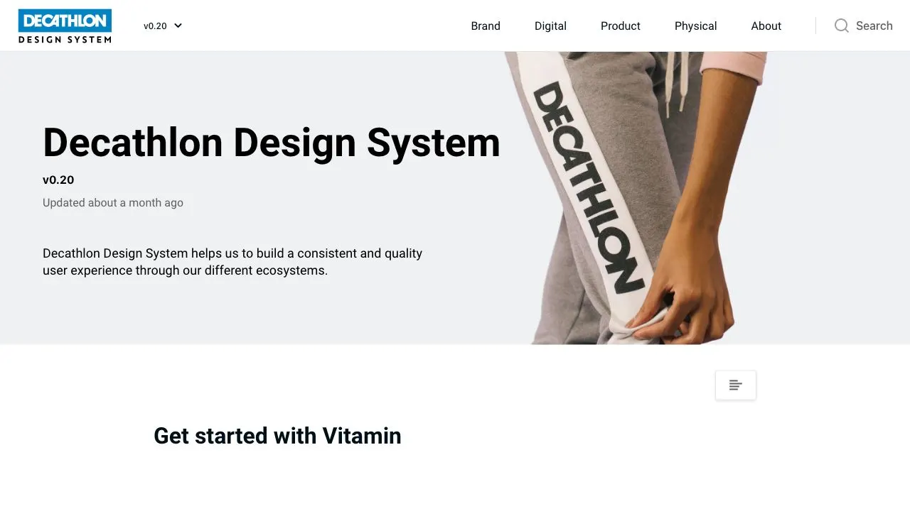
Decathlon Design System demonstrating the use of the brand in digital products but also physical products and stores.
Dell Design System
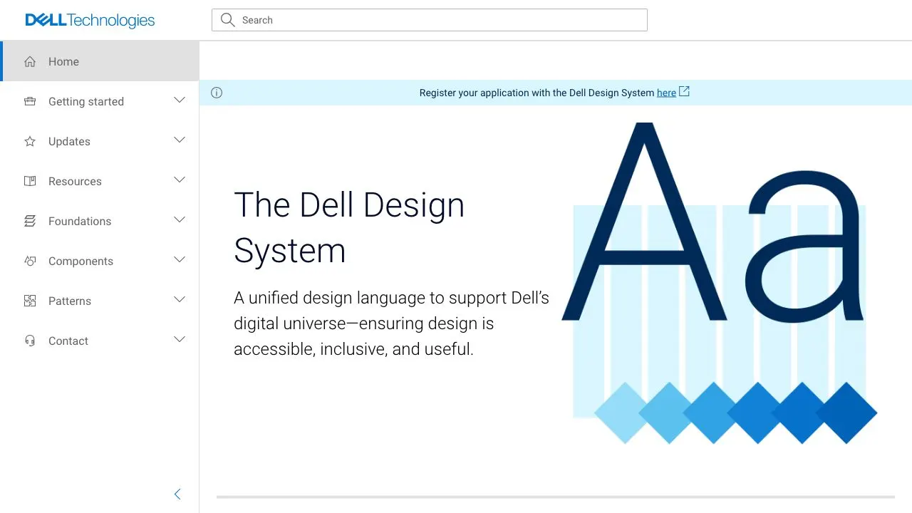
This is the new version 2 of Dell's design system. Every page can collect feedback ranking from 1 to 7. It's great to easily collect feedback from users. More design system sites should have it.
Digital Product Platform (DPP)
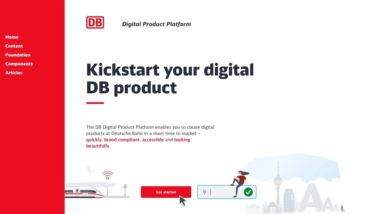
The DB Digital Product Platform is the design system for all Deutsche Bahn digital products. Deutsche Bahn’s documentation site is split into Foundations (colors, grid, layout, logos, typography) and Components, with ready-to-use React components. However, it also comes with a very complete Content section with resources for UX writing, terminology, etc.
DRUIDS
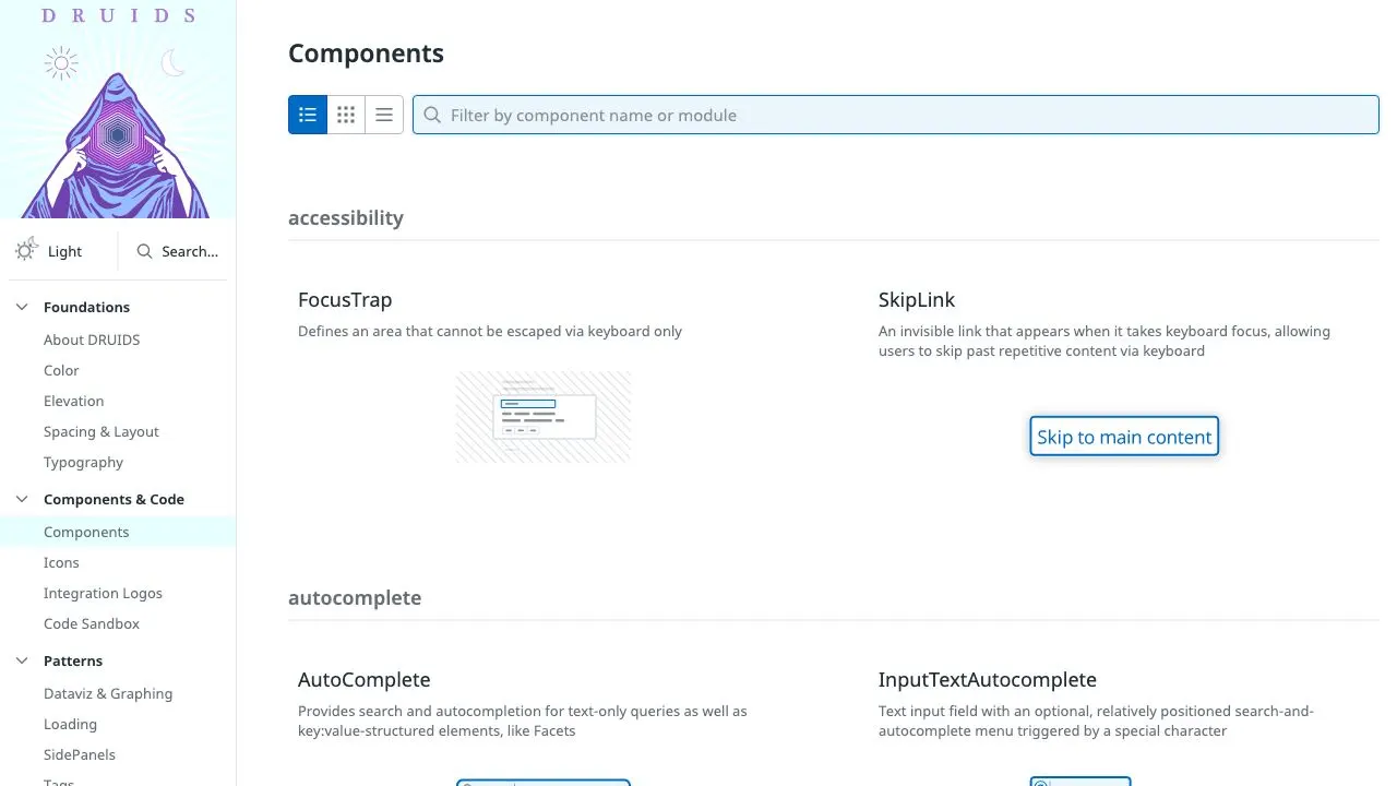
DRUIDS stands for “Datadog Reusable User Interface Design System” and it is Datadog’s primary UI foundation. Their documentation site has a simple and clear layout, with a search bar at the top for easy navigation. There is also the option to view the site in light or dark mode, which adds a delightful touch. Components are organized and grouped by their primary area of use (in a form, for dialogs, etc.); a different approach from the usual alphabetical list.
Duet Design System
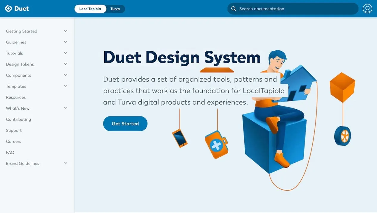
Duet provides a set of organized tools, patterns and practices that work as the foundation for LocalTapiola and Turva digital products and experiences.
Edison Design System
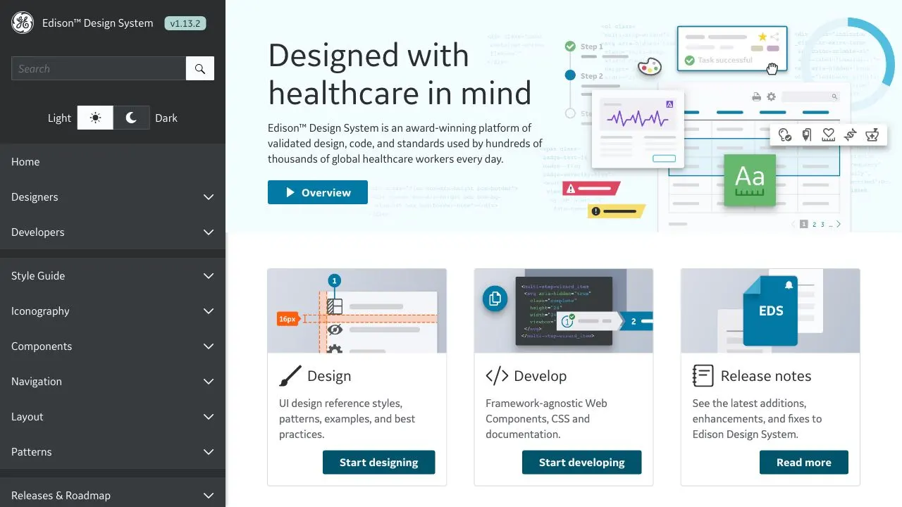
Edison is an award-winning design system of design and code standards used by hundreds of thousands of healthcare workers every day. The system is broken down into a style guide, icon library, components, navigation elements, layout templates and patterns.
Fluent 2
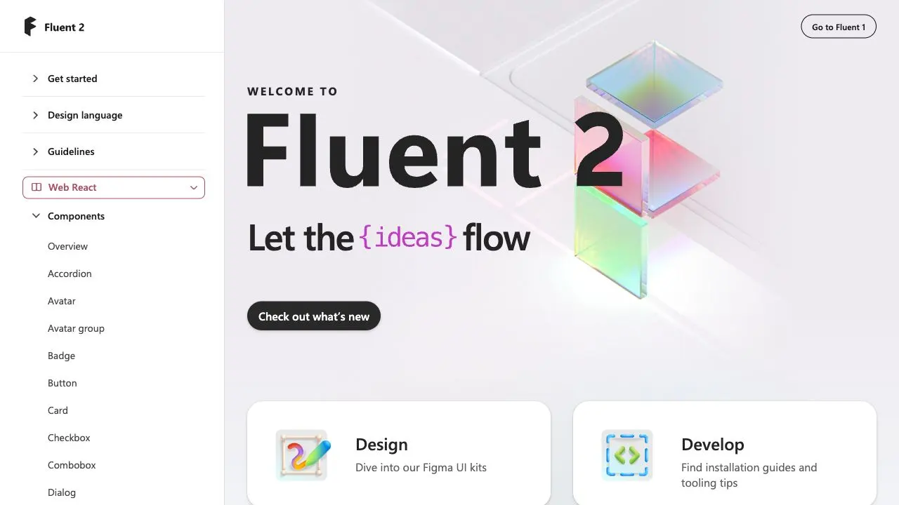
The next evolution of Microsoft's original design system, Fluent UI. Fluent 2 is a collection of UX frameworks for creating beautiful, cross-platform apps that share code, design and interaction behaviors.
Fluid Design System
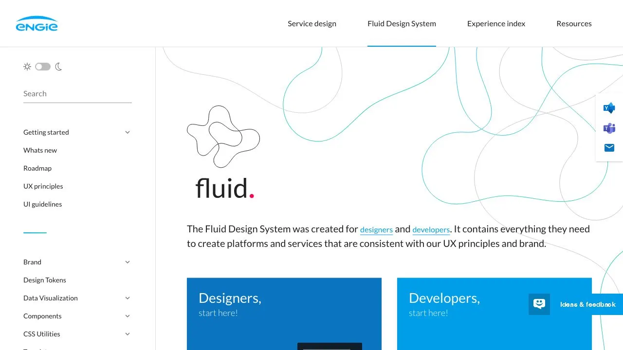
Structured with a Designer and Developer specific contents, the Engie team has done a tremendous work to relay UX Principals and Brand definition with practical and pragmatic resources.
Forma 36
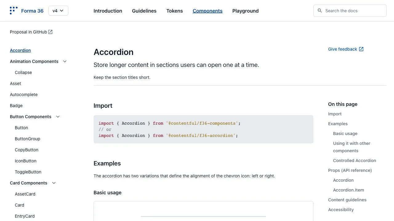
Forma 36 is an open-source design system made by Contentful that welcomes contributions from the community. Their documentation site is split into 5 sections: the introduction that includes an installation guide, a guidelines section about accessibilty and UX writing, design tokens, components and a playground for seeing how components look and interact.
Garden
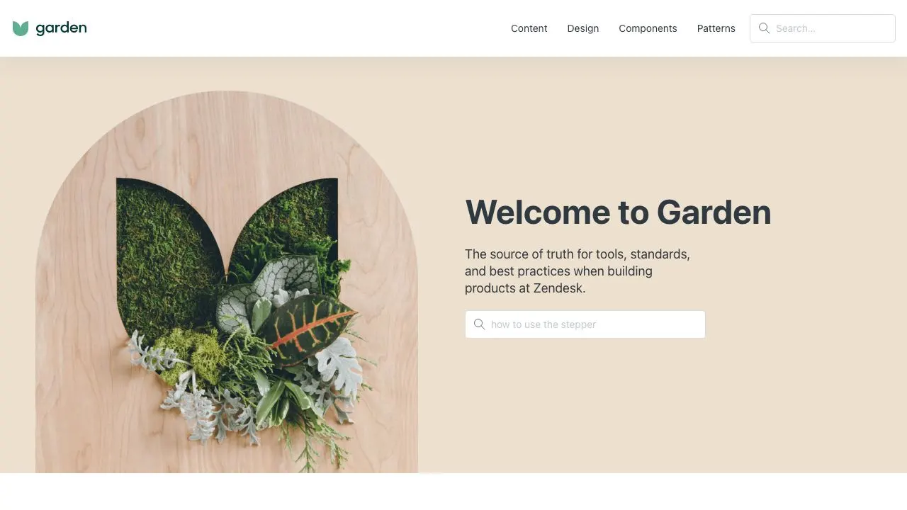
Garden is Zendesk's design system. It has one of the most elaborate `Content Design` definition - definitly the highlight of this design system site.
Gestalt Design System
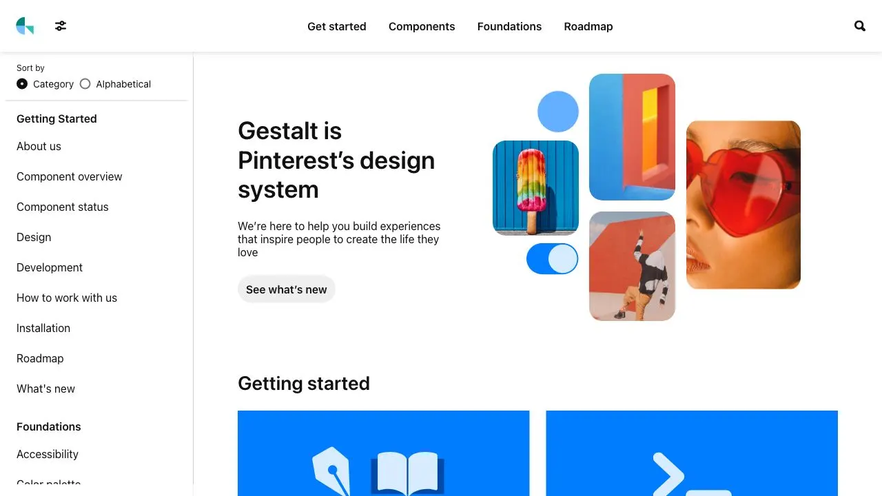
Pinterest deliveres here a very mature design system in a simple package. Function comes before form here for Gestalt. The details adressed in this documentation site are impressive and should be on topof your list to learn more about design systems.
GOV.UK Design System
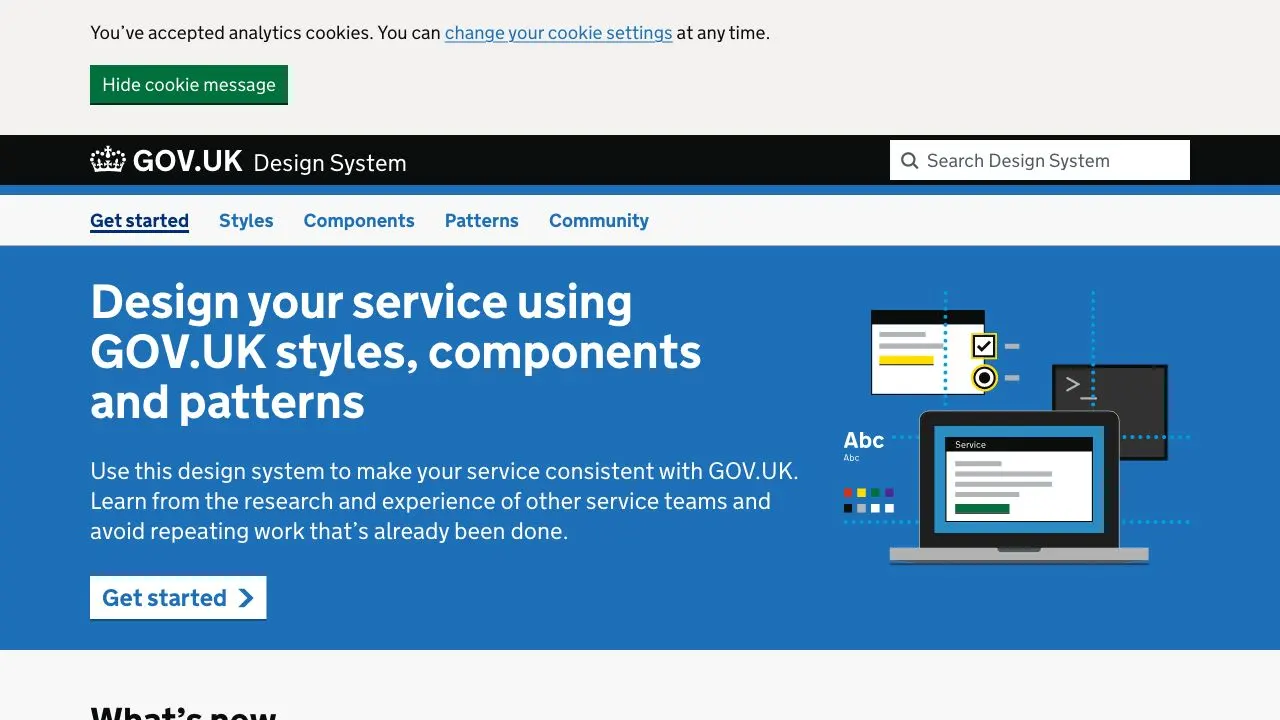
Design System of gov.uk to make all services consistent. Looks simple yet it's very advanced in the a11y department.
Graphite
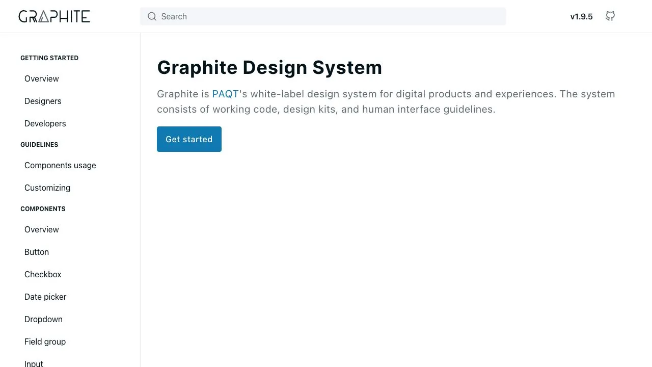
PAQT is a software development company based in the Netherlands. Graphite is their white-label design system that allows designers and developers to quickly build new digital experiences and complete them with any customer’s branding.
GroupUI
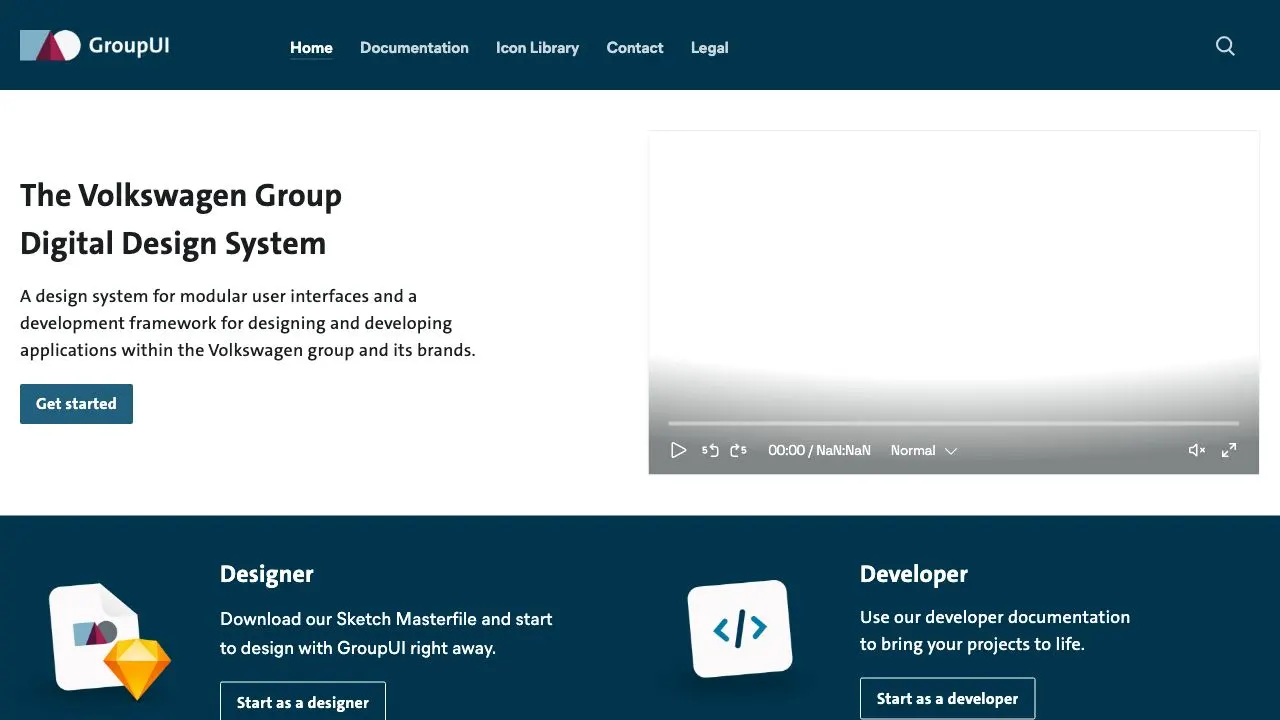
GroupUI is the Volkswagen’s digital design system, for designing and developing all applications within the group and its brands. It includes 3 main sections: Basics, Components and Templates.
Helsinki Design System
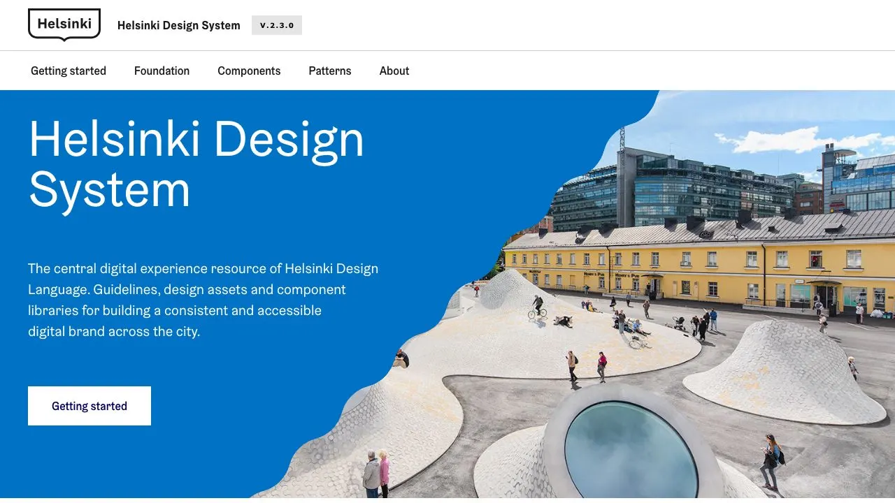
This is the central resource and system for the city of Helsinki’s design language. The homepage of their documentation site clearly highlights what each section of the design system is for. There are also complete guides for getting started with the Helsinki Design System, depending on whether you’re a designer or developer.
HPE Design System
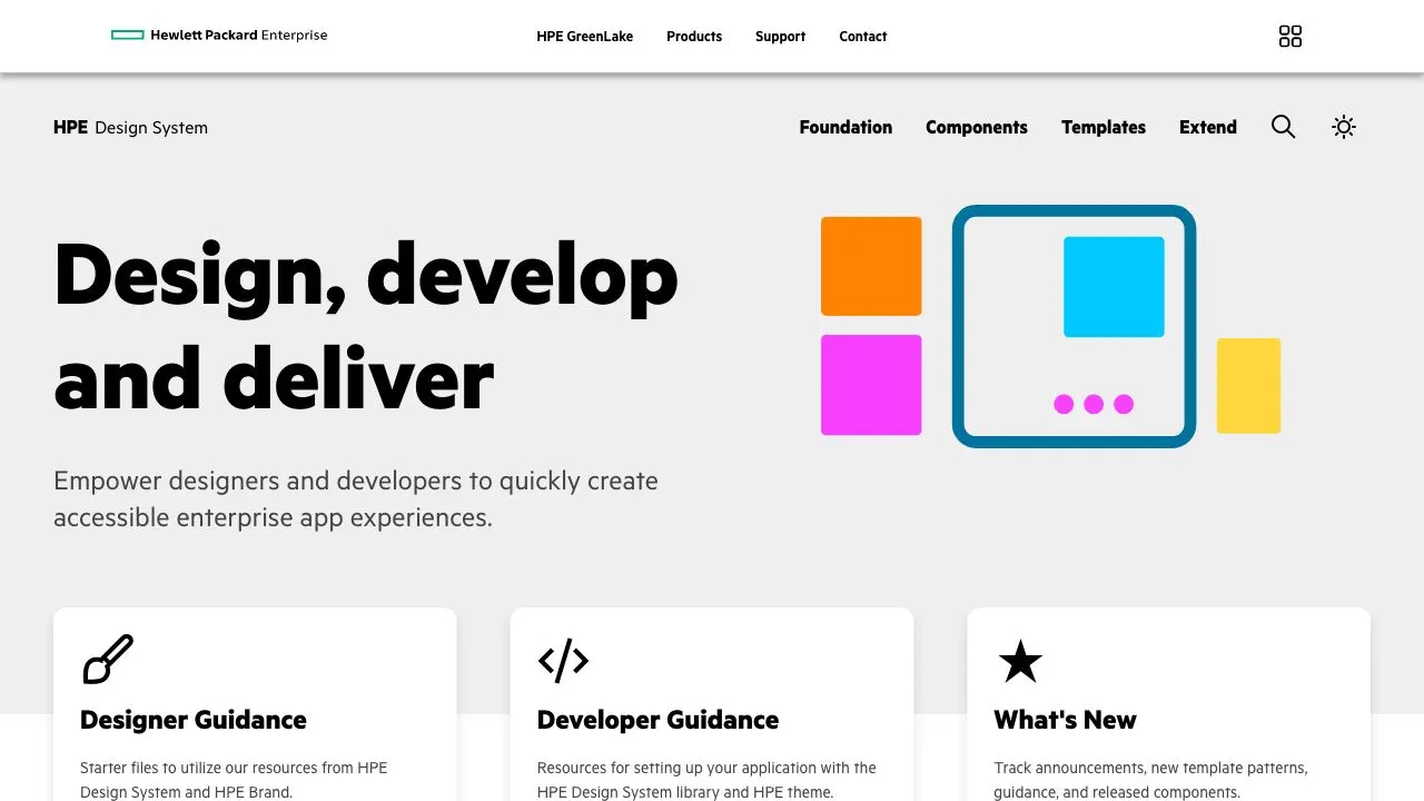
The HPE Design System was created to empower designers, developers, and others in contributing to an evolving design language that supports HPE's pursuit in making great customer app experiences.
Kaizen
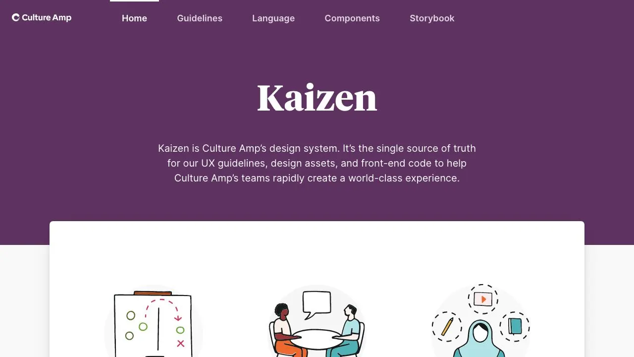
Kaizen is Culture Amp's design system. It has a great content design definition and a large number of components.
Lightning Design System
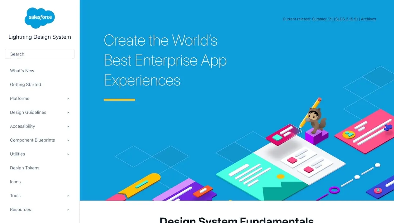
The Salesforce Lightning Design System includes resources and examples to create user interfaces consistent with the Salesforce Lightning principles, design language, and best practices. Rather than focusing on pixels, developers can focus on application logic, while designers can focus on user experience, interactions, and flows.
Liquid Oxygen
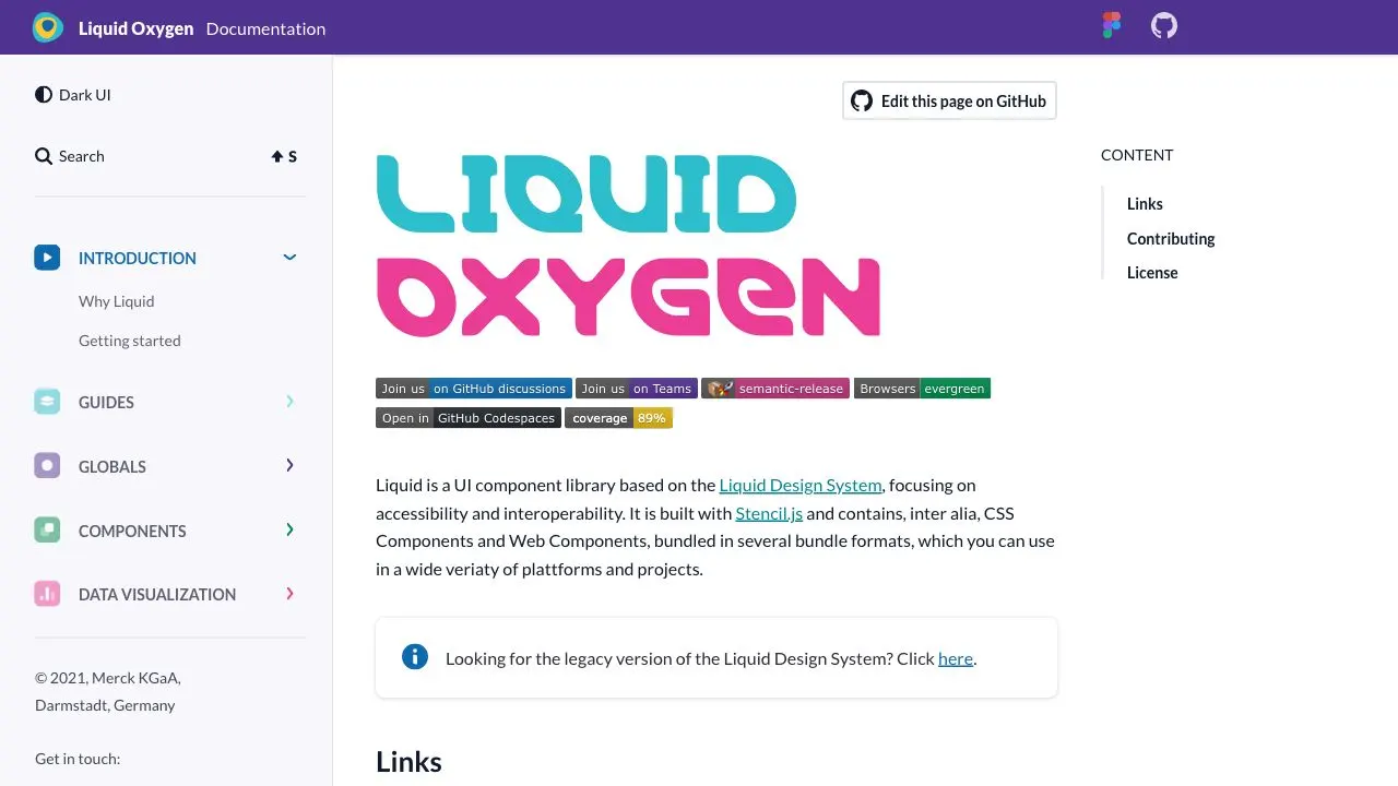
Liquid Oxygen is Merck’s UI component library, based on their Liquid Design System. It is built with Stencil.js and focuses on accessibility and interoperability.
Luna
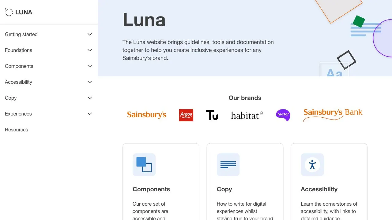
Impressive execution here by Sainsbury. Components can be explored in different themes for each of brands of the group: Argos, Nectar, Habitat and Tu. Absolute masterclass of multi-brand design system.
Material Design 3
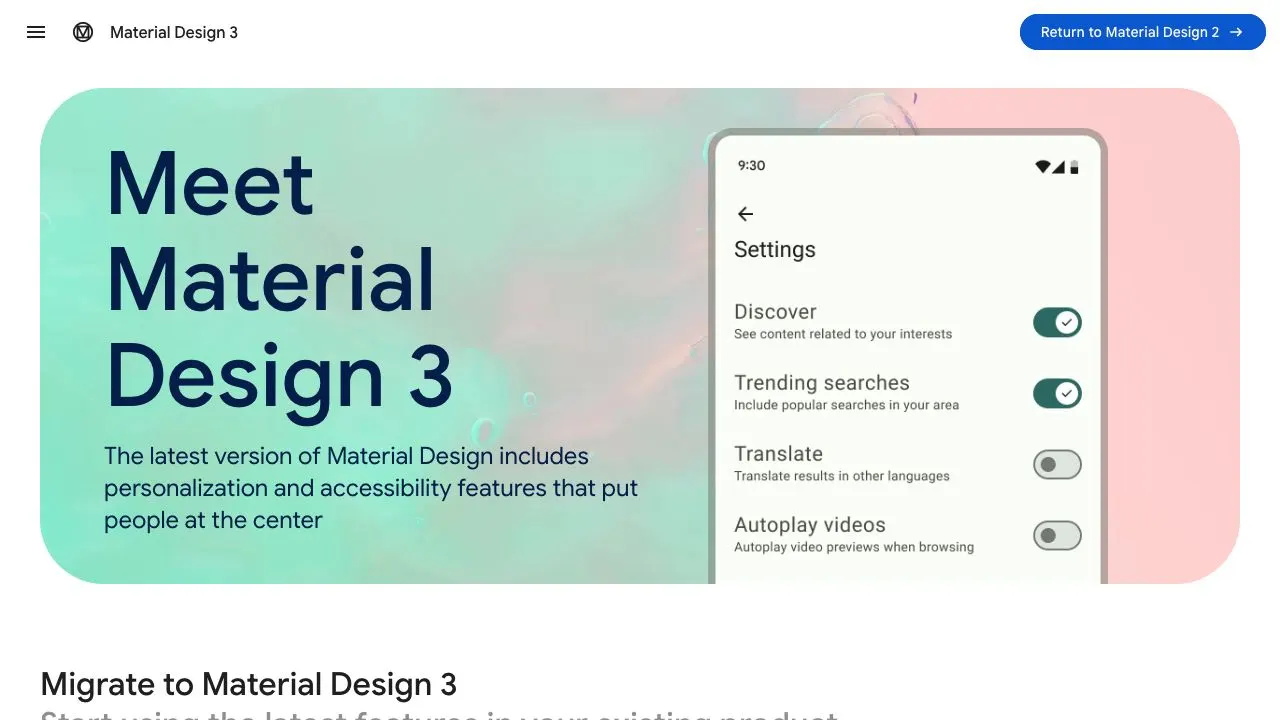
Latest version of Google's Material design system. This new documentation site is much easier to use while still packing a lot of content. Demonstration of the know-how from Google's design system team.
Mozaic
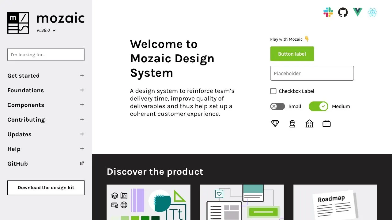
Mozaic is multi-brand design system with a large number of component and technologies. The component descriptions are very detailed with Code, Design and Accessibility details.
Nord Design System
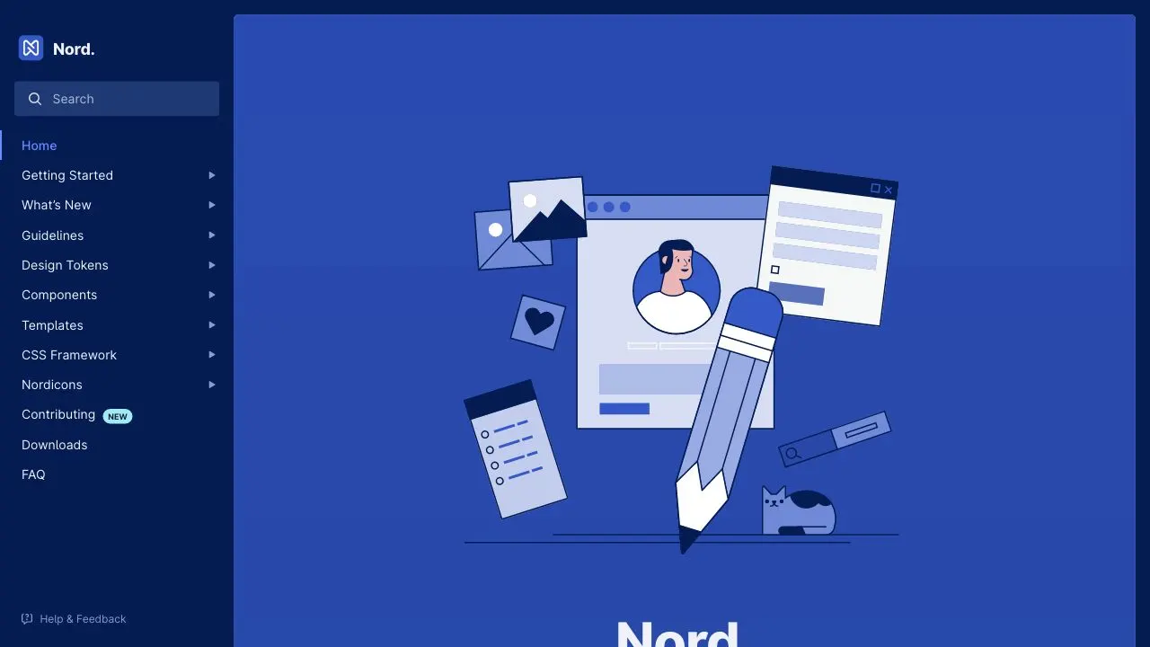
Still in early beta, you can already appreciate the structure of the documentation and the attention to detail.
Orbit
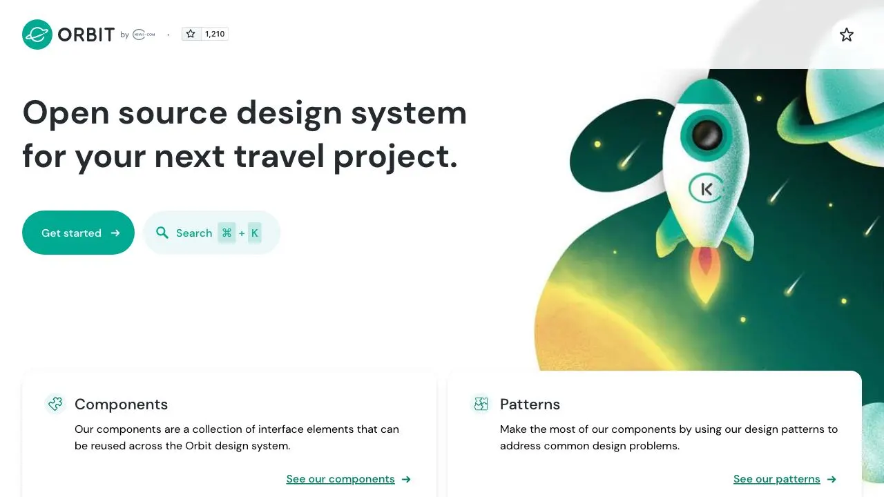
Orbit is a travel-oriented design system. Recently updated, it's one of the most complete design system documentation site available to public. Contains Figma references as well as React, iOS and Android components.
Paste
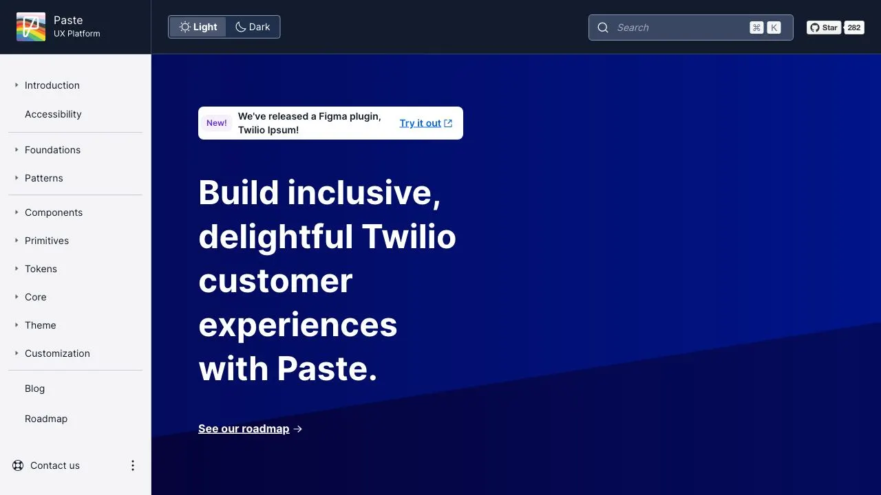
Design system to `build inclusive and delightful experiences`. Interesting Design Token implementation to consume in JSON, CSS, Sass, Less, Android, iOS and more.
Pharos
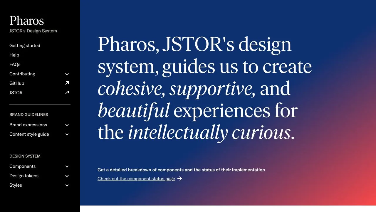
Pharos is the design system for JSTOR, a digital library with over 12 million journal articles, books and images. Pharos is broken down into components, design tokens and styles; accompanied by brand guidelines and a content style guide.
Polaris
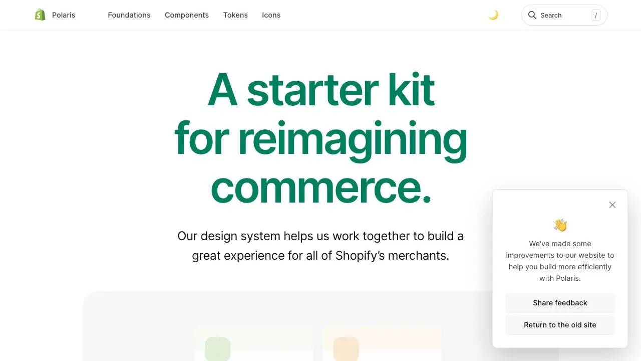
One of the most complete design system documentation. It goes way beyond the component library documentation. Shopify has been at the forefront of design systems.
Primer
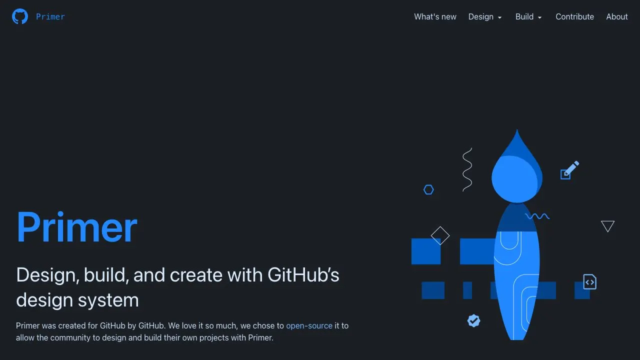
Design system of GitHub. CSS Framework and React components are available. Also contains Figma designs.
Progress Design System
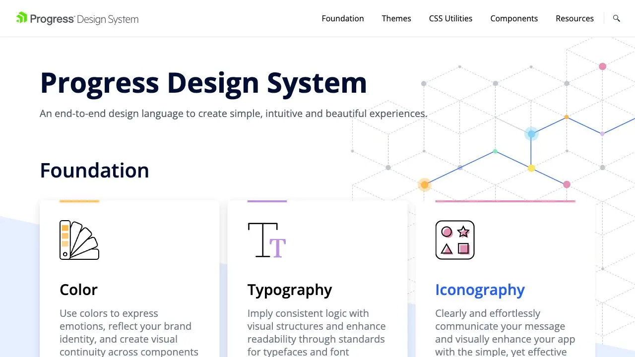
The Progress Design System from Telerik comes with a unique feature: all components can be fully customized to your brand's styles and theme. Whether it's done via code, or using their cloud app ThemeBuilder, the Progress Design System components can be fully customized to your brand. Their documentation site is also very complete, with details about usage, styles, accessibility and even globalization, for every component.
Quickbooks Design System
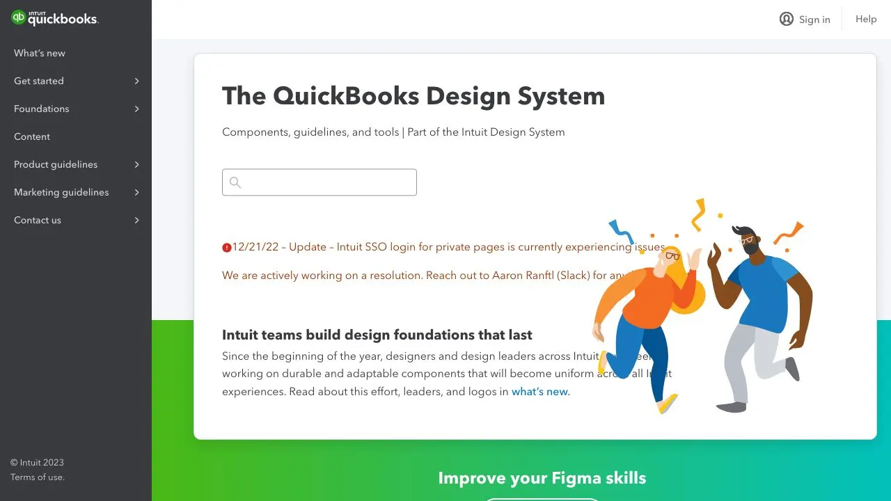
Intuit's Quickbooks Design System has one of the most complete documentation sites out there. With thorough sections for Foundations, Content, Product guidelines and even Marketing guidelines, every Quickbooks team can benefit from this design system's documentation site. Components are organized by use-case, rather than alphabetically; grouped under 'Communications', 'Containers' or 'Discovery', for example.
Red Hat Design System
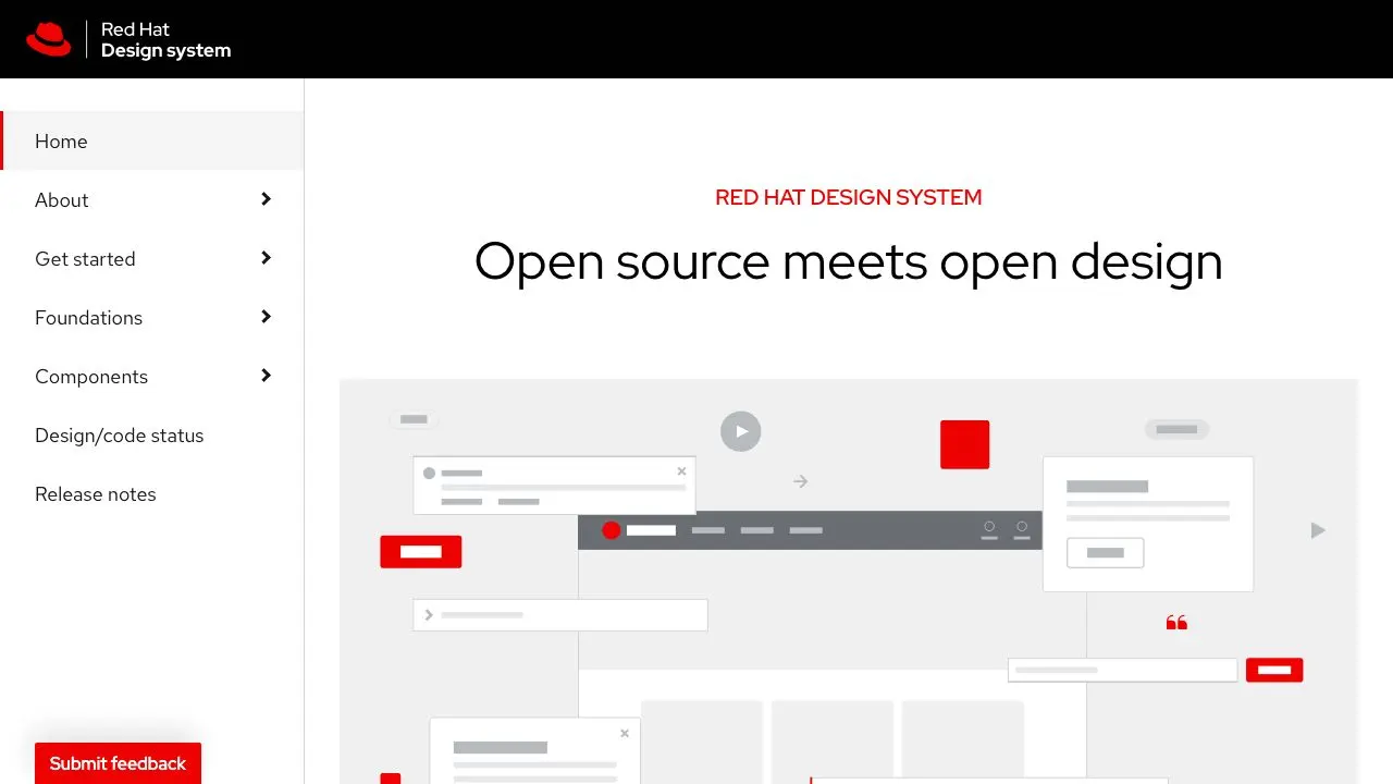
Red Hat is the leading open source software provider for enterprises. Their design system combines Red Hat brand standards with the open source PatternFly design system as a foundation.
Rivet
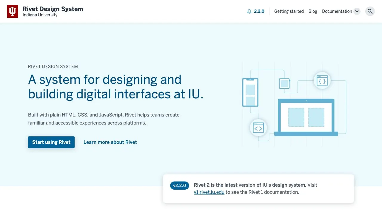
Rivet is the design system for Indiana University, an American public university in Bloomington, Indiana. Their design system is made up of five core parts: layouts, components, utilities, tokens and documentation. Rivet provides the university’s teams with common markup, styles and design guidelines for building all digital producs for the university.
Seeds
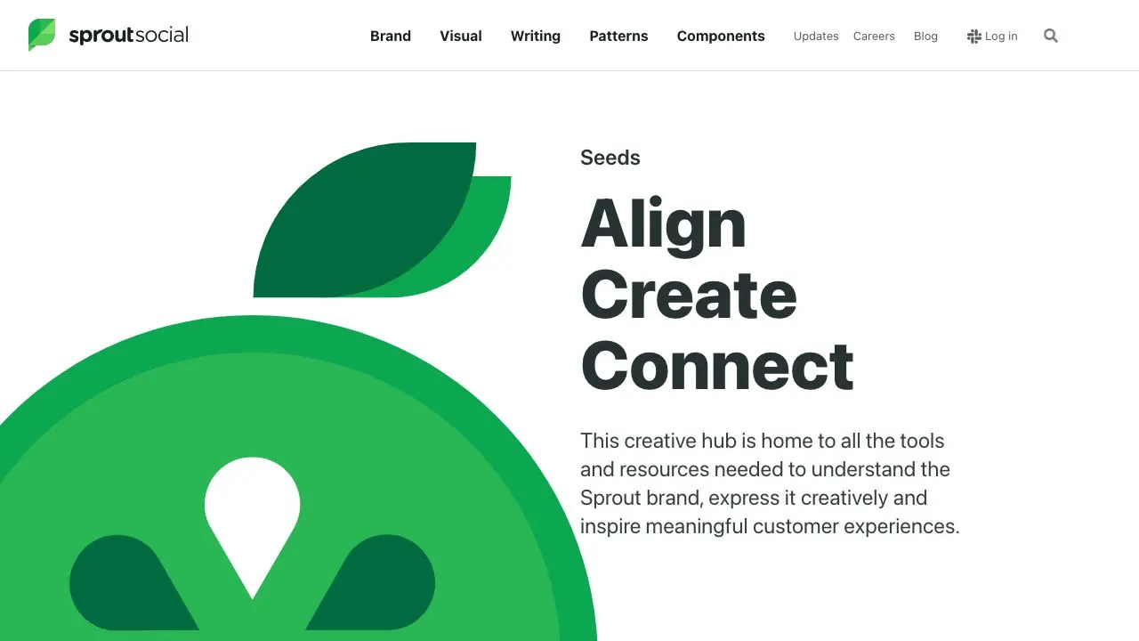
An extensive design system definition with Art direction and Writing guidelines on top of the usual components.
Skylab
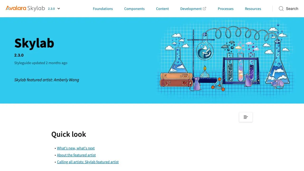
Skylab is Avalara’s design system and provides ready-to-use components, patterns and guidelines that unify language and design across Avalara’s entire user experience, including campaign marketing, their website and the product’s UX.
Spectrum
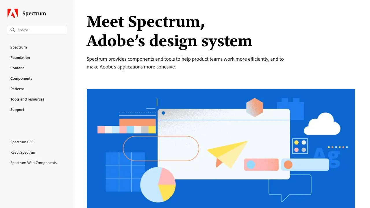
Spectrum is Adobe's design system. State of the art documentation site with Foundations, Content Design and Component libraries implementations for CSS, React and Web Components. Impressive work.
State of California Design System
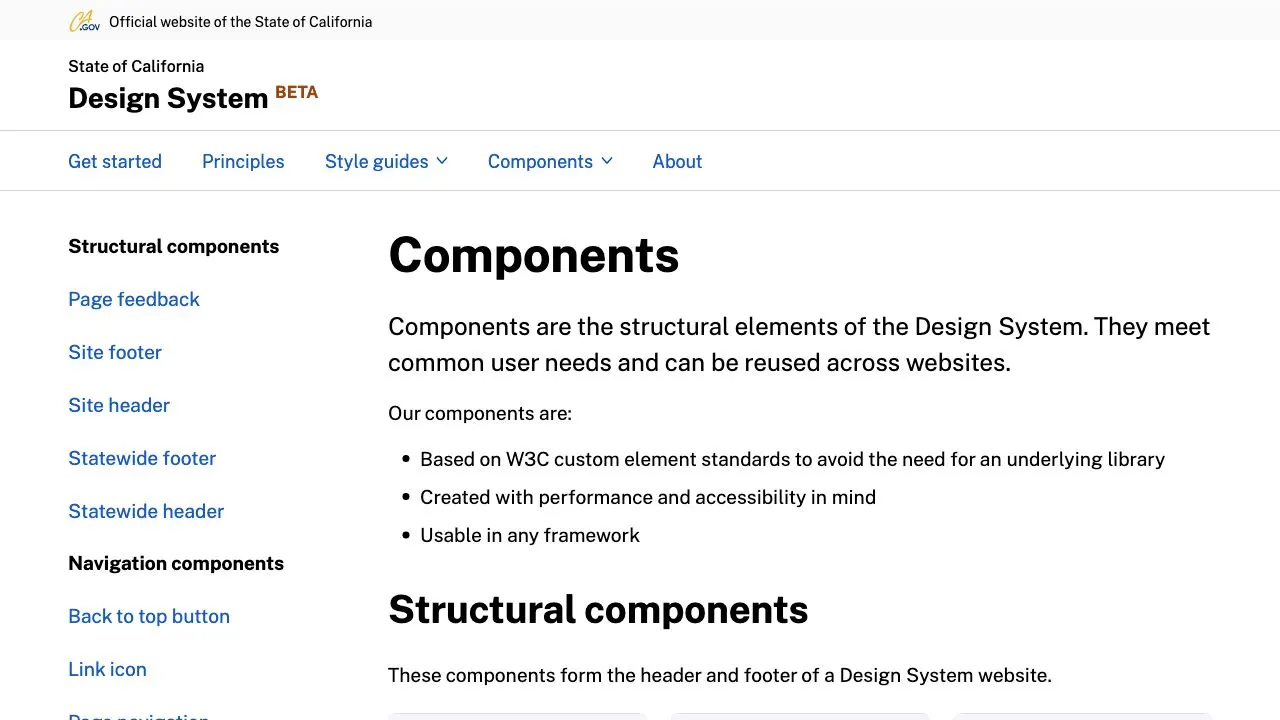
This is the official design system for all digital products of the State of California, and it’s currently in a Beta phase. Their documentation site starts off with guides for different users and contributors, such as developers, UX designers and content designers. The State of California Design System uses Web Components and has created a section in their documentation site that details why they use Web Components and the benefits of doing so.
Thumbprint
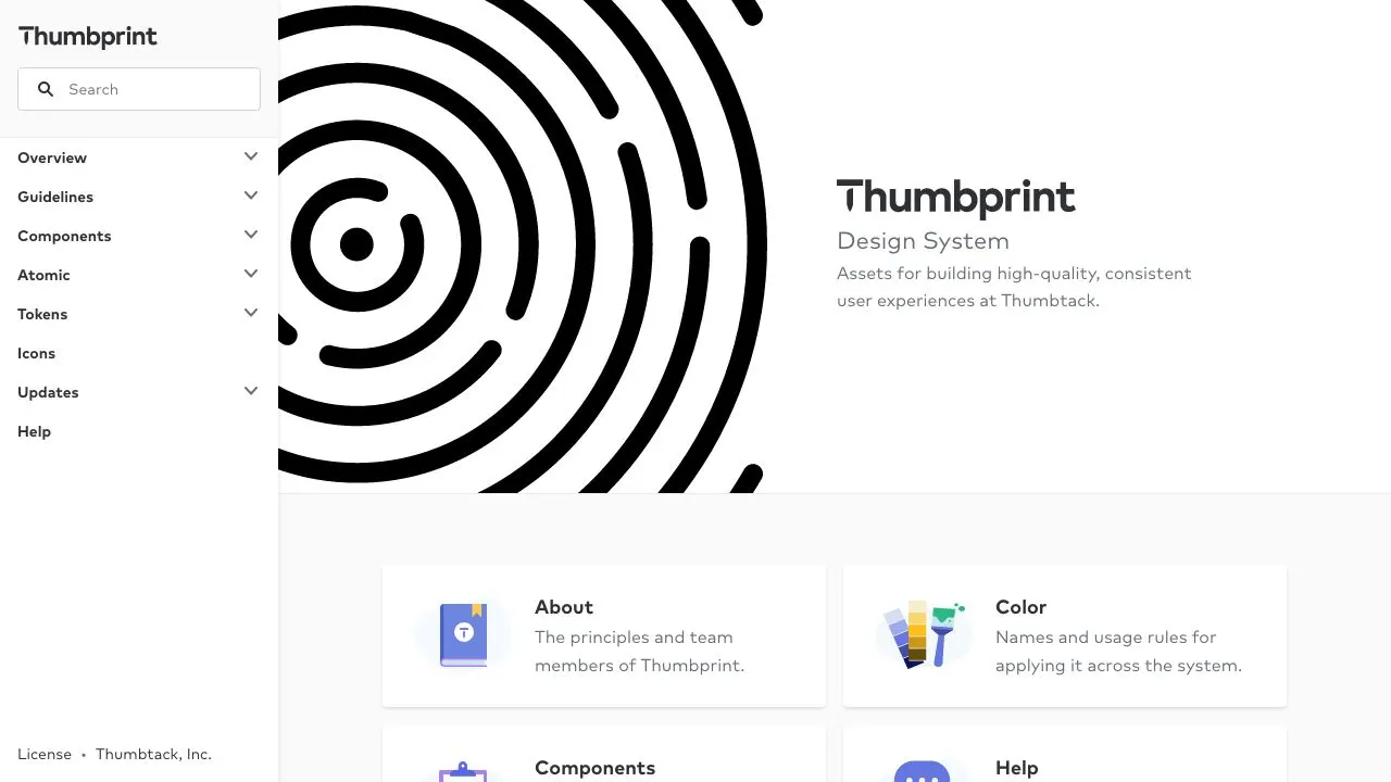
Thumbprint design system documentation perfectly uses Thumbprint in self. It's a beautiful design system with implementations for React, SCSS, Android and iOS.
U.S. Web Design System (USWDS)
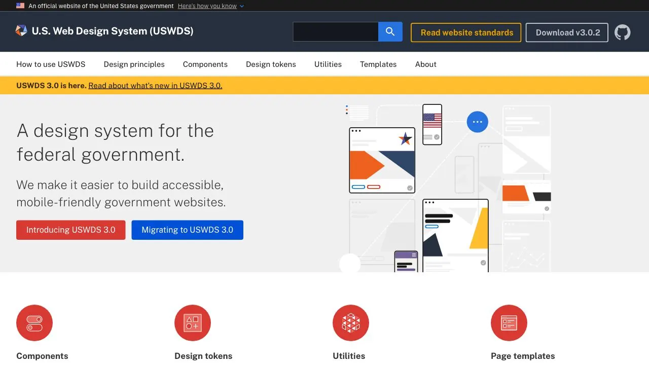
New USWDS 3.0 has been released. This design system has a great emphasis on accessibility and mobile-friendlyness. It defines Principals, Guidance and Code together.
Vattenfall Design System
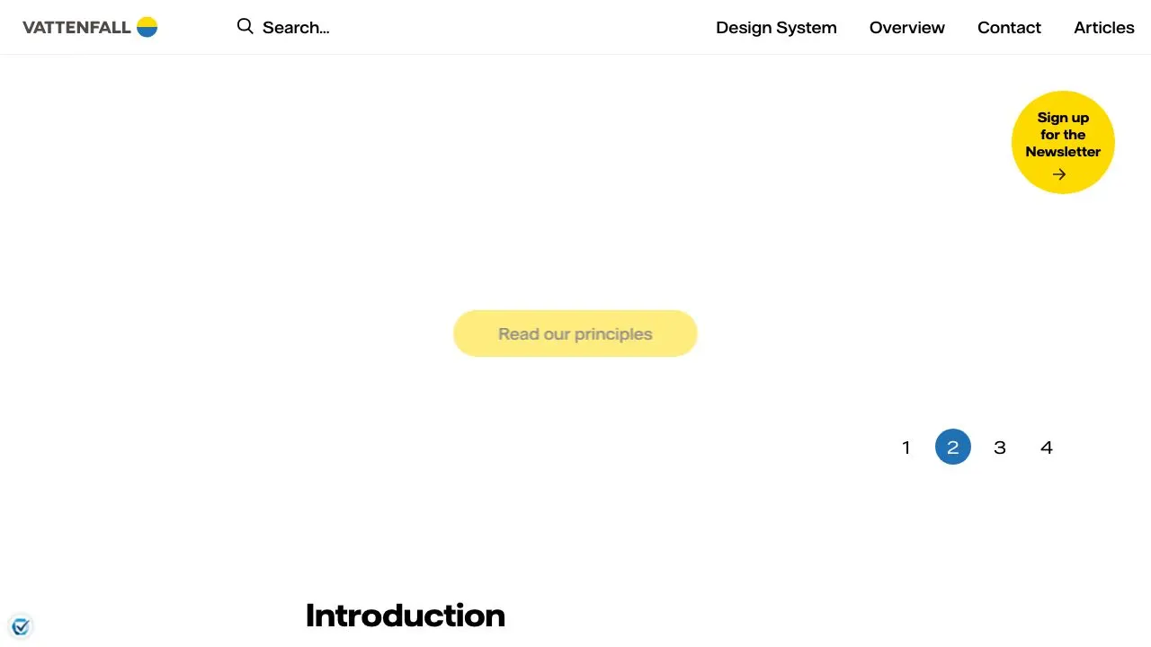
A fresh take on design system documentation sites with full screen animations and a separated side for developers and designers.
Wanda Design System
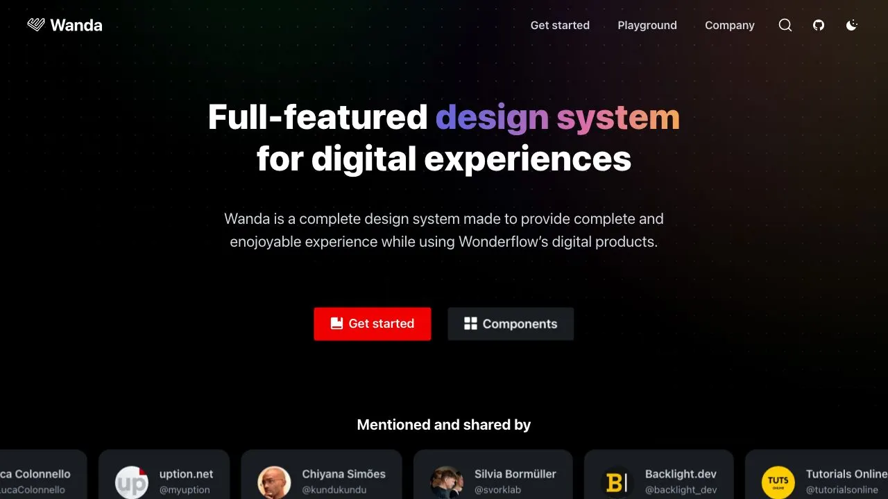
Wanda is Wonderflow’s open-source design system. A very impressive showcase of Wonderflow knowhow.
Washington Post Design System (WPDS)
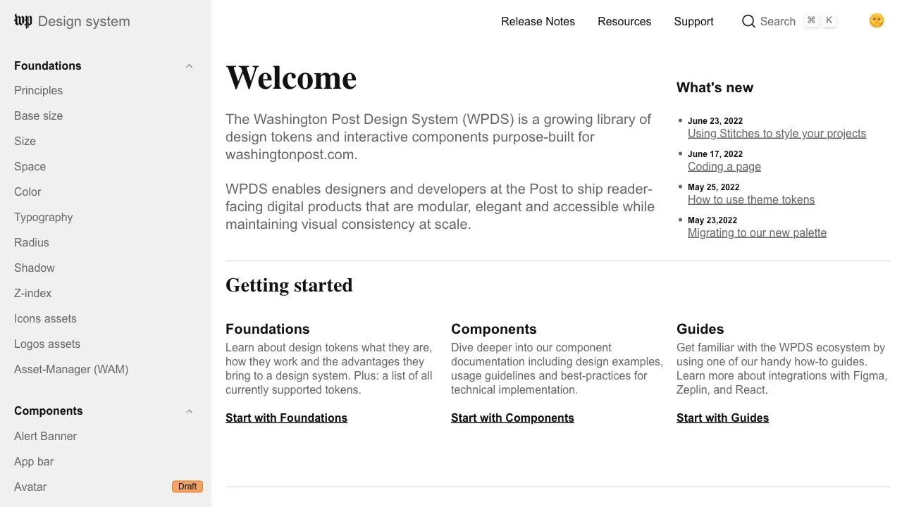
The Washington Post Design System (WPDS) is a growing library of design tokens and interactive components purpose-built for washingtonpost.com.
Wise Design
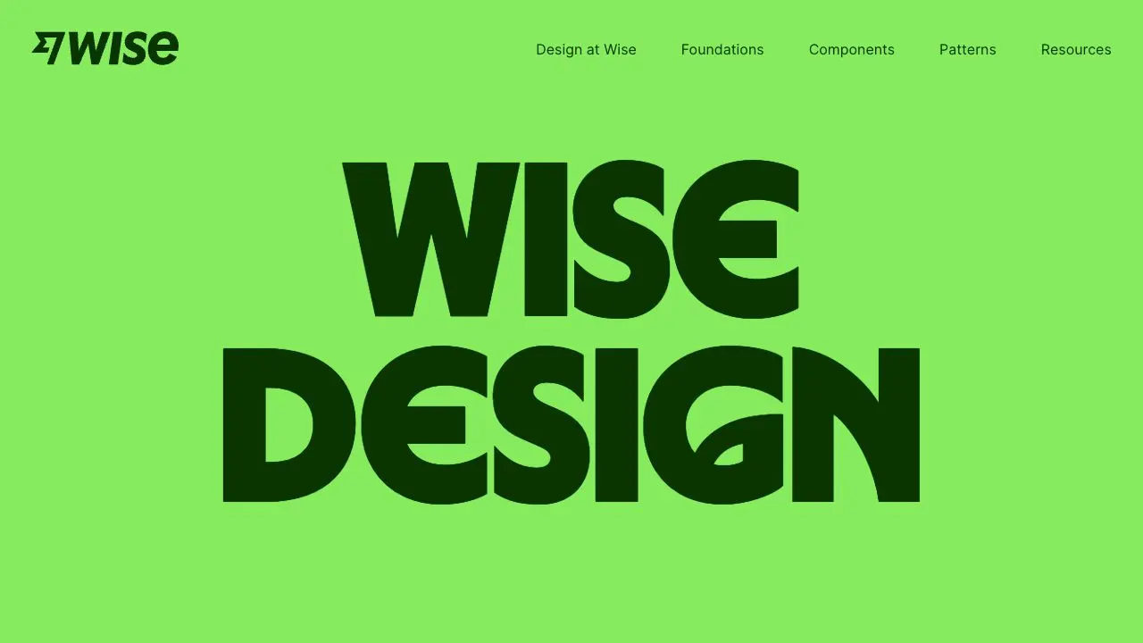
Wise Design is the design system for brand and product at Wise (formerly Transferwise). A complete and advanced design system with a very slick documentation site 🤩 Both the Foundations and Components areas are throrough, visual and useful. Each component comes with detailed guidelines for how and when to use it, as well as content guidelines for microcopy used within the component.
Workbench
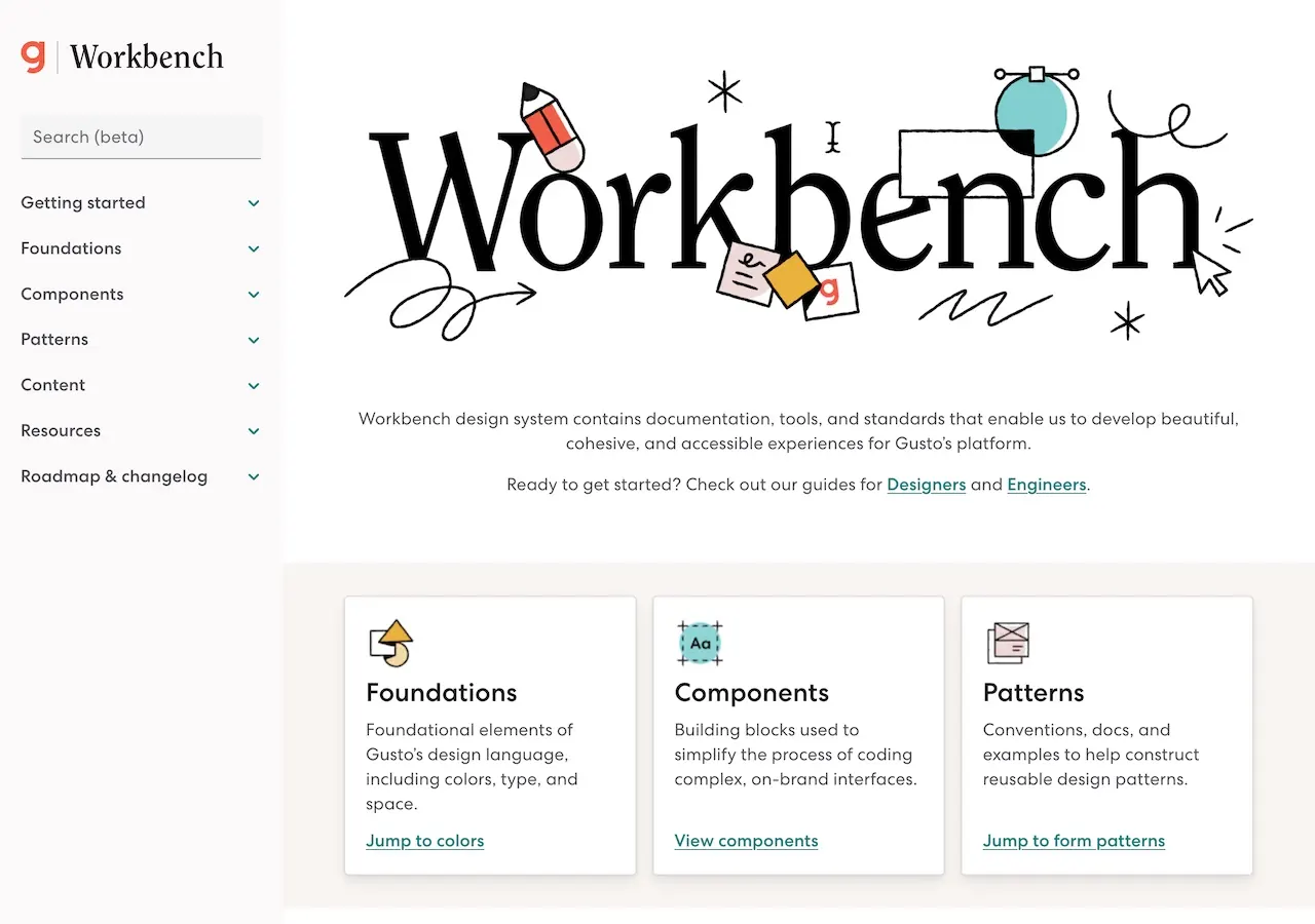
Made by Gusto’s design systems team, Workbench is an extensive design system with React components, storybook and a Figma kit.