Make your first design system
This quick guide will help you understand the basics of Backlight.dev and how to start your own design system.
General presentation
Your design system will include different types of components:
- Design Tokens: minimal components in your overall system, serving as a storage place for global references like colors, spacing, fonts and typography, etc. From a developer's perspective, you can see them as global variables used in components' composition.
- Components: these are your raw components, in their default version matching your design systems behaviors, with their variations. Think of them as
primary-button,secondary-button,card,badge, etc. - Templates, foundation, etc (optional): these are advanced components and the result when combining styled components and design tokens, like a
navbar, ahero, etc. - Infrastructure (optional): this section contains the internal tools of your design system, like dockit (a rendering system for built-in documentation) and doc-layout config files.
Customizable sections
The sections above aren't burned into the Backlight.dev editor. Their names and organization are purely examples and recommendations that can be followed or not by your design system team. They can be configured in the studio.config.json @packages.menu file in the ROOT FILES menu.
In your design system, each component; from design tokens to templates, should be considered as a functional component: they expose their properties (actions, styles, variants, etc), have their internals (states, etc), don't affect their environment and aren't affected by external components either.
Creating a design system from a starter kit
The section will guide you through the process of creating a design system using one of our existing starter kits:
- From the starter kit picker, choose one of the kits from the list, depending on your framework preference.
Congrats 🎉 You've just created your very first design system in Backlight.dev. Now let's spice it up!
Pick your own starter kit
We build different types of starter kits and code samples to help you get started on your design system journey, based on existing trends in front-end frameworks. In the following screenshots, we picked the Furious starter kit (based on Fast for Web Components), but you're free to choose the kit of your preference.
In the main Editor interface, select the Design Token
colors. This component contains and exports the tokens regarding the colors that will be available in your Ddsign system.In Backlight.dev, all components wrap different types of files:
src: the source code of your componentstories: the stories allow you to preview your componenttest: the component's unit testsdoc: the documentation related to the componentdesign: the design material for this component
Go to your
color-tokens, and select thesrc/folder in the top navbar. You'll see the current token definitions, depending on the starter kit you picked.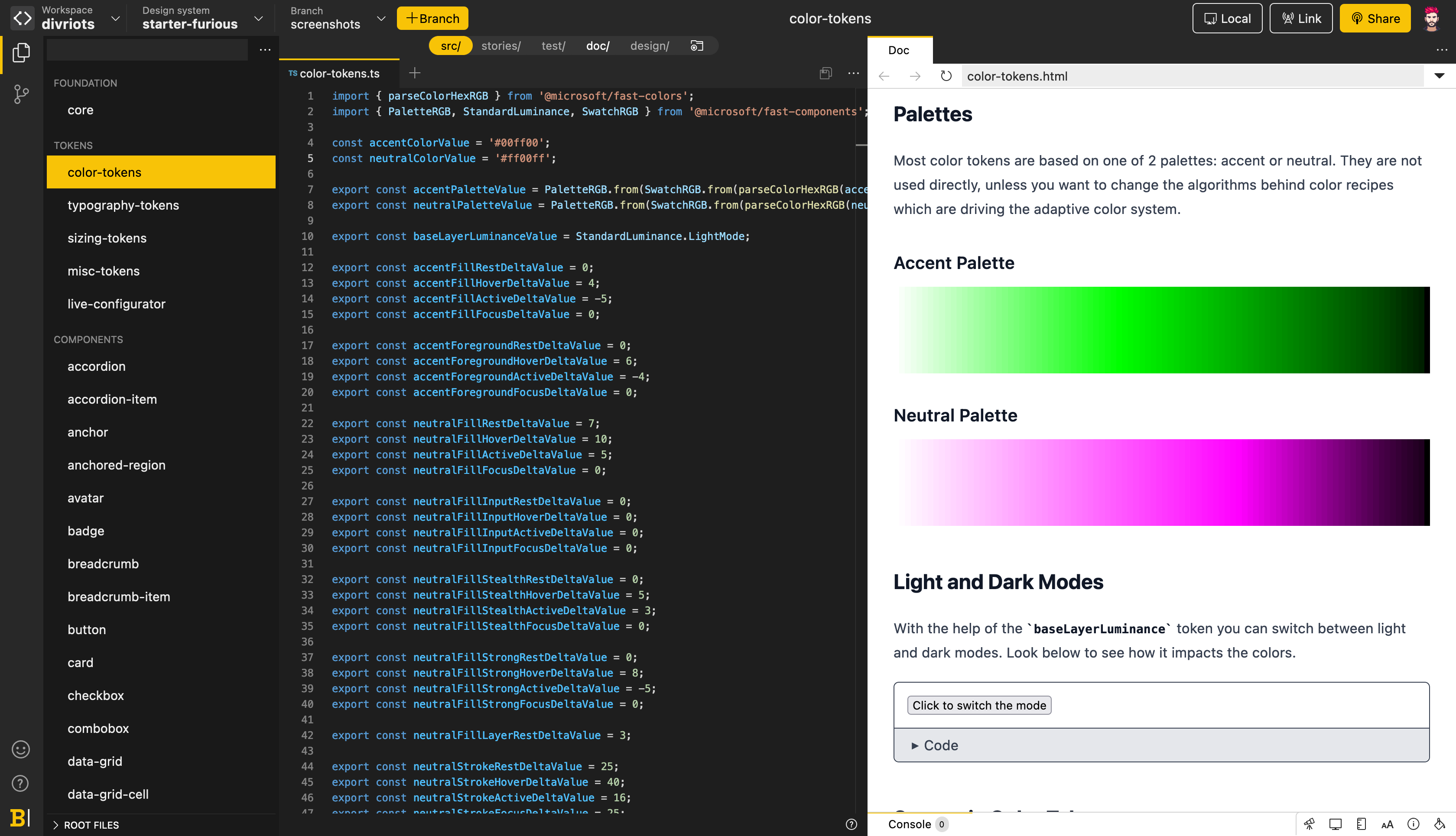
In the currently selected file (here:
color-tokens.ts), edit your base tokens. E.g.:const accentColorValue = '#00ff00'; const neutralColorValue = '#ff00ff';Save your file using Ctrl/Cmd
+S. Your design system's color preview updates immediately to reflect your changes.In the sidebar, select a styled component, like a
button. The Stories have now been updated with your new colors.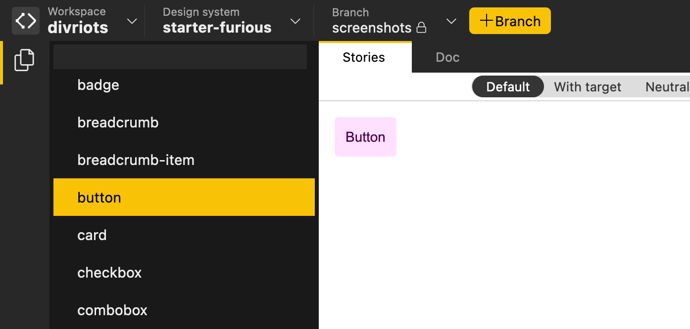
🚀 You have your very own design system! Try to edit the different Design Tokens already available, like colors, typopgraphy, space, and see how the changes are propagated to the design of the overall components.
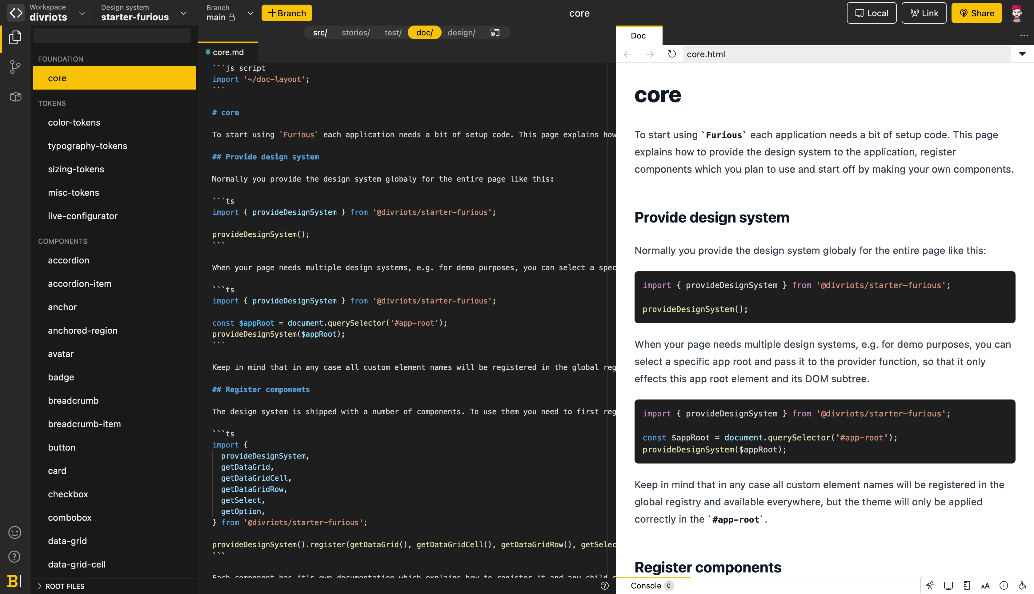
Adding documentation
A valuable design system describes in detail how to use its components, why they're designed this way and what their behaviors are. Backlight.dev embeds documentation for each component in your design system, allowing you to provide useful context to your users.
To so do, simply create your documentation page by adding files with an mdx extension to host your markdown doc (for other extensions available, see Documentation site chapter.
(Optional) Linking to a Github repository
Having your work synchronized with a Git repos provider allows you to easily track and share changes and updates.
Let's link your new design system to a Github [1] repository:
- In the Editor's side panel, click the button to display the Source Control view.
- Click on the Connect button, then log in to your Github account and authorize Backlight.dev to access your Github profile.
- In the side panel, click the Create Repo button.
- In the Create repository pop-up, choose the Github workspace where you want to create your new repo, rename the repo if you need to, then click the Create repo & push button.
Congratulations 🎉 Your design system is now synchronized with a Git repository on Github!
Use branches for your workflow
As the main branch is read-only in Backlight.dev, you do have to create a branch to edit your design system.
To create a new branch and edit your design system:
- Click the Branch button.
- In the Create a branch pop-up, name your new branch, then click the Create branch button.
- In the Editor's side panel, click the button to go back to the Components view and edit your source files.
- When you're satisfied, go back to the Source Control by clicking the button in the side panel.
- Check your changes, add a commit message in the section, then click the Push branch-name button.
Your branch is then pushed to Github, where you can create Pull Requests from your branches and merge them, as you would usually do.
Publishing on NPM
Now that your design system is ready, you can release it to NPM from the editor!
- In the Editor's side panel, click the to display the Release view.
- Click the Release... button to build the package.
- In the release modal view, choose your release's type:
Patch,Minor, orMajor, then type a release description.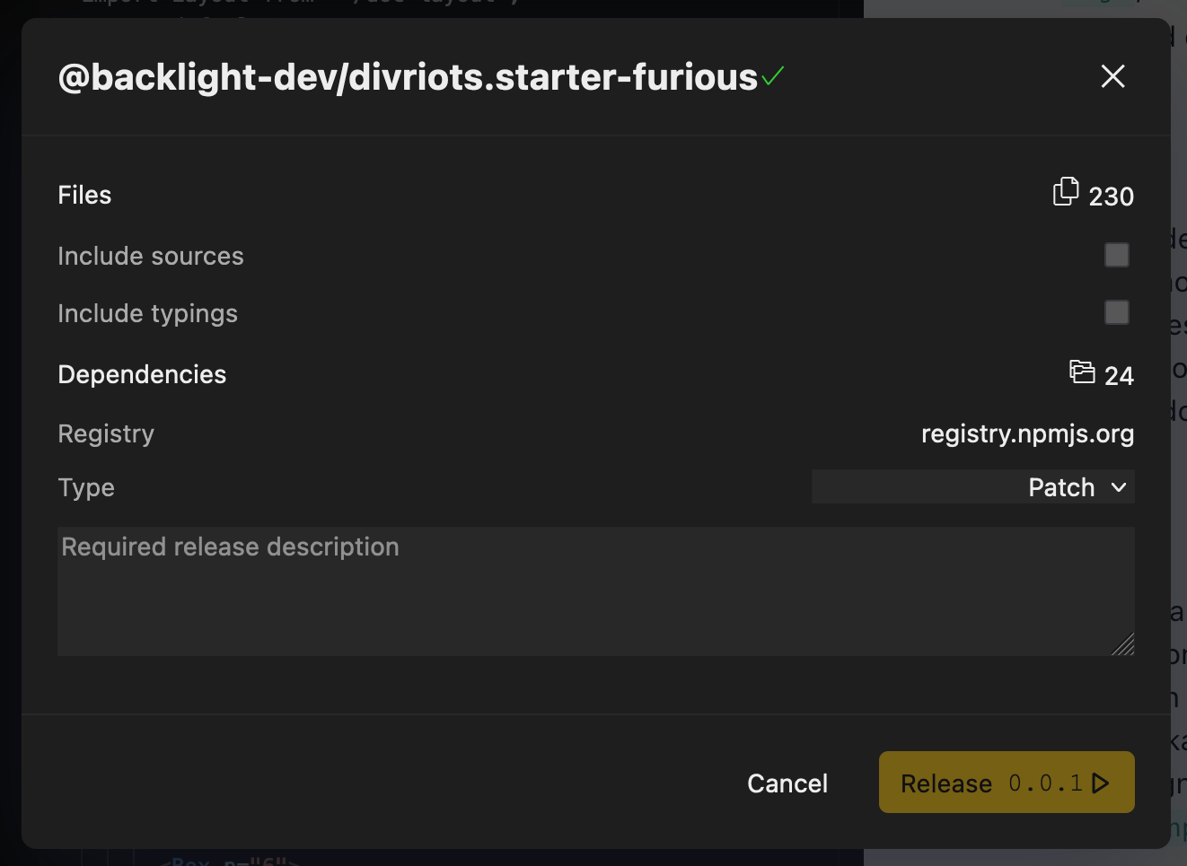
- Click the Release x.x.x button.
Your package is now available in the NPM registry and will be available almost immediately in any npm CDN like UNPKG or Skypack .
Importing the design system in your app
The goal of Backlight.dev is to provide your teammates with a ready-to-use living design system that embeds all your UI components.
To use it in the application you're developing use Backlight.dev's live linking feature:
- In the topbar, click the Link button.
- Copy the displayed command by clicking the icon.
In your local dev environment, open a terminal and paste the command. You design system will then be available as any external package and you can import your component as any other module, such as:
import { button } from @[workspace]/[your-design-system]/button
Awesome ✨ You can now customize, document, publish and use your own design system in all of your apps! You're also ready to go through and learn about all of Backlight.dev's features.
- Backlight.dev also supports Gitlab, BitBucket and Azure Devops as a provider. ↩︎