Previews
The preview panel, which is the the right end side of the Online studio or the main panel exposed by the CLI, can render the different parts of the selected component.
Stories
For files: *.stories.(jsx|js|ts|tsx).
This tab will show the different stories available.
Doc
For files: *.(md|mdx|svx)
This tab will show the rendered documentation page for the component.
> More details on Documentation
Tests
For files: *.(test|spec).(jsx|js|ts|tsx).
This tab will show the test report out of the test runner built-in.
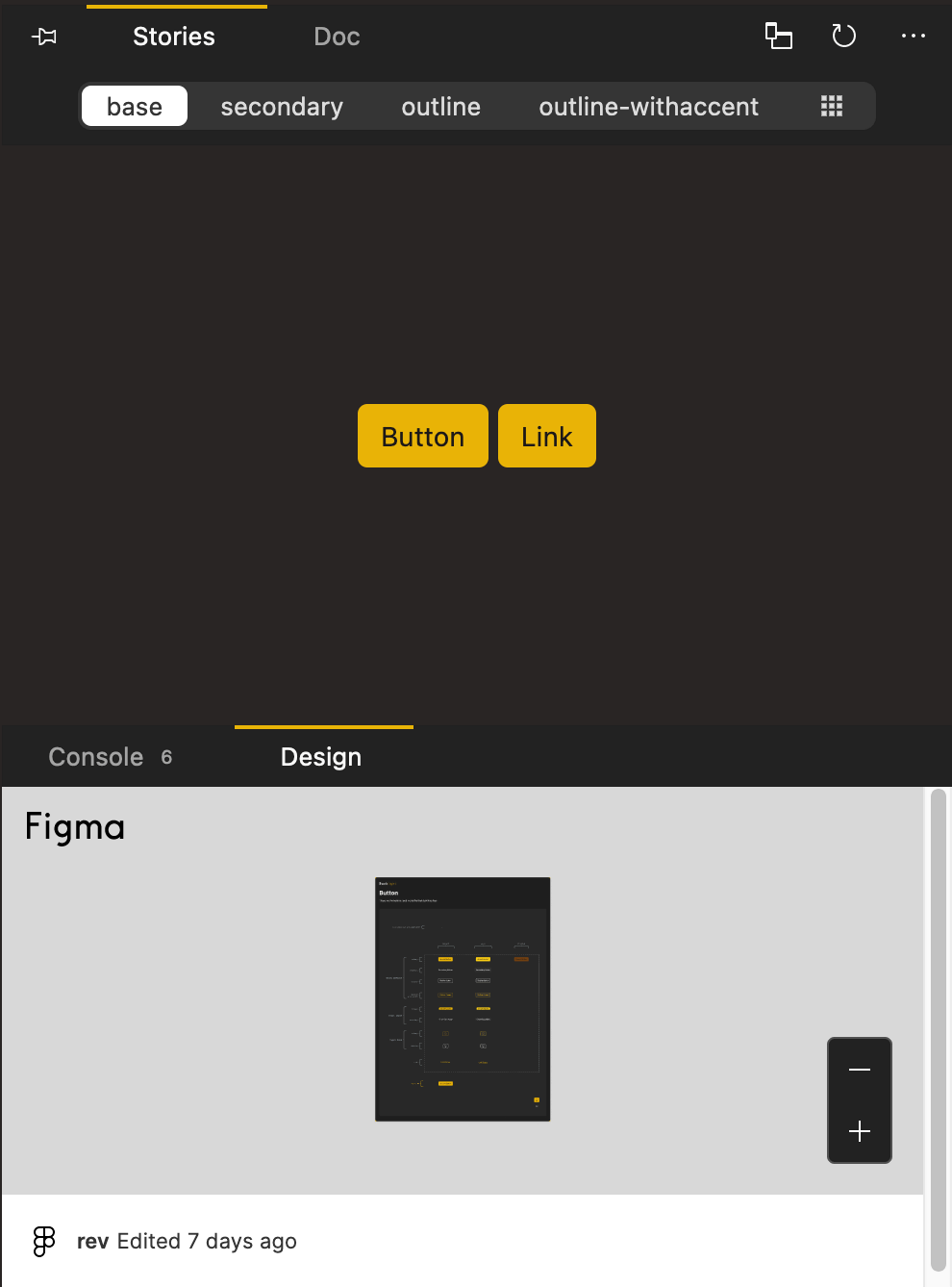
Design
All link files, in the Backlight interface, which in turn will provide a preview. The link will be presented directly inside an embedded preview. Make sure the link obtained from the design plarform has the necessary public sharing options.
Supported design embeds:
- Figma (embedded preview)
- Sketch (embedded preview)
- Adobe XD (embedded preview)
If you prefer working with the CLI and creating files in your IDE, you can paste the design link into a *.link file. Choose the name for the file that suits your needs, e.g: figma.link for a Figma link.
Note: it's displayed only when there is
linkfiles (*.link)