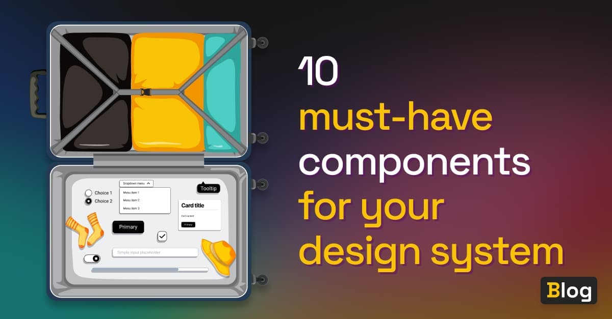
10 must-have components for your design system
-

- Name
- Thaís
- @th4is_ds
Starting a design system can be a daunting task if all you have is a blank page/canvas in front of you. When designing the features of your product, there will be times when a library of basic components proves useful, even if it seems too early.
Starting the design process - or development process for that matter - with a basic set of components will certainly speed up the entire operation and let you focus on the user experience features. At a minimum, there will be a primary button somewhere in the app, right? But just thinking about this primary button already unleashes a string of follow-up questions:
- What does it look like? Rounded, pill, large paddings, big font?
- What design tokens does it need?
- What is each button state going to look like: hover, active, focus?
- Do I need more than one sized button? What other variations can be useful?
- Should I have an option with
text + iconfor it? - What are the technical aspects I should think beforehand?
A must-have list of components to start with
To help you kick-start the process of deciding which components you should have, we came up with a list. Like a travel checklist for your next trip, this is the list to remember when you’re next boarding your design system journey.
Here’s a list of components, in order of importance, to keep with you when starting your next design system:
- Button

The classic, and almost always the first example of what makes up a design system. Buttons are the culmination of every design system decision: you have typography, spacing, brand colors, radius… Everything that represents your brand, all summarized in one little rectangle item. The ultimate element your end users will always interact with. In the button component, you might want to consider at least 3 different types of button for every interface need:
- the primary, to represent the most relevant action on the interface
- a secondary, sometimes seen with the outline style, that works as the complementary action to the first action
- and possibly a tertiary button, which should be less prominent in style to not bring much attention to itself
- Input

The input component can become very extensive and complex if you want it to. It usually starts off as a simple text input, but if you add icons to the right, suddenly you can have a search box, or a password input. In a date picker input, that icon can be a trigger to open a calendar. Additionally, faulty input can be validated and warnings or errors can be shown, but only after certain user interaction have happened to prevent showing them too early.
Coming up with all possibilities for your input when just beginning your design system might be a bit advanced. If that is the case, just start with the input base that you can eventually expand on.
- Checkbox

The product might need to give some setting options to the user to select. A classic use-case: the checkbox shown at sign-up, where we’re all guilty of checking it to confirm we have read the Terms and Conditions, when we really haven’t. 😅
- Radio group

When your application depends on the user selecting only one of multiple options, you might want to let them choose via the radio group. Depending on your design this can also be achieved with a button group, but the simplicity of a radio group can certainly make the interface feel lighter.
- Switch

Switches probably first started showing up in phones, but soon it took over the front-end world as well. It’s a nice little representation that toggles the option on or off. We often see it just before taking-off for that trip, when flight attendants ask us to turn on airplane mode.
- Dropdown menu
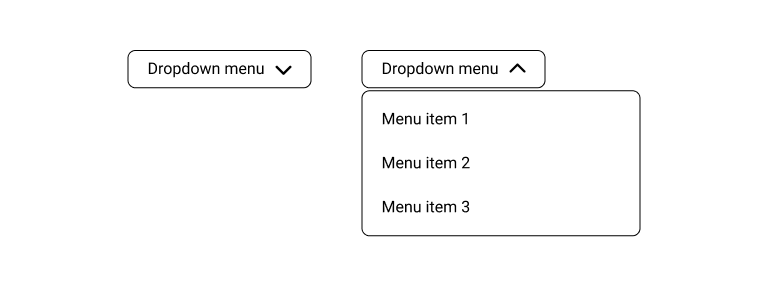
This component starts to look a bit more like a combination of different components, which is often the case. For the dropdown menu, you need a button that triggers a floating box underneath, to present the user with a collection of actions.
- Dialog box
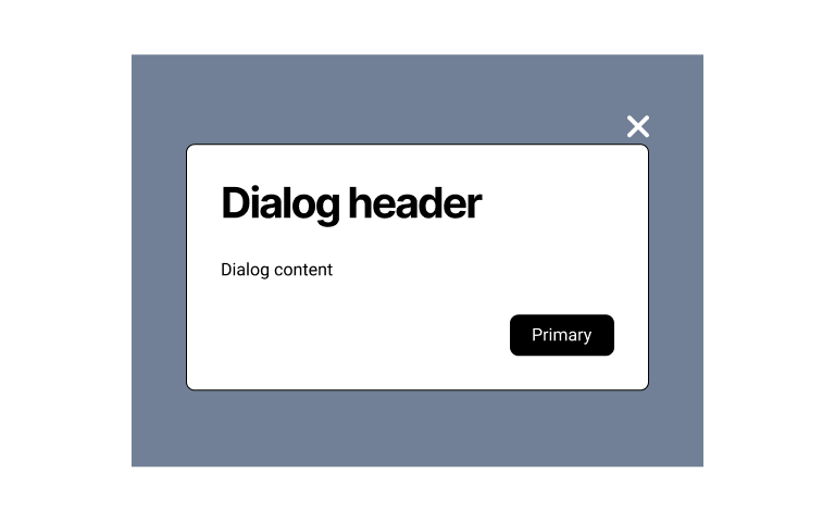
At some point in your product, you might need to to grab the user’s full attention, that’s when a dialog box, or modal, can be very useful. This component overlays a background color over the rest of the interface. This reduces the noise around the action, allowing the user to read the message and take action.
- Card
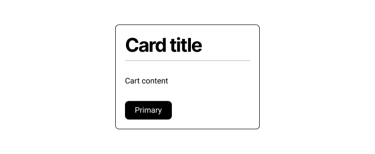
When the interface is in need of more playful and visual elements, the card can be the component that helps achieve just that. This component is normally designed to display content as if it was a playing card, which helps distinguish it’s information from the rest, or provides several pieces of similar content in a distributed manner.
- Progress bar

It’s important to show to the users the loading time between interactions in your product. The progress bar is a useful component that gives the user the feedback needed to avoid frustrations while waiting.
- Tooltip

Sometimes we get excited to represent several items in the interface with the use of icons. With those visual choices sometimes comes misunderstanding, and that’s why the tooltip is an essential component to clarify any interpretation issues.
Besides, it’s also a way to make your product more accessible, as it will display the meaning of the element when it receives the keyboard focus.
Quick wins
These next components are an additional set, in case there’s enough time to create them. They’re generally elements that are easy to design and code.
Divider

This type of component can be easily achieved with the use of an hr tag in html. However, there is a huge benefit setting it up from the beginning as a component: you get to connect it to your design tokens and re-use it within other components when needed. Did you notice there was a divider inside the card above?
Badge
The badge isn’t normally a component that requires user interaction and it’s quite useful to highlight status within your application. It’s important to clearly differentiate it visually from your buttons, so as to not cause confusion to your end-user.
Avatar
If your application is set to have some kind of user space, where they log in, you will probably want to give them the option to choose an avatar: an image they can select to represent themselves. This component is also a way to make the interface a bit more human and relatable.
I have my components, what’s next?
Build your Figma library
You can duplicate the Figma File used for this article as a base to get started with your design library.
Base your design system documentation on those of big companies
In our curated list of design system examples, you can find the best design systems made by companies whose products we use in our everyday lives, like Material UI from Google, or Spectrum by Adobe.
Using these design systems as reference can help you make sure to cover all the important details for each component. They are often platform-agnostic and provide components that they found relevant for their products.
Choose a starter kit in Backlight to build a complete design system
We’re very passionate about making a platform that allows any team to build their design system in a more effective and collaborative way, and the consequence of working in such product is that we get to make several versions of full design systems for others to use as inspiration.
We experiment with different setups and technologies to extensively test our platform, and everyone gets to make use of that! We’ve worked on Simba, Origami, Furious and many more. Check it out.
Stay tuned
Design systems are a lot more than just component libraries, and the other parts of it deserve their own must-have list as well. We’ll keep you posted!
 Tweet
Tweet
 Linkedin