Introducing Furious, the FAST Design System
Furious is a Design System Starter Kit for Backlight, based on FAST Frame. We do know that building a Design System from scratch is a really hard and tedious task. We love the Developers’ community. We also do love the Web Components ecosystem and the FAST Project. So we built Furious: you can now start your Design System based on FAST in Backlight. Engines On!
We’re committed to helping people quickly jump into a world of advanced Design Systems. Here are the Furious main features to help you do so:
- ♻️ Open source
- 🤘 Based on FAST Frame (
fast-components) - 🔥 40+ accessible components
- 🎨 Adaptive color system
- 📚 Interactive documentation
- 🌗 Dark mode support out of the box
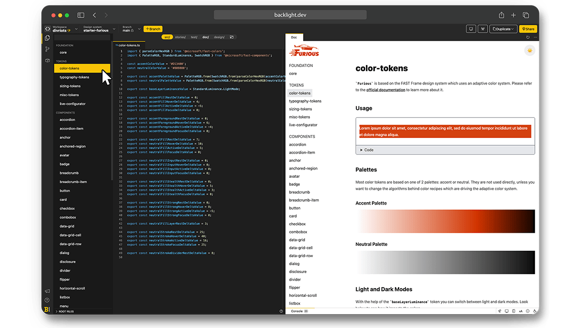
Design Tokens
The starter kit is built around three main tokens: Colors, Typography, and Sizing. All values are exported as Typescript const ready to be used in the final components.
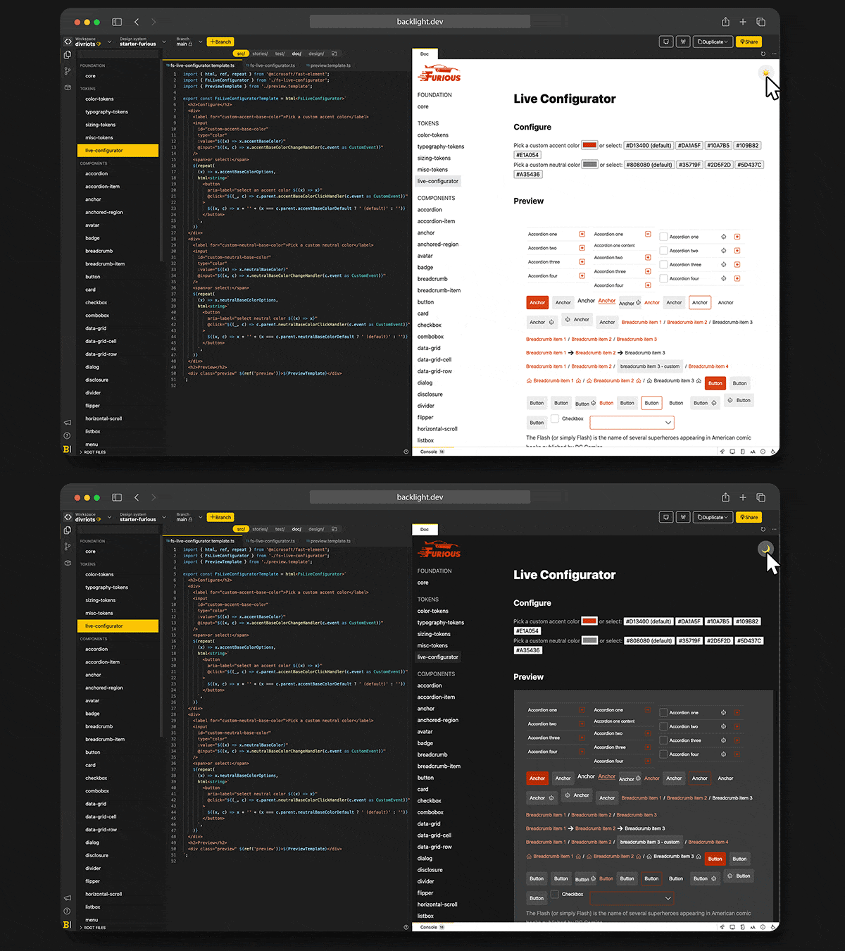
Dark Mode
Dark and Light themes are supported out-of-the-box.
To help you pick a theme, we embedded a Live configurator in the editor itself, helping you to preview the final look ‘n feel.
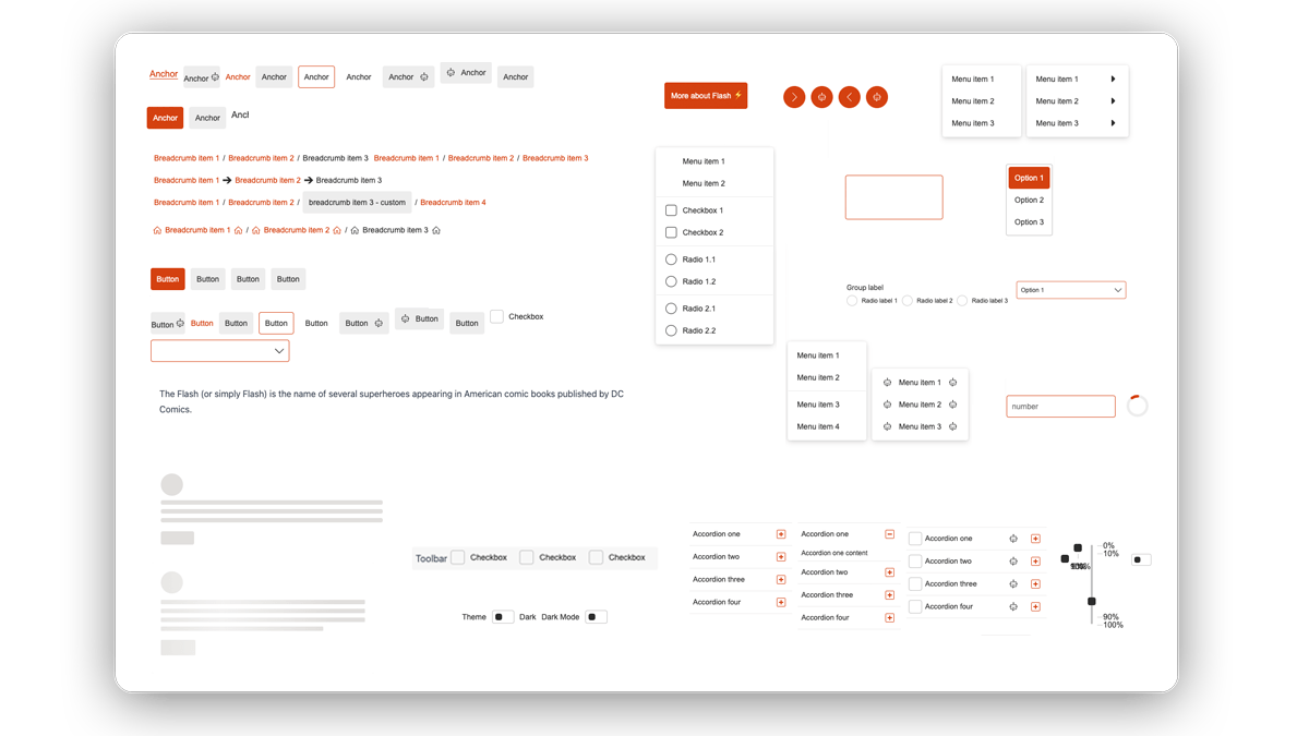
Components
Furious comes with 40+ components to get started: menu, dialog, buttons, checkbox, cards… Everything you need to cover all the use-cases, from the basics to the most advanced ones.
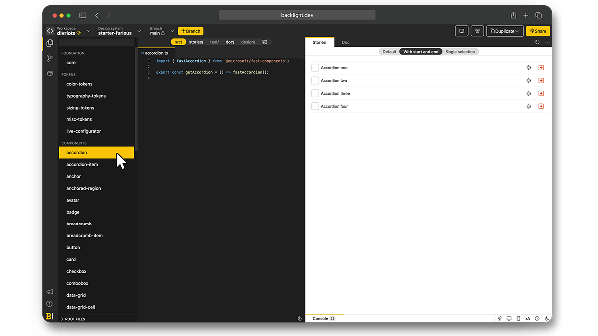
Stories
CSF Stories are available for every component allowing you to code your components in isolation and check all variations you may expect.
Documentation
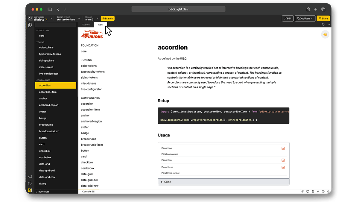
Written in Markdown JavaScript (mdjs), the documentation is available next to the code, following FAST components directly and ensuring a shallow learning curve as well as an easy onboarding for anyone joining the project.
The documentation also includes interactive playgrounds for a visual live render along with its source code when using the component.
Resources
- 👉 Explore Furious on Backlight.dev
- ♻️ Source code available on GitHub
- 📦 Furious on NPM to try it in your app in its default version
Further Reading
Check all others Backlight’s Starter Kits.
