Introducing Origami - a React Native design system
-

- Name
- Pierrick
- @S3kelman1
-

- Name
- Georges
- @georges_gomes
-

- Name
- Mihai
- @mihai_veres
Origami is a React-Native Design System starter kit, using React Native Paper component library: an open source components library based on Material Design.
Origami features:
- Open-source
- Cross-platform: Mobile & Web
- 25+ components
- Interactive documentation
- Light & Dark mode
▶️ Explore Origami now on Backlight.dev
Design Tokens
Origami takes the design tokens defined in Paper.
- Colors
- Fonts
- Roundness
- Animation
And make them automatically documented and visually discoverable.
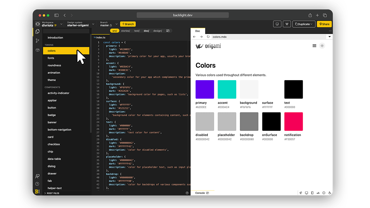
Paper has great semantical design tokens. It’s simple but very efficient. The Paper team has done a great job here.
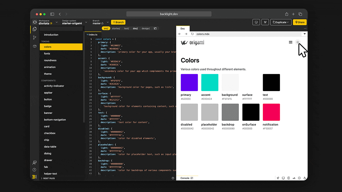
Dark mode
Dark and Light themes are included out-of-the-box. You can experience it in the documentation itself.
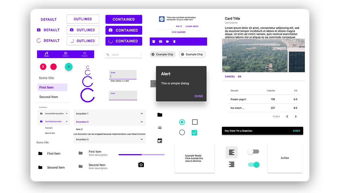
Components
Origami comes with 25+ components to get started: menu, dialog, buttons, checkbox, cards, everything to cover the basics, and more.
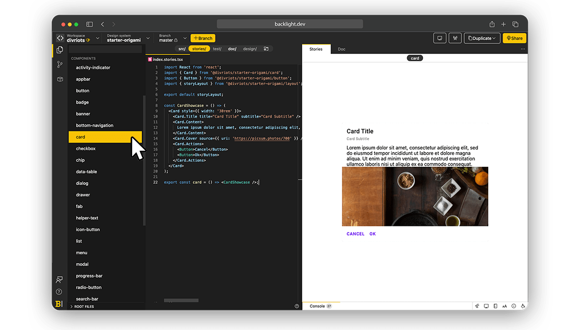
Stories
CSF Stories are available for every component so you can code your components in isolation and check all variantions.
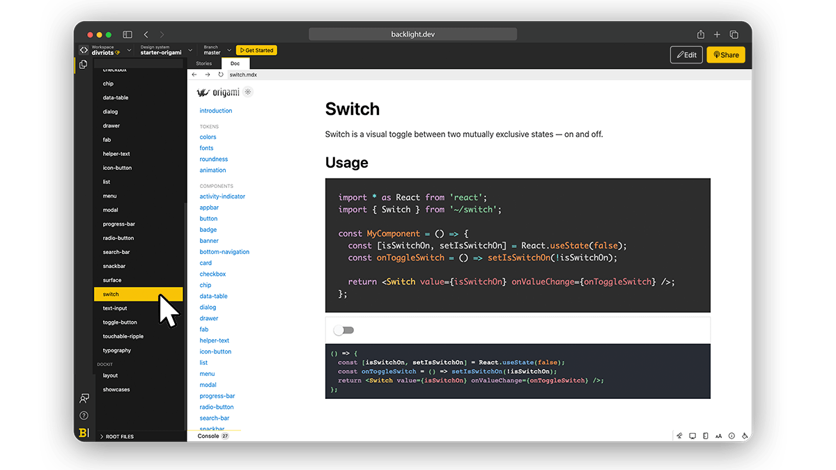
Documentation
Written in MDX, the documentation inlines React Native components directly. The documentation also includes interactive Playgrounds powered by @divriots/dockit-react library (Also made in Backlight).
Links
▶️ Explore Origami now on Backlight.dev
👩💻 Source code available on Backlight and GitHub
📦 npm package to try Origami unchanged.
Further reading
Check all other Backlight’s starter kits.
 Tweet
Tweet
 Linkedin