Naming conventions for design systems
-

- Name
- Ardena
- ardenagflahavin
Finding the right names for things is an art. Speak to most content professionals and they’ll tell you that naming can be hard. Fun, but hard. Some naming exercises require creativity and originality, such as coming up with the name for a new product. However, other naming tasks come down to logic and clarity. Design systems fall into this second category. Naming components is less about originality and more about ease of understanding and standardization.
Why should we care about naming in design systems?
- Get the team to speak the same language: One of the main goals of a design system is to establish a unified design language, so different teams use a single design language when building a given product. However, if we don’t give any thought to how we name things in our design system (design tokens, components, patterns, etc.), we’re missing a huge opportunity to create synergy between designers and developers when they talk about elements in the design system. Imagine developers call a given component one thing and designers another. This not only leads to miscommunication, but can also create huge inefficiencies when it comes to updating a component from design to code, and vice versa.
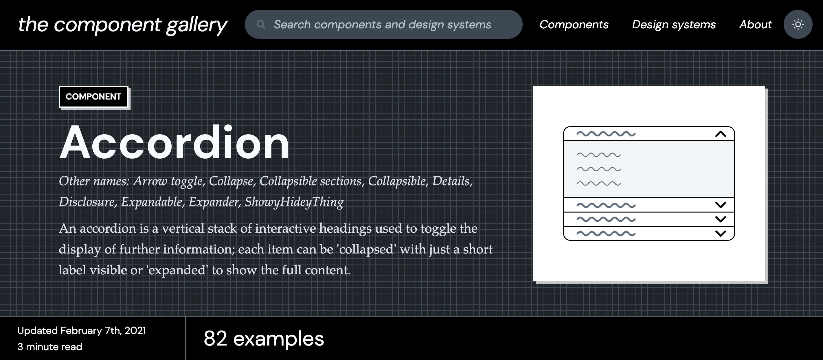
- Transform abstract ideas into tangible ones: Finding good names for the elements of our design system is an exercise in taking abstract concepts and making them clear and tangible. Let’s take the example of the Accordion component (also referred to sometimes as Collapsible sections or Arrow toggle). This component is essentially a vertical stack of headings that can be interacted with to display further information. This can be quite abstract and hard for some to visualize. Giving it a name like Accordion, which describes what it looks like, allows us to more clearly visualize the component and understand what it is.
- Alignment between code and design: Many front-end teams still struggle with alignment between code and design, and vice versa. Finding common names for elements of our design system should be a joint, collaborative exercise with the goal of using the same names on the code-side (Storybook, etc.) and on the design-side (Figma, etc.). This makes it easier for everyone on the team to “speak the same language” when talking about design systems and eases collaboration.
Best practices for naming elements in a design system
When thinking of names for any part of your design system, keep in mind that they should generally be:
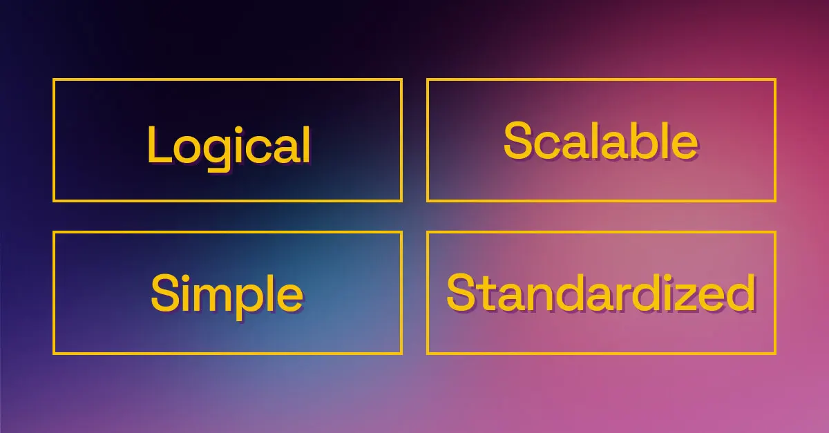
- Logical: Describe the component clearly, using a name that represents it. For example, the name Accordion describes the component visually and even how it works when a user interacts with it.
- Scalable: Find names that allow for possible variations or additions to the component that could come in the future. For example, when categorizing text style sizes, it’s often best to use T-shirt sizing (S, M, L, XL) as there is always the possibility of adding more sizes in the future. Typically the main size will be M, so both smaller and larger sizes can be introduced as needed.
- Simple: Keep names short and basic. 1-2 words is often enough for a component, and if more details are needed this can be done through the use of forward slashes to represent further categorization. Use names that are commonly understood and avoid long or unique names that require someone to look it up or ask what it represents.
- Standardized: The best component names are the ones used over and over again by most people in the industry. Button is a great example. It has become so standardized, it’s very hard to find any other name for this component. If you need help finding the most standardly-used component names, sites like UI Guideline or Component Gallery are great resources. They gather the most common component names used in the best design systems.
Some decisions to make when naming
States: The different states of a component need names, too. It’s important to follow the same best practices above and find names that are logical and standard, or otherwise clearly defined. The most common names for component states include:
| Name of state | Definition |
|---|---|
| Enabled | An interactive component/element that the user can usually click on or interact with. |
| Hover | A visual cue to show users that they are hovering over the component concerned. |
| Focused | Triggered when a user has highlighted an item, using an input method such as a keyboard or voice. |
| Pressed | A visual indicator for the user to confirm that the component has just been clicked. |
| Disabled | The opposite of the “Enabled” state. It, therefore, indicates that the component is inactive and therefore not clickable. |
| Visited | Mainly used on links to indicate which links the user already clicked on. |
| Error | Concerns mainly form components to indicate input errors to the user visually. |
| Validated | Indicates to the user that what they filled is correct and complete. It is a feedback on an action just completed. |
| Read-only | Somewhere between an “enabled” and “disabled” state. User can’t interact with the component, but it’s essential to display the component to indicate it has been properly activated. |
Colors: While it seems counterintuitive, colors should not take the name of the actual color itself (blue, red, green), but one that represents its function. If your product or company were to undergo a full rebranding, for example, it’s likely the colors will change, forcing you to rename every single color token. Plus, using the actual colors as names doesn’t give design system users any indication of when, where or how to use that particular color. Instead, the most common names for colors include:
- Branding: primary, secondary, tertiary…
- Functional: success, warning, informational…
- Greyscale: grey-000, grey-100…
Casing: While choosing a casing style really only concerns naming on the code-side, it can still influence the structure of component names and might be reflected somewhere in documentation or in design. There are 4 common casing styles for naming on the code-side:
| Casing style | How to format it |
|---|---|
| camelCase | No spaces and each word is capitalized except the first one. Most commonly used for variables and functions in JavaScript. |
| PascalCase | All words are capitalized including the first one and all spaces are removed. It is commonly used for C# and Java. |
| kebab-case | Replace the spaces with a hyphen “-” between each word and make sure all words are lowercase. It is commonly used for CSS and HTML5. |
| snake_case | Very similar to the kebab-case, the only difference being the use of underscores “_” to separate each word. It’s commonly used for database programs such as SQL databases, but also with PHP or Python. |
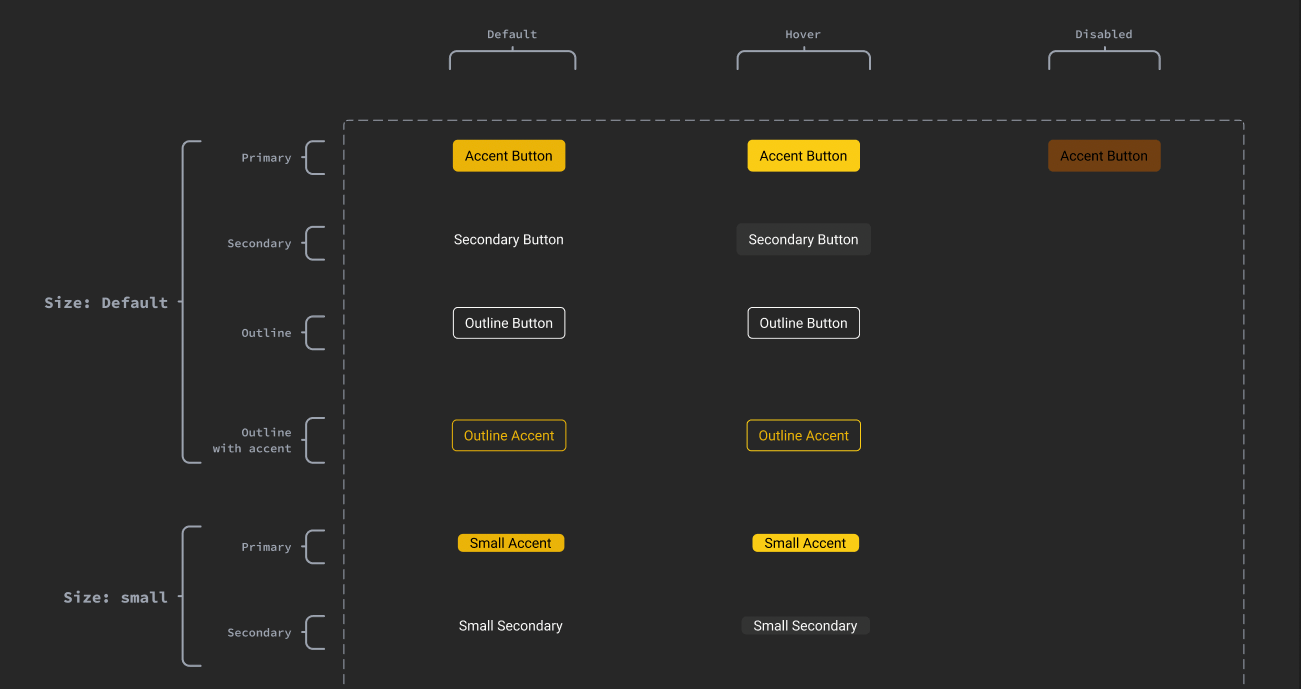
Breaking down a component’s name: Most components typically have several types, variations, states and even themes. It’s important to clearly organize the name of components to reflect these differences, using a forward slash to break it down:
[Category] / [Component] / [Type / Variant] / [State] / [Theme]
E.g.: Actions / Button / Primary / Hover / Dark
Alignment across all design system tools/programs: More than a decision to make, this is a step to take when tackling naming. Developers and designers typically use different tools to work on a design system. Plus, there is the documentation site. It’s all too common to find components in Storybook called one thing and those same components in Figma called something else. Certain tools, like Backlight, keep code, stories, design and documentation in one place. This makes it much easier to maintain alignment across component naming. However, it’s still a team exercise that requires consensus and alignment on names, making sure they’re consistent across all tools used to build the design system.
So, where to begin?
If you’re starting a design system from scratch, you have the perfect blank canvas to start naming components following the guidelines above. However, it’s more likely that you already have a design system in place, and that some names are unclear, inconsistent across tools or need a little attention. A great place to start is with a component naming workshop with your design system team. Do an audit of everything you have and see where these naming conventions can be applied. Another approach is to benchmark other design systems. We’ve curated a list of some of the best design systems to turn to for inspiration. Take 2 or 3 design systems and see how they organize their categories, structure their components’ names and reference their design tokens. Pick a method that works best for your team and design system, and stick to it. Bonus: if you have a UX writer or content designer in your team, ask them for help! It’s yet another example of how content design practice can benefit your design system.
Any good naming conventions to add to these? Tweet us!
 Tweet
Tweet
 Linkedin