Why your design system needs content design
Words are too important to be neglected.
To quote our very own CEO, words are too important to be neglected. Design will never exist without words, and words will never exist without design. Words are everywhere in our products, so why not build a system around them?
If you think about it, design systems actually have a lot of content:
- The content that tells you what a design system is and how to use it.
- The content in the components themselves: buttons, form labels, error messages…
- The documentation describing the patterns, rules and usage guidelines.
- If it’s a more advanced system, there will likely be content design guidelines for how to write in the product—tone of voice, grammar and style guides.
And yet, many design system teams don’t include a content designer or UX writer. If you’re still on the fence, here are 3 good reasons to make content design a part of your design system:

It’s good for your product
Consistency = A familiar experience
One of the main goals of a design system is to achieve consistency in the visual UI and experience. Who wants a completely different button every time when you can have just one used everywhere? The same goes for microcopy. The usability of components like buttons depends as much on the words inside them than on the visual design. Using different words to describe the same actions damages the experience, increases the cognitive load on users and, well, looks sloppy. To achieve a familiar and coherent user experience means standardizing the words we use, not just the visual design.

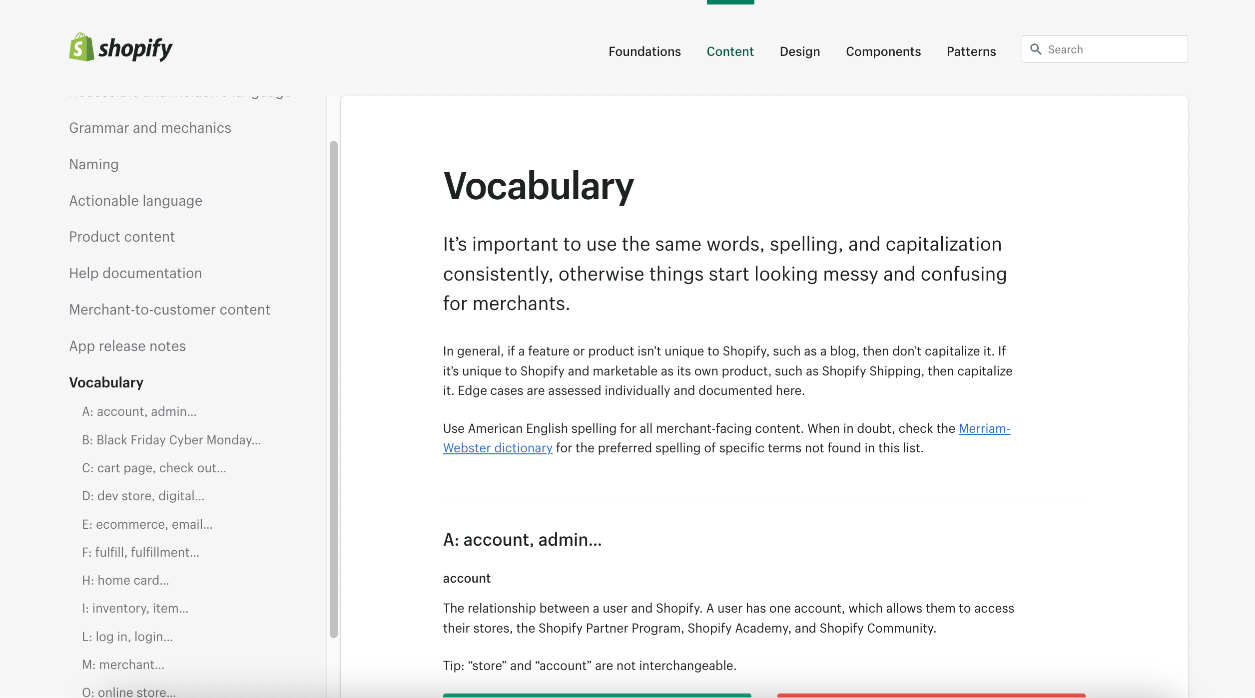
A vocabulary list or glossary (like this one from Shopify’s design system Polaris), is a great way to standarize the language used in the product.
Efficiency and scalability
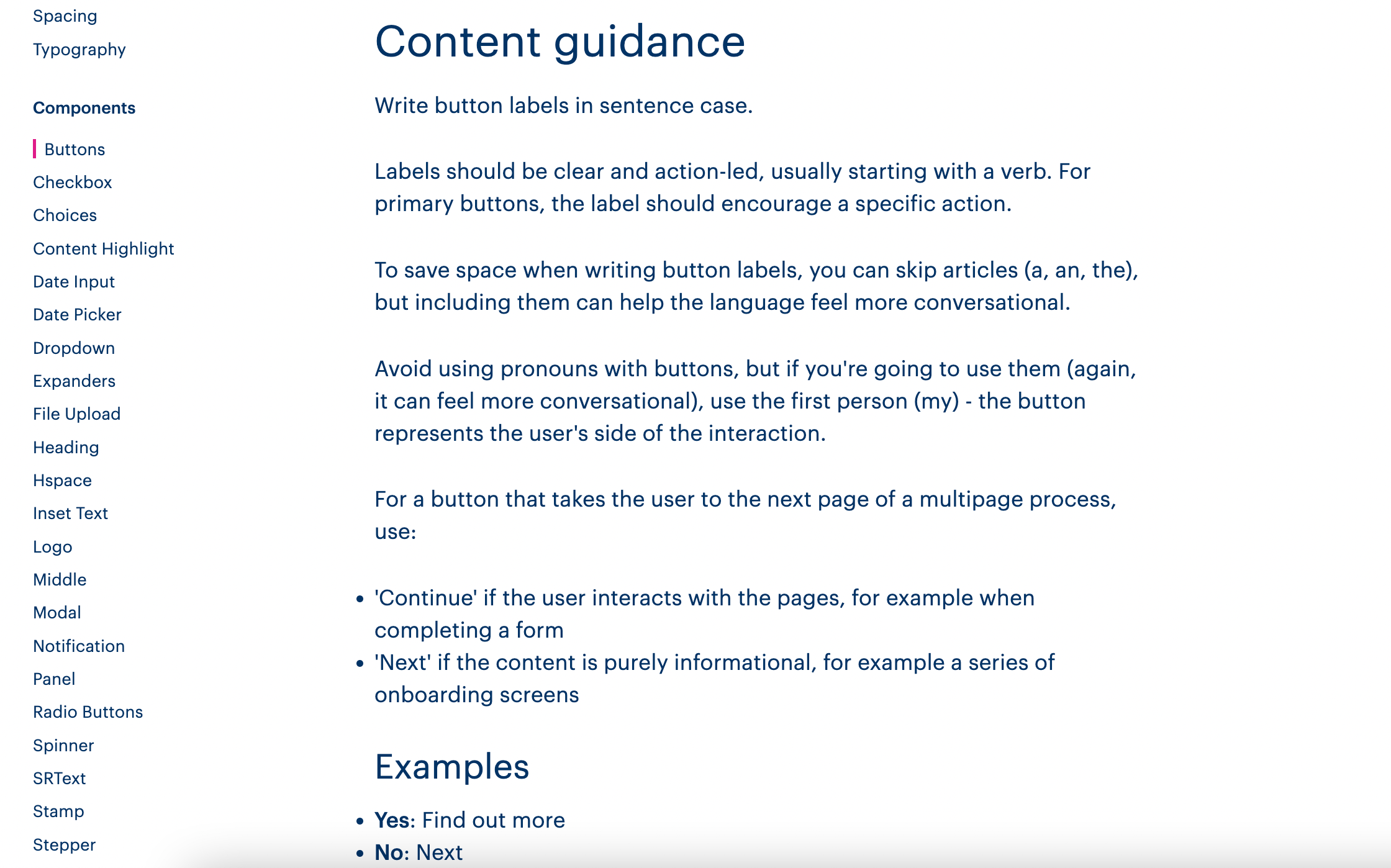
Another goal of design systems is to define rules and patterns once, then re-use at scale. When content design is left out of the picture, certain questions get asked over and over again: “What date format do we use?”, “When do I capitalize which word?”, “What placeholder text do I use here?” These are decisions that can be made once and integrated into our design system so that different teams and disciplines have access to them. We waste less time on these small, one-time decisions and leave room for the bigger questions. We can also reproduce the right content at scale, leading us back to our point above about consistency. If we decide as a team that the call-to-action for any button that takes us to a next step should be “Continue”, let’s automate that! Or, at the very least, let’s put it in our design system.

Bulb’s Solar Design System specifies what content to use for which CTA.
It’s good for your team
More time to think about more complex problems
While the trend is changing, there’s typically a limited number of UX writers or content designers in the team (for most of my career, I’ve been the only UX writer in teams of 5+ designers). By having content guidelines integrated into our design systems, we put a lot less strain on our UX writers, and free them up to work on more complex user problems. Product designers can use the design system for copy guidance, allowing them to make more educated content decisions when the in-house content expert is busy or absent. More importantly, less of the team’s precious time and brain power is spent thinking about design and content questions that could easily be turned into rules.
Grammar and consistency is a team effort
A skill that many UX writers and content designers typically share is their attention to detail. Spot a typo here, wrong syntax there, incorrect term there… But if you only have 1 or 2 UX writers in the team, keeping track of every single grammar and syntax mistake can be exhausting (and a waste of resources). With content design guidelines integrated into your design system, everyone can participate in spotting mistakes because they know the rules to follow.
An educational tool for new joiners
While not the most obvious reason, design systems are also great onboarding material. When new designers, developers or UX writers join the team; they can start by getting to know the guidelines for the product’s visual and verbal language. The onboarding of these new joiners will be much faster and more efficient, allowing them to get right to work on the more interesting, complex projects.
It’s good for your design system
Design systems have documentation. Documentation means content!
Design systems have a lot of documentation. While it isn’t user-facing content the way button text is, it should still be crafted carefully so it’s easy to read, understand and follow. More advanced design systems like Shopify’s Polaris or Kiwi.com’s Orbit (to name a few) have great documentation. Someone took time to think about the information architecture, the naming of all the design system’s elements and designed the content to be consumed by different disciplines and teams. While modern-day tools like Backlight make it easier for everyone to write and contribute to the documentation, a UX writer can help take it to the next level.
Keep code, design and content together
Before design systems were in the picture, most companies would keep guidelines in a brand book or style guide: a stand-alone document with things like tone of voice guidelines and best practices for writing. The problem with these guides is that they’re far away from the context; separate from how components look and feel. It also creates different sources of truth, often forcing teams to recreate their own versions of guidelines. To build functional and meaningful experiences, it only makes sense for code, design and content standards to all live in the same place. Today, tools like Backlight can help front-end teams build and collaborate on design systems, keeping all of its pillars in the same workspace.

Final words…
Language is a core part of a system’s foundation and needs. Including content design when designing our components, for example, means we’ll create them with real content needs in mind, avoiding issues like truncation, lack of contextual information or, worse, the use of lorem ipsum.
Words are too important to be neglected.
When developers, designers and UX writers work together to build design systems; the result is a cohesive, intuitive and user-centered product.
