
Best practices for integrating content design in your design system
-

- Name
- Ardena
- ardenagflahavin
A few weeks ago, we shared why your design system needs content design. It’s now time to follow-up with how to include content design in your design system. While there are general best practices for documenting a design system, in this post we’ll focus on those specific to content design documentation. Whether you’re starting from scratch, or already have some guidelines in place, these best practices can help make sure content design is fully integrated in your design system documentation.
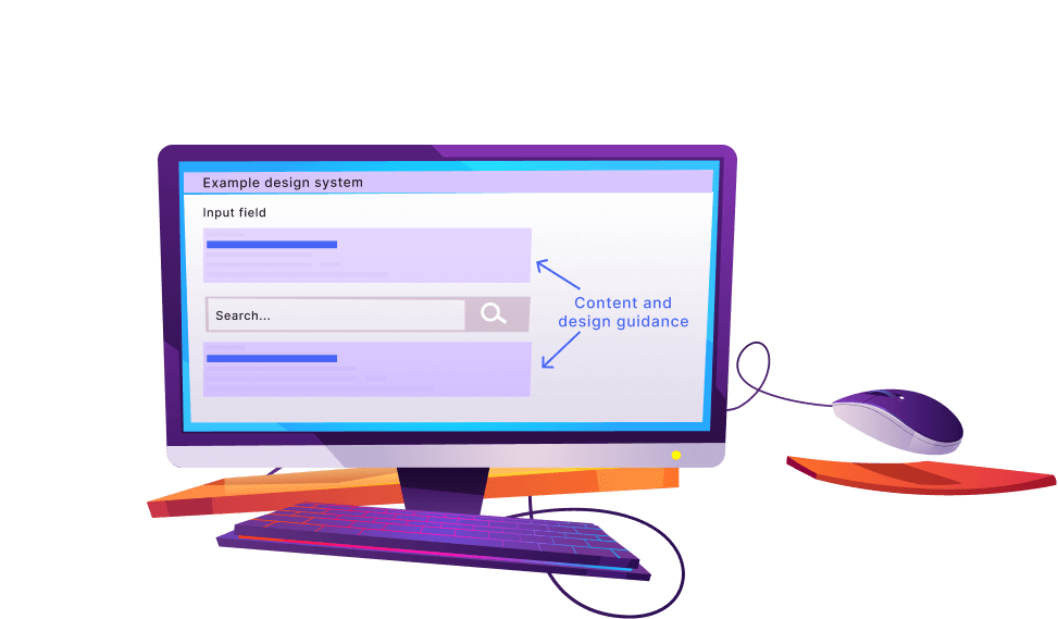
Document a component’s content and design guidelines together
Many companies already have some sort of content guidelines as a part of their brand book or style guide. While it’s tempting to just add a link to these somewhere in your design system and call it a day, this isn’t enough to integrate content design effectively.
A next step might be to create a specific section for content design, and group all guidelines here. While it’s better than just adding a link, it still creates a division between “content” and everything else. It suggests that content is just a nice-to-have bonus, as opposed to a core element to designing experiences. A separate content design section can be useful for very general guidelines that apply to all writing throughout a product. However, it is not the place to reference guidelines specific to a component or pattern.
So, what’s the best way? Content design impacts a user’s experience just as much as visual, functional and technical design. Content guidelines should be incorporated right where users are most likely to see and follow them. They should be embedded within the documentation of a component, in the same way visual design conventions are.
Use realistic copy examples in components
It’s tempting to use placeholder copy (such as lorem ipsum), or instructional copy (like “insert label here”) in documentation and component previews. However, this only creates a missed opportunity to really show what good content design looks like. Using realistic copy helps design system users to understand the context in which a component or pattern could be used, as well as indicating proper content formatting (e.g.: length, sentence case, grammar, etc.).
Guidelines should be specific, focused and useful
Is there a rule that must be followed? Distinguish it from the recommendations. Is there a given format or structure for the copy of a particular component? Clearly outline it. Is there a specific call-to-action to use in a button for a given scenario? Indicate it (ideally in the button’s documentation).
The more precise and contextualized content guidelines are, the more useful they will be.
Create a clear list of DO’s and DONT’s
A UX writer or content designer might find the guideline “Use sentence case” to be enough to follow the rule. But we need to keep in mind that most design system users are not UX writers, and may not know how to follow this guideline. Examples are a MUST! For every guideline, it’s always best to illustrate it with a clear “Do” and “Don’t”. The more “Do” and “Don’t” examples presented, the easier it will be to follow. If we take our example above, the full guideline could look something like this:
Always follow sentence case for all titles, subtitles and paragraph text.
| DO ✅ | DON’T ❌ |
|---|---|
| Account log-in | Account Log-In |
| Design system best practices | Design System Best Practices |
Start small and build progressively
Build on your content design guidelines as your team needs them. Not every product requires a design system as complete or advanced as Polaris, for example. While tools like Backlight can greatly speed up the process and collaboration involved in building a design system, these still require time and resources. Don’t waste them adding guidelines and documentation that nobody will ever use or read. Start with the basic rules and guidelines you see most repeatedly in your product, and go from there.
Consider inclusivity and accessibility
Accessibility is something that should be embedded from the start when designing and building components. It should be for content, too. If you’re just starting out crafting the content design guidelines in your design system, it’s a great opportunity to consider accessibility and inclusiveness right from the beginning. If you already have existing content guidelines in your design system, start asking yourself how they can account for inclusivity and accessibility. What words should not be used? What words should be used instead? How can the guidelines help create content that’s anti-racist, inclusive of all genders and anti-ableist, for example? When creating inclusive and accessible content guidelines the most important part of the process is to include, and get feedback from, the very communities you want to serve.
Get inspired by existing design systems
There’s no need to reinvent the wheel with all the amazing design systems to get inspired from. Here are a few companies who have done a great job at incorporating content design into their design systems:
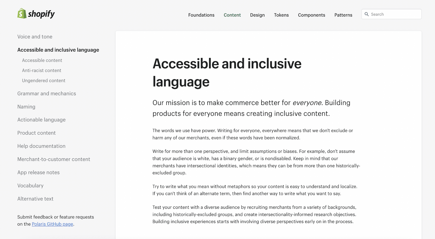
Shopify’s Polaris

One of the most advanced and complete design systems, and often considered a pioneer in the content design space.
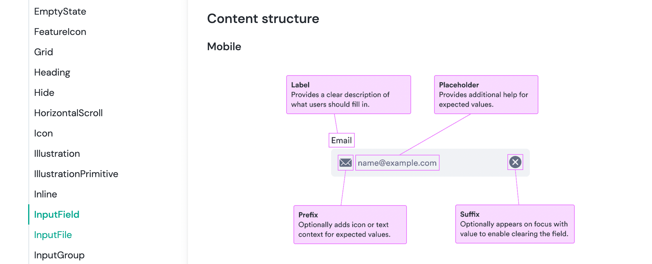
Kiwi’s Orbit
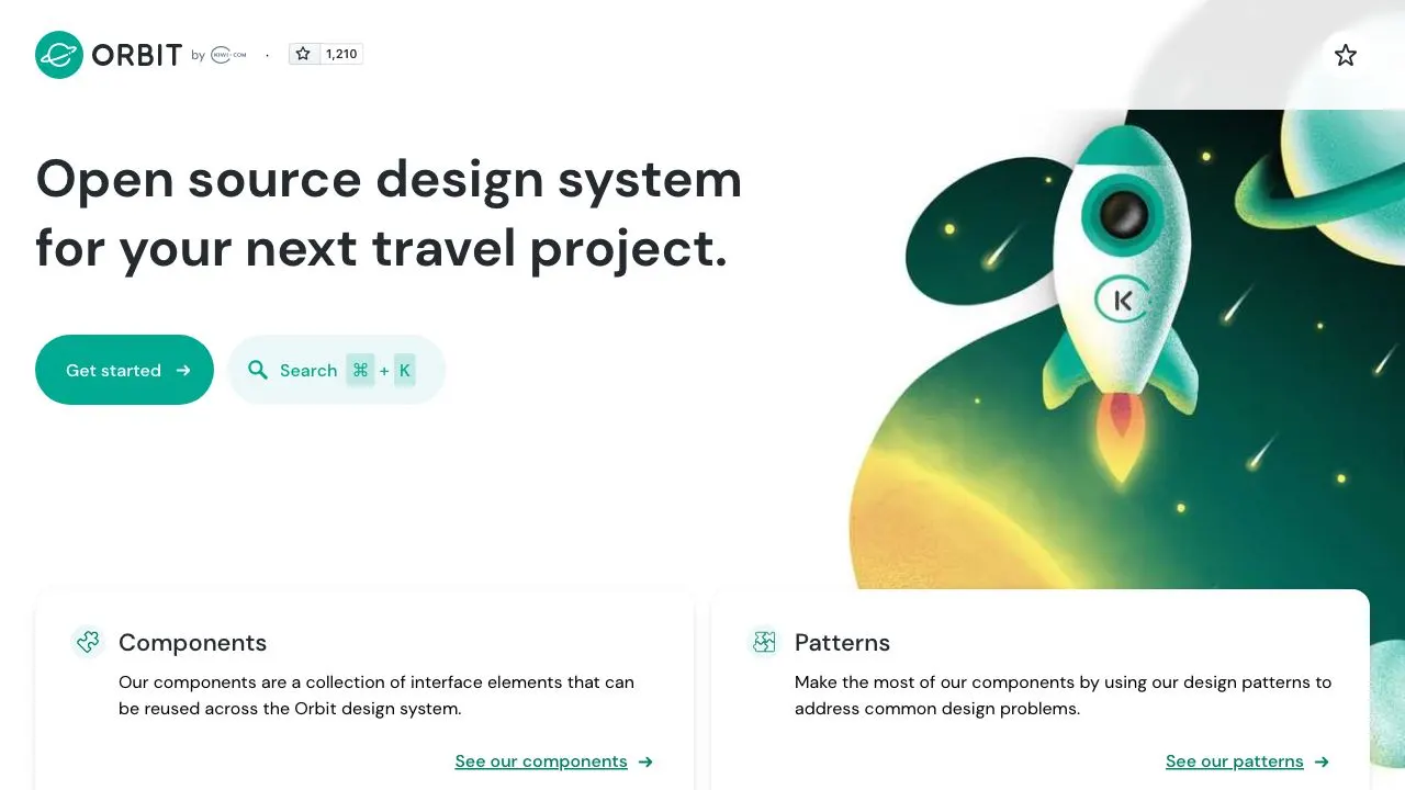
Orbit has some good examples for outlining a component’s content structure.
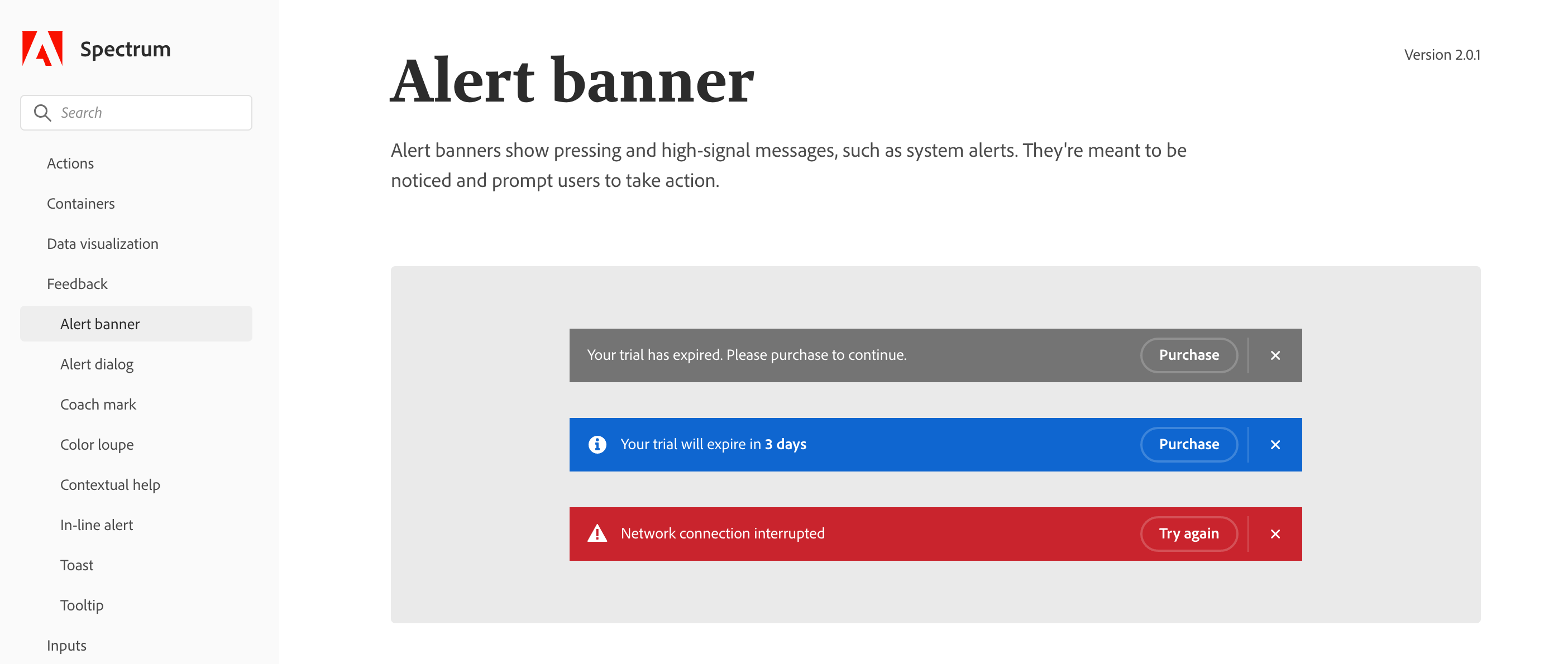
Adobe’s Spectrum

Adobe uses realistic copy in almost all of their component previews.
Atlassian Design System
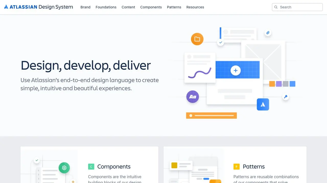
Atlassian has an extensive section on inclusive language, with specific Do’s and Don’ts for writing inclusively.
GOV.UK Design System
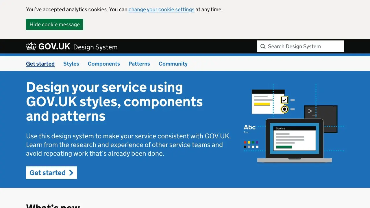
One of the most thorough in documenting content guidelines for each component, specifying exact copy to use when required.
For even more inspiration, check out our list of favorite design system documentation sites.
What best practices would you add?
Integrating content design into your design system isn’t always an easy path. It requires strong collaboration and team effort to do it right. However, following these best practices will hopefully reinforce that content is an integral part of a component or pattern. They will show non UX writers what good content looks like, and help the whole team to avoid errors and inconsistencies. Have you made content guidelines a part of your design system? What best practices would you add? Share with us on Twitter @backlight_dev!
 Tweet
Tweet
 Linkedin