
Backlight is now also @ Figma Community
-

- Name
- Thaís
- @th4is_ds
Backlight has several Design Systems Starter-kits to help teams jumpstart their Design System journey. We’re excited to announce that we are now also building Figma UI Kits that go with the coded starter-kits! 🥳
Up until recently, inside Backlight you would only see the components from a code perspective, but now you can also see the corresponding Figma components embedded in the interface. In our Figma community page figma.com/@backlight_dev we have published 4 starter-kit matching UI Kits so far: Bricks, Simba, Yogi and Spooky. 🚀 However, there are many more coded start-kits available for developers, so you can expect more UI Kits to be coming soon!
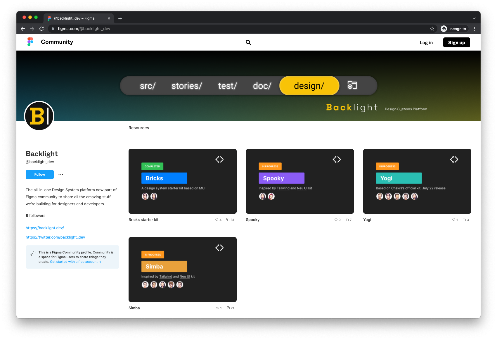
Figma community is a great space for creatives to publish their work. Not only does it showcase what they have made, it also enables others to duplicate and use the files for their own projects. Our goal with the @backlight_dev Figma community space is to bring the world of Backlight to the designers and help teams have the complete landscape when using Backlight.
Designers contributing to the system
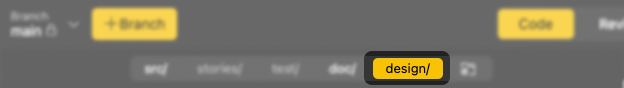
Even though Backlight is a platform made for developers, the designers can (and should) participate in building and maintaining the Design System in it. The collaboration is possible because Backlight has a feature for designers. 💥 You may have noticed in the interface already, one of the navigation tabs is called Design, which refers to the design folder that can contain any reference to the design materials.
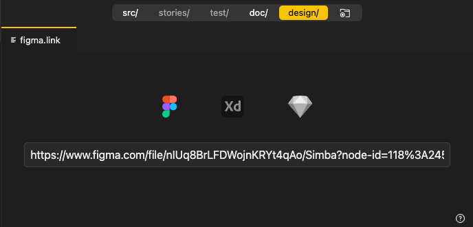
In this tab users are able to add a link to their UI Kit made in Figma, Sketch or Adobe XD. The connection happens by placing the sharable link in the input box. This space automatically recognises which platform the link is from and instantly embeds a preview of the link.
This integration allows teams to access the resources from all disciplines in one interface. Developers can easily view what designers are working on and designers can relate their work to what’s being developed in code. This simple yet time-saving feature is the bridge that gets everybody on the same (web)page 😉 when building their design system. No more slack messages like “Hey, could you send me your design link again please?”
One of the advantages of previewing the designed components next to its code/documentation is to increase the parity between the designers’ assets and the coded components. With Backlight it’s much easier to toggle between tabs and spot the inconsistencies.
The Starter-kits in Figma
The same way as the starter-kit is for code, the purpose of these Figma UI kits is to provide designers with a basic set of elements that they can expand on. In these files you will find most components that can also be found in code.
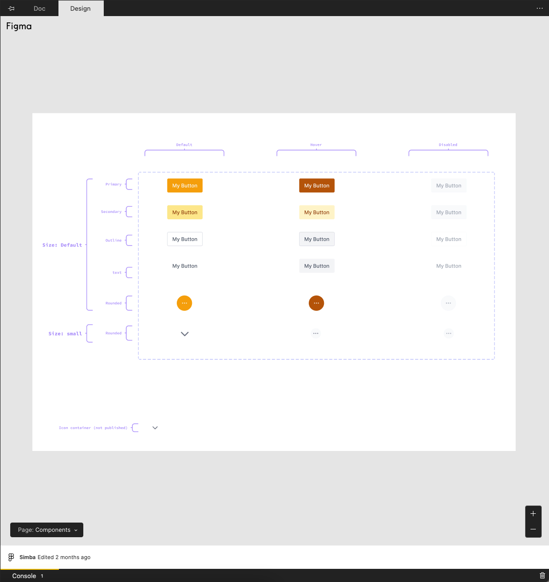
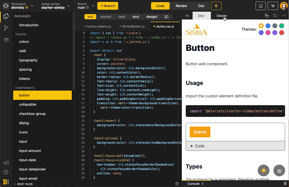
Simba UI Kit
This library uses Tailwind official styles, just as the code does, and everything is linked to Backlight.
Key features
- Tailwind default styles
- Styles documented and its frames linked to Design Tokens section in Simba Starter-kit
- 10+ ready components and its frames linked in Backlight
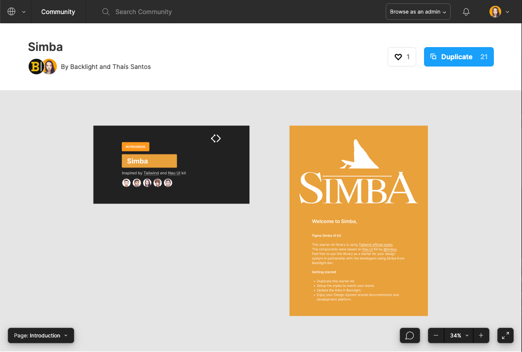
Yogi UI Kit
Yogi starter-kit is based on Chakra UI component library. In this Figma file you will find all of Chakra’s Design Tokens styles as well as the latest components that Chakra’s official team made available in Figma.
Key features
- Chakra UI styles
- Styles documented and its frames linked to Design Tokens section Yogi Starter-kit
- All official available Chakra UI components and its frames linked in Backlight
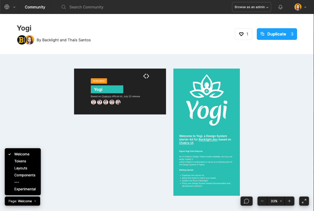
Spooky UI Kit
We made a Halloween themed version of the Simba starter-kit. You can read more about our journey with Spooky here: Creating a Design System from scratch for Halloween
Key features
- A fun set of Halloween themed components
- Frames linked in Backlight
Bricks UI Kit
We have a Material UI based starter-kit in Backlight called Bricks, and to match that we now have the Bricks Figma UI Kit. This library is using MUI official Figma library as a base for components and tokens. Additionally, we already connected all the styles with the Figma Tokens plugin to enable an easy switch between light and dark mode.
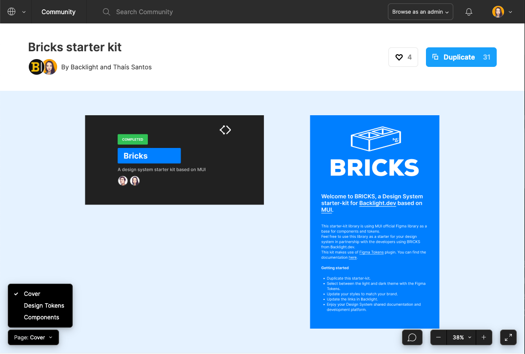
Key features
- MUI styles and components
- Switch between light and dark mode
- Styles documented and its frames linked to Design Tokens section Bricks Starter-kit
- All official available MUI components and its frames linked in Backlight
How to use the libraries
Similar to following the steps in the documentation from getting started with Backlight your team should choose a starter-kit to start your Design System. Next, the designer should duplicate the corresponding file from the kit that can be found in the @backlight_dev Figma community space.
Make sure that every Figma link in your new design system, inside the Design tab in Backlight.dev, is updated with the links to the frames of the newly duplicated UI kit, because the duplication of the file changes the connection between Backlight and the Figma embeds.
As the team goes through modifying and adapting each component in the code, so should the designer in their Figma library. Luckily, with Backlight everything becomes much easier to align and communicate.
Once you finished setting up your UI kit, you can enjoy a synced and fully documented design system!
What’s next?
We will continue to build more UI kits, experimenting with different approaches to making Figma components and better ways to provide starter-kits to the design community, as well as start building some Figma plugins. 🤓 Watch this space!
 Tweet
Tweet
 Linkedin