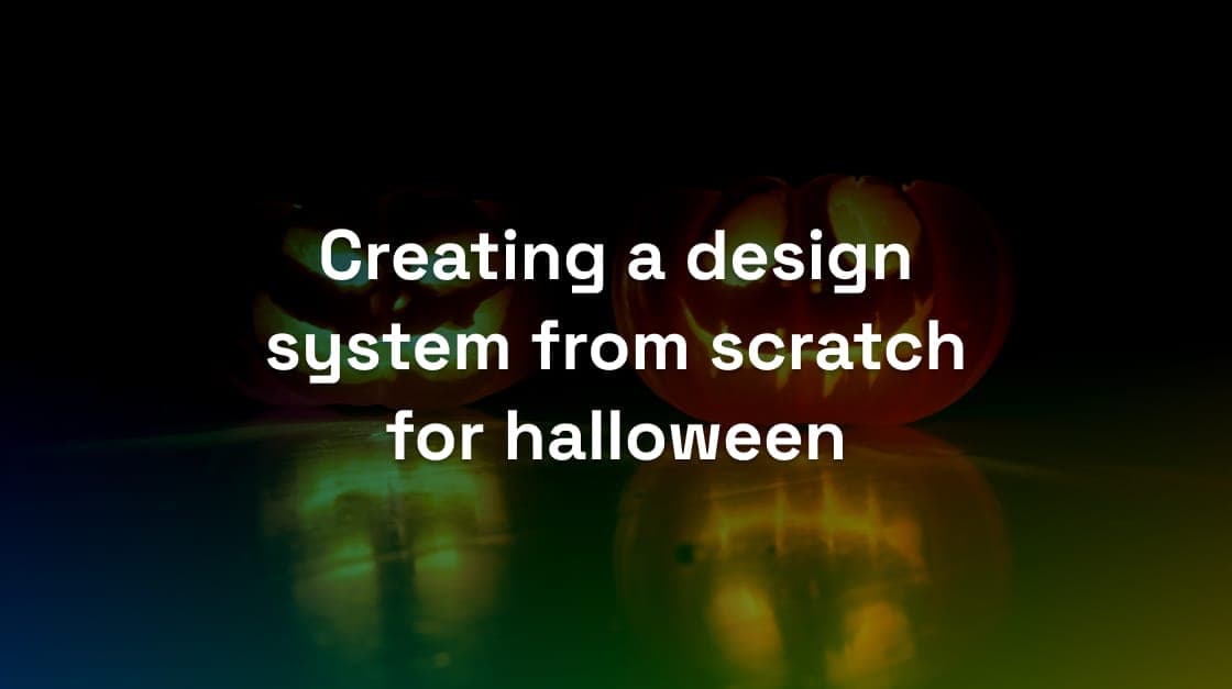
Creating a Design System from scratch for Halloween
-

- Name
- Thaís
- @th4is_ds
-

- Name
- Charlène
- @CharleneGK187
-

- Name
- Joren
- @jorenbroekema
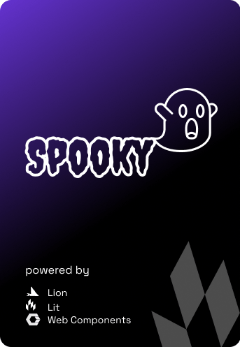
How we created a SPOOKY themed design system in 3 days
It’s that time of the year, the leaves are falling, the temperatures are dropping, autumn is in full swing and we start seeing halloween decorations everywhere…
It sure seems a lot of fun to dress up in scary costumes, hang cotton strings, find scary objects to display and carve out pumpkins to make funny expressions.
That’s when our team, who is working with design systems all day, had a brilliant thought: “what if we could dress them up for the occasion as well?!”
We put our minds together and in 3 days Spooky came to life.
What started as a joke became a fully fledge design system with the most scary features you can think about:
Creepy factors
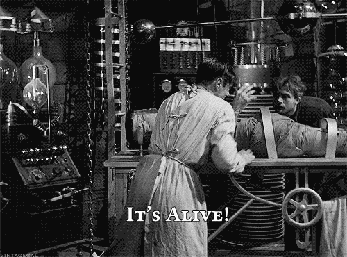
The Doctor(s) Frankenstein(s) from this saga was Charlene (dev) and me (design). We would be the ones that would make this monster come to life.
Starting a design system from scratch doesn’t mean we had to start empty handed. Luckily Backlight allowed us to choose an existing starter-kits and build upon it.
We choose to use Simba because we could easily set the dark-theme as default, considering that it wouldn’t make sense to have a design system in light colors, the vampires would run away from it.
That small trick got us started with:
- Tokens
- 17+ components
- Documentation
- Figma files
- Dark mode
Since everything is highly customizable, all we needed was to get creative 🙂
1. Setting up Tokens
First step was to select the purple palette as our primary color, define a horrifying font family (creepster) and most of the component already started looking… well, creepy. 😅
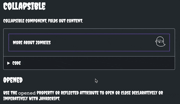
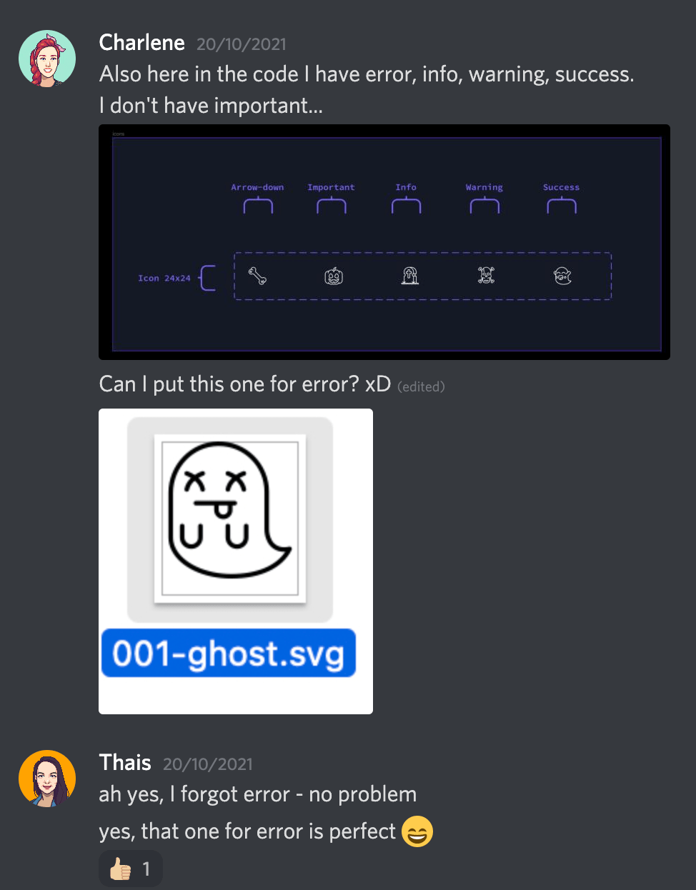
Additionally, to enhance components’ halloween-feel we selected an icon library that would make each element more interesting. Needless to say that Charlene and I fell in love with the ghosts in this set, so you will see them everywhere. My favourite one being in the collapsible:
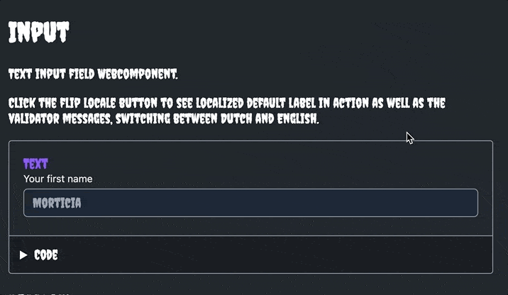
Since it’s halloween, we glanced at a lot - and I mean a LOT - of aspects that anyone building a design system should be concerned about. If you were trying to understand the text and had issues reading it, that’s what I’m talking about… Accessibility was not taken into account here, but hey, this was just for fun!
Let me rephrase that: everything that you see in this design system was intentionally bad. It’s a feature of these components to be bad for your sight and interaction. It would be quite a prank to your users to make Spooky as the design system in your application 😆
2. Building components
Charlene had a head-start with the coded components because Simba comes with a default dark theme set up, and with the simple toggle she got most components in the right colors.
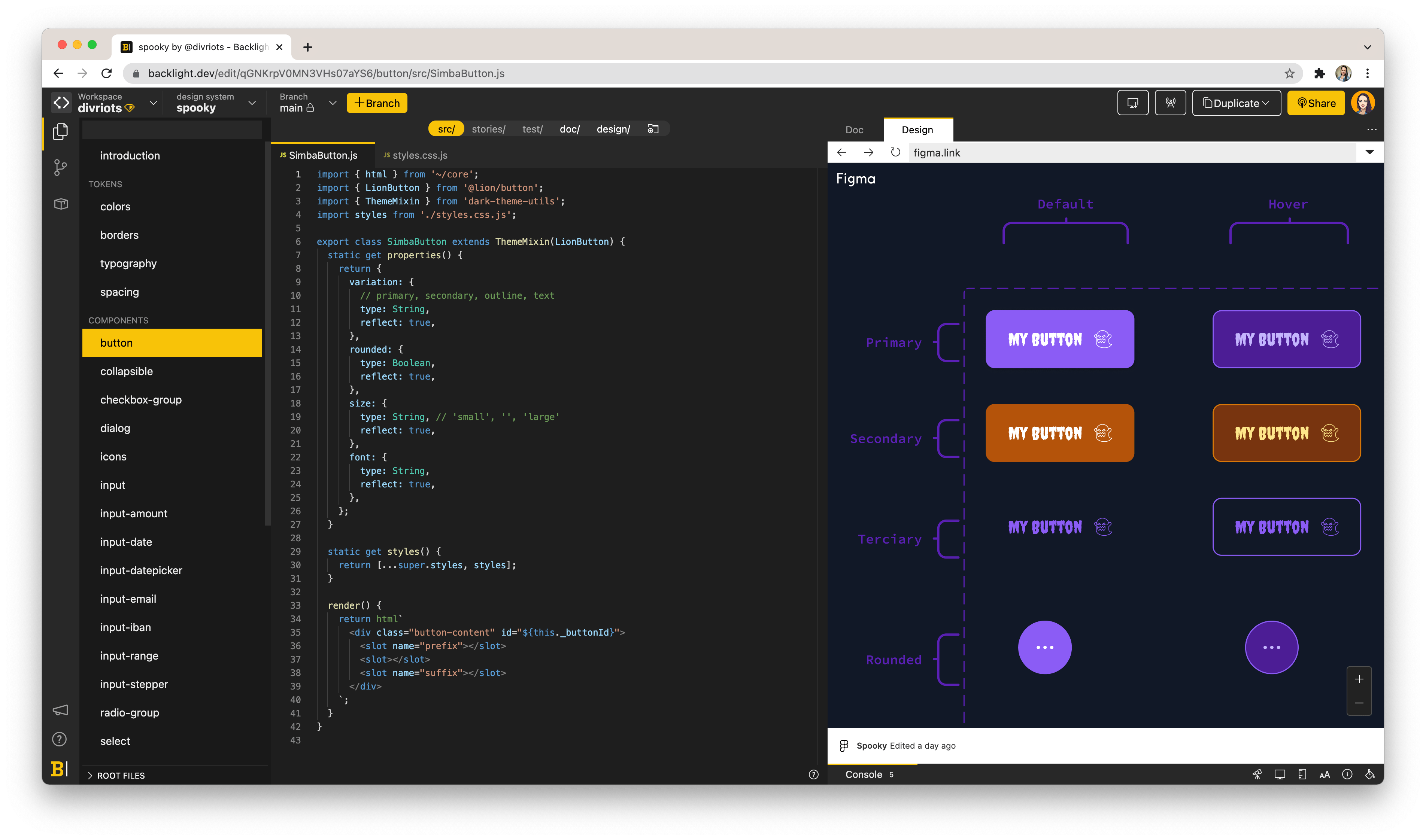
In order to speed up the design decisions that would make each component unique I duplicated Simba’s Figma library, renamed it to Spooky and updated the links inside the Design tab in Backlight.
In Figma, however, I didn’t have the dark theme ready yet, so I had some catching up to do to make sure my designs were matching.
The advantage of having a Figma embed inside Backlight is that Charlene could see my suggestions in the same platform that she was coding. The communication was smooth and she had enough information to keep on editing the code.
3. Team communication
We still exchanged a few messages in the chat, just to make sure we were on the same page. At most, having the designs side-by-side the code enabled us to keep working asynchronously.
I wasn’t aiming at spending hours in each component, and I certainly wouldn’t want her to wait for my input to be able to move ahead, that’s why I was happy that Charlene took the initiative to make some design decisions herself.
4. Added benefit of backlight
A part that we overlooked at first is the ability for both Developer and Designer to experiment with the other side: Backlight is simple enough to get both Designer experimenting in the code and Developers to test their design skills. Charlene could experiment Design in her code and I would just update my design based on her suggestions. Being able to access the work she was doing, while she was doing it, without having to run anything in my computer was a bliss!
5. A spooky perk
Charlene had progressed a lot in what she could change inside the components but then she was running out of ideas to make it really spooky. That’s when our colleague Joren proposed to pair-program and together they came up with Boo.
Remember clippy? That lovely Microsoft assistant? Meet Boo, our own AI powered documentation assistant, with quite a sensitive personality and not that helpful after all. He will be there floating in your documentation window just to keep you distracted and make you forget about all the work you have to do in your design system.
Jokes aside, making Boo had its challenges:
- Edge detection, how does Boo know it’s at the edge of the screen
- Make Boo face the direction it’s traveling in by flipping him with CSS custom properties
- Calculate distance from the mouse to Boo properly (pythagoras was needed, which is probably one of the few high school math things Joren could still remember)
- Find a way to prevent that the amount of Boo’s on the page accumulates in SPA-like applications, by exporting a cleanup utility you can call before switching view especially the last one was interesting to think about, if you switch view, Boo stays in HTML because your views probably render somewhere inside a sibling element of Boo, so Boo is unaffected when you switch views unless you clean him up
Still, the challenges brought us a good showcase for web-components. We decided to expose the work done with Boo for everyone to use. When Joren saw how cool Boo was in starter-spooky he figured he could score some points in the community by making it usable in any application 😄 You can read his blog post here.
Was it a trick or a treat?
After 3 days, a lot of other tasks to work on, was Spooky a trick or a treat? Most definitely a treat with a lot of laughs and interesting insights in our workflow.
Here’s what Charlene thought about it:
It was interesting to experience the point of view of a user who would use Simba to start their own design system. I also enjoyed going crazy with the Halloween theme: icons, fonts and colors, with the little bonuses like Boo and the slimy titles 🤣
I really enjoyed brainstorming about what it mean to “dress up” a component. It also broaden my ideas around making the design system so flexible that an application could actually change the entire look and feel just to celebrate holidays. Above all, it was a great way to have fun!
I wonder which one should we do next? A Christmas design system? 😇
 Tweet
Tweet
 Linkedin