How your favourite UI libraries manage their icons
-

- Name
- Andrico Karoulla
- @AndricoKaroulla
Introduction
If you’ve been around the design system / UI library block a few times, you might recognise that the approach I took for A2k in How to manage icons in your UI library may not be the best approach for every library (or even most libraries).
If you haven’t read the first part (it’s interesting, I promise), A2k took the following approach:
- A2k sent over an external asset on load that contained the SVGs of our icons.
- The user would pass through the icon’s name as a property to the
a2k-iconcomponent. - The
a2k-iconcomponent cloned these SVGs into the DOM viause.
My approach downloads all icons to the user on initial load. As the number of icons grows, so does the data footprint, which will become increasingly problematic, especially for users with slow connections/bandwidth issues. This is certainly a problem that many of our favourite UI libraries have come across and have, hopefully, solved. So let’s see how these libraries manage their icons. Surely at a level of maturity, all libraries converge at the same, correct solution, right?
Not quite! As you’ll see UI libraries are like animals evolving to better suit their respective ecosystems. We’ll take a peek at a handful of well-known libraries to see how they manage their icons, the benefits of their approach, and some of the trade-offs that come as a result.
Spoiler alert, no strategy is perfect and each one has its own set of benefits and drawbacks. Some libraries prioritise icon availability instead of a small network footprint. Other libraries offer greater customisation at the cost of a more complex API.
For anyone interested in building an icon library, I hope this guide helps you decide what’s important for you and your users and how you can go about implementing your icon strategy. This isn’t a formal grading of the icon libraries and every library I’ll discuss is excellent with a hardworking team behind it making it the best library it can be. Some of the things I’ll be focusing on are:
- Number of icons sent on load
- Likelihood of users downloading unused icons
- API complexity
- API flexibility
Let’s kick off with a big player like Adobe.
Spectrum Web Components
Spectrum’s journey runs opposite to A2k’s. Where A2k went from exposing multiple icon components to a single icon, Spectrum is moving from a single icon component to multiple icon components. That was a mouthful… 😵
Before we dive into how Spectrum manages its icons now, it’s important to understand how they managed them in the past. Doing so allows us to see the motivation to move toward their current solution.
Spectrum’s previous approach
Spectrum’s previous approach was a little more novel than the solutions we’ll see later on. To display an icon on screen, you’d need to have registered and rendered two custom web components, an iconset and an icon.
- The iconset, e.g.
sp-icons-medium, was responsible for making sure the icons you need are available to render. - The icon, i.e.
sp-icon, was responsible for rendering the correct icon based on the value ofname.
The HTML would like this:
<sp-icons-medium></sp-icons-medium>
<sp-icon name="ui:Arrow100"></sp-icon>
The folks at Spectrum recognised some limitations with this approach:
- Rendering an iconset downloads icons that may never be used
- Defining a custom iconset shifts complexity to the user
- Adding icons to an iconset will have a direct negative impact on the user’s experience.
And an added personal note:
- Registering an iconset by rendering a custom element feels very un-HTML
In fact, Adobe’s workflow iconset, contains nearly 900 icons. Registering an iconset of that size would increase the network footprint tremendously. It seems that the Spectrum team recognised these drawbacks and are pushing forward with a different strategy.
Spectrum’s current approach
Instead of offering a single sp-icon component, Spectrum lets you render a web component specific to an icon, like sp-icon-abc. To use <sp-icon-abc> you’ll need to register the component by importing it directly:
<script type="module">
  // Downloads the icon and registers the sp-icon-abc component
  import '@spectrum-web-components/icons-workflow/icons/sp-icon-abc.js';
</script>

<sp-icon-abc></sp-icon-abc>So what about the downsides that A2k came across? Managing 12 icons alone proved complicated. How does Spectrum manage nearly 900?! For a start, the developers at Spectrum aren’t creating each component by hand. Instead, when the @spectrum-web-component/icons-workflow package builds it pulls in the SVGs from the official Adobe icon repo and generates all the web component boilerplate, including the code to register to the icon.
There’s still the problem of potentially downloading too many assets, since the icon is downloaded to the browser once JavaScript runs the import code. As a result, the onus is on the developer to ensure that the initialisation scripts aren’t pulling in too much too early.
We’ll see later on how other libraries offset this risk in their own ways.
Spectrum’s third approach
Using Adobe’s workflow iconset is a good bet. You know you’re getting high quality icons from a company whose vision is to empower creators to make inspiring digital experiences. But you might not be fortunate enough to use Adobe’s icons. Your project might require you to use another set of branded icons. Spectrum offers an escape hatch for custom icons, simply pass through your SVG node as a child to sp-icon:
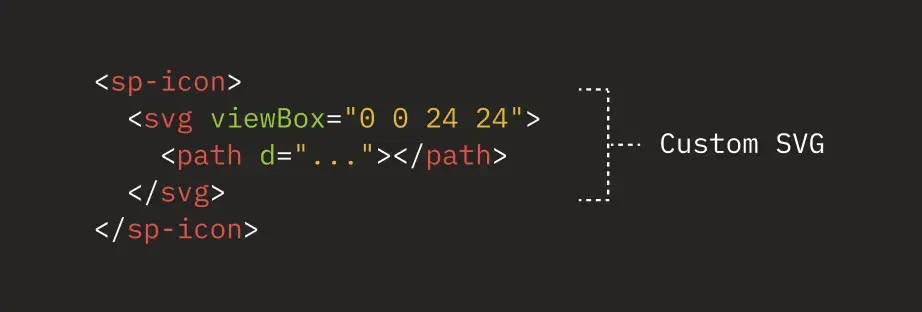
If you’d like to reuse a single component, you could encapsulate your custom icon within a web component like so:
import { LitElement, html } from 'lit-element';
import '@spectrum-web-components/icon';

class CustomIcon extends LitElement {
  render() {
    return html`
      <sp-icon>
        <svg>
          <path d="..."></path>
        </svg>
      </sp-icon>
    `;
  }
}

customElements.define('sp-icon-custom', SpAbcIcon);
The above is not a solution specific to Spectrum so you can generate your own web component any time you want to reduce code duplication.
Pros
- You have full control over the icons that are sent to your users’ browser.
- Because the icons are downloaded immediately, there’s no pop in once the component has been registered.
Cons
- Spectrum doesn’t offer any out-of-the-box lazy loading capabilities, so all icons are sent to the browser when the icon is registered.
Vaadin
Vaadin exports a single component vaadin-icon and offers 600 different icons to choose from. By default, it’s possible to choose between two different icon sets.
If you wanted to use Vaadin’s phone icon, you would write the following:
The pattern for choosing an icon is iconsset:icon
You can see that the API is like A2k’s. Vaadin exposes a single web component, <vaadin-icon>, which accepts the name of the icon via the icon attribute. One key difference is the inclusion of iconsets. Vaadin offers two different iconsets, “lumo” and “vaadin”.
So what’s going on in the HTML when we load/render our icons?
Like A2k, Vaadin sends over all of the icons to the client when the application loads. Unlike A2k, which downloads a separate file and uses the use element to clone the icon nodes, Vaadin inserts the entire iconset into the head of the document. Each icon has an id, which the <vaadin-icon> element can reference.
When a <vaadin-icon> element renders, it finds the correct SVG node in the head of the document by referencing the icon’s id using the icon’s value.
Because the Vaadin library loads and writes the entire iconset to the DOM on load, it increases the amount of data transferred by 250kb. Many of the 600 icons are likely to be left unused.
As the size of the payload is so high, the browser needs some time to download, parse, and run the JavaScript. As a result, there may be a noticeable gap between the page loading and the icons loading.
Pros
- All icons will be made available once all resources have loaded
Cons
- Requesting the entire iconset on page load increases data transferred by 250kb.
Shoelace
Like both A2k and Vaadin, Shoelace is a library that exposes a single web component to display icons.
Shoelace’s default icon library contains 1,300 Bootstrap icons. Rendering a phone icon to the browser is done via the following:
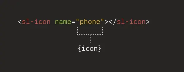
Shoelace also offers a handful of additional libraries. Unlike Vaadin’s API, where the iconset is specified with the name of the icon, Shoelace offers a separate attribute:
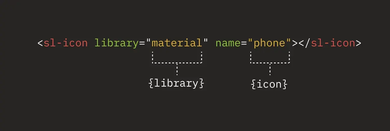
Library consumers can also register custom icon libraries, via a resolver function. The accompanying resolver function can resolve icons from the local assets folder or a CDN.
In terms of the user-facing API, Shoelace’s offering is similar to the libraries we’ve talked about. When we look at our HTML after loading/rendering icons, we can see that Shoelace does things differently.
Shoelace downloads the icons on demand and then stores them in-memory. This yields one big advantage and one big disadvantage over Vaadin’s/Spectrum’s approach.
Since the entire icon library isn’t transferred over the wire on load, it reduces the network load by a considerable amount. This also gives the developer flexibility to increase the number of available icons without worrying about adding more bytes to the page.
The downside is that we’re deferring additional network requests when the sl-icon component wants to render the icon to the page. While a network request in this case isn’t problematic, there’s the likelihood of the icon flashing into existence.
Joren Broekema, a developer of the Lion component library, suggests that the benefits of deferring icons vastly outweigh the drawbacks.
I would defer them, is the pop-in effect bad? Do you mean you get a vertical layout shift? Because I suppose that could be prevented with setting a static height on it? I dunno, for me it’s more important for page to be interactive than for system icons to be visible immediately.
— jorenbroekema (@jorenbroekema) August 22, 2022
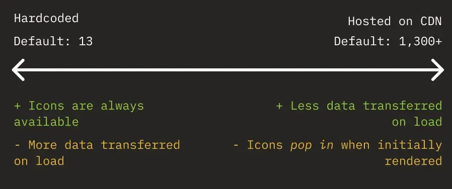
The Shoelace library also has a special icon library called the system library. The system library is used to ensure availability for specific icons, like the ones used in your components. The resolver for the system library bypasses network requests because it returns the hardcoded data URI for an icon. Configuring the system library can give users control over how many icons are shipped with the base site and which ones are requested when needed. A developer can even register a custom icon library to resolve in the same way the system library does, custom icons don’t need to resolve asynchronously.
Pros
- Icons won’t affect the initial amount of data transferred.
- Shoelace provides flexibility on how many icons are hardcoded and how many are hosted externally.
- Ability to provide Shoelace with custom icon libraries.
Cons
- Icons that require a network request may pop-in the first time Shoelace attempts to render them.
- You may not know how many “system icons” to hardcode ahead of time.
Lion WC
Lion’s a little different from the libraries we’ve seen so far. Lion doesn’t offer a ready-to-use component library. In fact, the components by default are unstyled. These white-labeled components are designed to be used to build a design system.
The benefits of such an approach means that Lion can focus on delivering a core set of fully-functioning and accessible components, while giving you complete control over your components’ appearance.
Lion, like all libraries we’ve seen so far, exports a single icon component, lion-icon, but it doesn’t provide any SVG icons, you’ll have to supply your own.
When it comes to minimising the network footprint, Lion takes a few steps to keep it low. Take the following as one such example:
Lion gives library authors the option to import multiple libraries and multiple iconsets within those libraries. By cleverly grouping related icons together you can download commonly used icons in batches.
Icons resolve through a resolver function, the implementation of which is up to the library author.
These icons can be resolved synchronously (via a simple SVG object):
const icons = {
  space: {
    spaceship: html` <svg>...</svg> `,
  },
};

function resolveLionIcon(iconset, name) {
  return icons[iconSets][name];
}
Or asynchronously, like when importing from the file system.
function resolveLionIcon(iconset, name) {
  switch (iconset) {
    case 'space':
      return import('./icons/iconset-space.js').then((module) => module[name]);
  }
}
Since the above switch statement is using dynamic imports, the iconsets are lazily-loaded. This means that they’re only loaded when needed, which reduces the amount of data sent with the initial request.
You can learn more about how Lion manages icons via the documentation.
Overall, Lion’s icon loading principles are more in-line with Shoelace’s, but instead of focusing on loading individual icons when needed, Lion focuses more on loading iconsets.
Pros
- Icons won’t affect the amount of data transferred on load.
- Lion has no opinions on where your icons should live, on the file system or in a CDN.
Cons
- As icons are lazy loaded, your end users may experience the icon “popping” into existence. This will only happen the first time Lion attempts to render a given icon.
- Grouping icons into iconsets may still result in unused code sent to the end-user.
UnoCSS
Up until now, we’ve only looked at web component frameworks. Are there any options for those that want to take a pure CSS approach?
Yes, and for those who want to reduce the JavaScript footprint of their web applications, a pure CSS approach might be for you. If you were to handle SVGs in HTML/CSS yourself, you could choose from one of the following options:
- write your SVGs inline
- use the
useelement to clone an SVG that exists in the document or in an external asset - use an
imgelement and point thesrcto the image’s destination - display an svg via the
background-imagecss property - display an svg via the
maskcss property
UnoCSS takes the latter approach.
How does UnoCSS work?
Sadly, you can’t simply import web components like with the aforementioned web component libraries. UnoCSS requires a build tool to work along with some UnoCSS configuration.
Part of this configuration involves supplying an icon library since UnoCSS doesn’t offer any icons by default. Instead, it’s compatible with all @iconify-json/* icon libraries. You’ll need to install them like any other NPM package and configure your UnoCSS config.
Once that’s done, you’ll be able to render your icons:
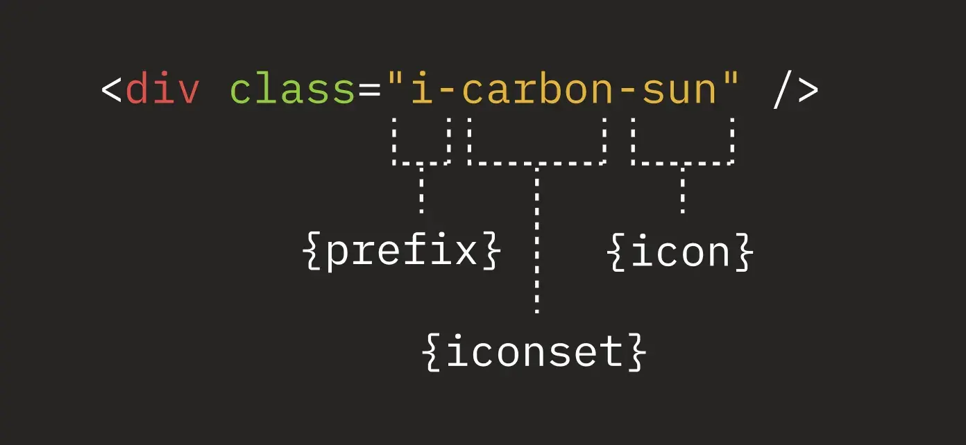
We need to provide three pieces of information in the element’s class for UnoCSS to display the correct icon.
i- tells UnoCSS that we want to render an iconcarbon- tells UnoCSS that we want an icon from the Carbon librarysun- tells UnoCSS that we want to render the sun SVG
Once UnoCSS has worked it’s magic, you’ll find the following styles in the CSS output:
.i-carbon-sun {
  mask: url('data:image/svg+xml;utf8,...') no-repeat;
  mask-size: 100% 100%;
  background-color: currentColor;
  width: 1em;
  height: 1em;
}
So what does the above CSS rule do?
mask- displays the image passed through to theurl()function and doesn’t repeat itmask-size- ensures that the image takes up the entire content of the elementbackground-color: currentColor- applies the inherited colour to the SVGwidth+height- explicitly sets the dimensions
So how does UnoCSS go from i-carbon-sun to the CSS above?
- When your project builds, UnoCSS looks for all classes that match the
i-*pattern. - When it finds a match, it accesses the correct SVG from your chosen iconset.
- It encodes the SVG string into a utf-8 string and writes it inline as a data URL.
- Finally, it generates the CSS and writes it to one of your CSS files.
Even with the added complexity of a build step, we can see that it offers a pretty huge benefit, UnoCSS only generates CSS rules based on the icons you’ve used. No unused icons are shipped to our users.
Pros
- Icons are generated at build time so all icons will be available on page load.
- Only necessary icons are sent to the user.
Cons
- Requires a build step along with some configuration.
Material UI
Aside from Uno, we’ve only looked at web component libraries. As a result, the solutions we’ve seen share similar loading and rendering patterns. Let’s see how a different framework affects how a library manages icons.
First off, React apps require a build step, which isn’t necessary for building web components. If you’re writing a React application, you’re likely using some build-tooling like Webpack and Parcel under-the-hood to:
- tree shake unused code
- transpile your JSX into a browser useable form of JavaScript
- bundle your JS files together
- code split your bundle into logical chunks which can be downloaded on-demand.
Libraries like MUI can rely on a number of the above techniques to offer improvements to the developer experience
Technique 1: Code Splitting
If you’ve built in React for a while, you may have remembered a time when all of your code was bundled into a single entry point, like app.js. All of the JS code you wrote lived in this one file. When your skeleton HTML file loaded, it would download your app.js file, parse it and then execute it. Generally, the more code you shipped, the longer this process took.
As the JavaScript language advanced, build tools could leverage a technique called code splitting. Code splitting helps break down big JavaScript bundles into smaller chunks of code that get loaded only when necessary. The initial bundle is smaller, which cuts down on download and parsing time, and any additional assets can be downloaded as they’re needed.
So how does Material UI leverage code splitting? Unlike all of the other examples we’ve seen, Material UI doesn’t export a single icon component. Instead, it exports 10,000 different icons using raw SVGs taken from Google’s official Material Icons collection and are transformed into individual React components that are rendered like this:
import { AbcIcon } from '@mui/icons-material';

function Page() {
  return (
    // Other DOM elements...
    <AbcIcon />
  );
}
If the bundler is code splitting by route and your icon is only used in the blog route, then you can safely assume that your icon won’t be downloaded to the user’s browser when they access the profile page.
Technique 2: Tree Shaking
Another interesting technique that many bundlers offer is tree shaking. When bundling code using import/ export syntax, bundlers can learn which exports are not being used and avoid adding them to the bundle.
React UI libraries, like Material UI, leverage these techniques to offer us a nicer developer experience without worrying about bloating our initial bundle size.
That’s why a library like Material UI, which boasts an icon library of over 10,000 icons, allows us to use as many or as few icons as we’d like while reducing the likelihood of us shipping unused code.
Both tree shaking and code splitting are topics more complex than I’d dare cover in this article. If you’d like to learn a little more, then you can check out the MDN resources on tree shaking.
Lack of interoperability
We’ve seen how introducing a build step brings its own set of benefits, but what about the drawbacks?
One caveat of using a library coupled tightly to React is that your components lose framework interoperability. If you’re building a set of components to use across several teams each team is forced to use React or miss out on using your components. Building a component library with web components gives your consumers the flexibility to use it alongside their framework of choice, like React or Svelte, etc. I couldn’t possibly do the topic of web component interoperability justice in this article, so please read Adam Rackis’ article on the subject if you’d like to learn more.
Caveats with using SVGs in JSX
Interoperability isn’t the only drawback when using React. There’s also the additional performance overhead that comes with using React to render SVGs. This Twitter thread by Jason Miller explains these problems in more detail.
Please don’t import SVGs as JSX. It’s the most expensive form of sprite sheet: costs a minimum of 3x more than other techniques, and hurts both runtime (rendering) performance and memory usage.
This bundle from a popular site is almost 50% SVG icons (250kb), and most are unused. pic.twitter.com/G1IgOjTeIT
— Jason Miller 🦊⚛ (@_developit) April 15, 2021
Later on in the thread, Jason elaborates on the performance issues and states:
SVG in HTML is fine - it gets parsed and rendered once by the browser. SVG in JSX requires the JS to download & execute first, generate VDOM for the SVG, render that to DOM…
For components like large datagrids which may use icons in every row, the performance hit adds up. On the flip side, a benefit of inlining the SVGs in the JSX is a lack of pop-in, which isn’t the case for many of the libraries showcased above.
So how could we solve both the pop-in issue and the performance issue? One of the solutions that Jason recommends is extracting the SVG content and inline it in the HTML, then use the use element to clone the icon…
Huh… hold on a sec…
Wrapping up
It feels like we’re ending the article back at how we began since the use strategy is the approach A2k took. That doesn’t mean that A2k uses the perfect solution, far from it! The fact that we’ve come full circle shows that every solution has a drawback and chasing a perfect solution will have you running around in circles.
Each library we’ve discussed recognises what’s important and chooses a solution that respects that priority. It’s also interesting to see how something as ubiquitous as icons can be implemented in so many different ways, across so many different libraries. The libraries I chose for this article are just five out of thousands! Who knows how many other alternative strategies there are out there, each with benefits and drawbacks.
If there are other strategies I’ve missed, please let me know. You can reach out to me on Twitter.
Reference
| Name | Icon Count | Registered component count | Are icons lazy-loaded? | Can users register their own icons | Tooling | Additional notes |
|---|---|---|---|---|---|---|
| A2k | 12 | 1 | No | No | Web Components | - |
| Vaadin | 600 | 1 | No | Yes | Web Components | - |
| Spectrum | 900 | 900 | No | No* | Web Components | *But you can render custom SVGs as children to sp-icon. |
| Shoelace | 1500 | 1 | Yes | Yes | Web Components | System icons are hardcoded into the library, while oher icons are requested via network request on demand. |
| Lion | N/A | 1 | Yes | Yes | Web Components | Lion is a tool to help library authors jumpstart their libraries, so the feature set is geared toward library authors. |
| UnoCSS | 100,000* | 0 | No | Yes | Pure CSS | *UnoCSS is compatible with all iconify-json packages. |
| MUI | 10,000 | 10,000 | Yes* | Yes** | React | *Icons are lazy loaded based on code splitting. The chunk may be downloaded after the initial bundle has downloaded, but before the Icon is used. **Users can create their own Icon components using MUI’s BaseIcon, which can be imported like any existing Icon components. |
Resources
Building interoperable web components
Experience Backlight today!
🐤 Check out Backlight’s starter kits, up to 3 users can collaborate for free!
💻 Book a demo to see Backlight in action
💬 Join the official Backlight Discord community
👋 Follow us on Twitter for latest updates
 Tweet
Tweet
 Linkedin