How to manage icons in your UI library
-

- Name
- Andrico Karoulla
- @AndricoKaroulla
Introduction
For the past few months, I’ve been working on a small UI library called A2k.
I’ve been gradually making changes when I get some time, but haven’t given much consideration to certain aspects of the library’s architecture.
For something small and scrappy, like a prototype or a proof-of-concept, testing an idea quickly is better than coding it perfectly. For other projects, it’s important to consider how the project’s architecture may positively or negatively impact the project over time.
Many small projects, like A2k, grow organically. As an organic project grows larger, some unwanted patterns start to emerge. I recognized one such undesirable pattern for how A2k handled icons.
For each icon added, I would create a file with the web component boilerplate + the contents of the SVG. I would also need to create another file to register the component. This equates to two files and a lot of shared code per icon.
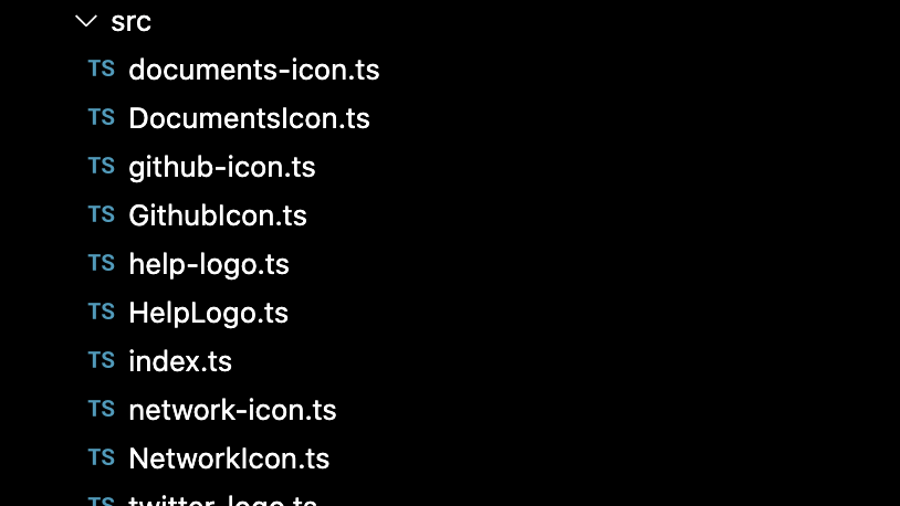
Here’s the folder structure after adding the first handful of SVG icons to A2k:
Only half a dozen icons and this approach is already becoming unwieldy. Also, there’s already a lack of consistency between the naming conventions (Logo vs Icon anyone?). Thirdly, adding a new icon requires a bunch of boilerplate.
This approach not only impacts the development experience and the code complexity, but also those consuming A2k. Because each icon is a component, the consumer will need to register all of the icons they intend to use. If an icon is not explicitly imported, it will not render.
This approach didn’t feel right for A2k. I wanted:
- A simple API, one custom element to rule them all.
- End-users to not have to explicitly register the icons they wanted to use.
- All of our SVG icons served from a single file, which means we only make a single network request.
- Guaranteed constraints across all icons, as individual icons increase the possibility of entropy.
My approach? Refactor the library so that end-users only need to register a single web component. The icon they’d like to use would be specified as a property on that component.
I’m also interested in understanding how other libraries and authors have solved this. Most of these libraries have different requirements and constraints, so understanding different perspectives will help us think critically about which choice is the most appropriate for our given situation.
As a result, I’ll be splitting this article series into two parts.
Part 1 will follow the refactoring of A2k, covering concepts like:
- Using SVG’s
useelement - Using
ems for icon sizing - Using
import.metato import assets
Part 2 will share alternative icon strategies used by more established component libraries and authors.
Part 1: Icon anatomy and refactor
I mentioned in the introduction that each component requires the standard web component boilerplate. As I was using Lit to write my web components, every icon component looked like this:
import { LitElement, svg } from 'lit';

export class HelpIcon extends LitElement {
  render() {
    return svg`
      <svg
	      viewBox="0 0 24 24"
	      fill="none"
    >
      {all the child SVG elements}
    </svg>
    `;
  }
}
Which renders perfectly fine in the browser:
It looks good and the code’s straightforward enough. The main problem is that the boilerplate is identical to the other icon components. So let’s begin consolidating our icons into a single component.
To do that, we’ll need to understand the tools we have at our disposal to achieve this.
SVG use
To separate our icon web component from our SVG image, we need to reference SVG images that live in an external file. We can achieve this through the use of SVG’s use element.
The use element allows us to reference an SVG image and clone it where the use element is used. It’s an excellent way to reduce duplicate SVG logic if the same image is used in several places.
For our use case, use is handy as a means of separating concerns. Our icon component is only concerned about rendering, while an external .svg file houses all of our icons.
Our refactored code looks a little something like this:
// More on this statement later
const url = new URL('../../a2k-icons.svg', import.meta.url).href;

export class A2kIcon extends LitElement {
  // More on these styles later
  static styles = css`
    :host {
      display: flex;
      align-items: center;
      justify-content: center;
      font-size: 2em;
    }
  `;

  @property({ type: String })
  icon = '';

  render() {
    if (!this.icon) {
      console.warn(
        "This icon is a missing a 'name', please specify the 'name' of the icon you want to display"
      );
    }

    return svg`
			// More on these styles later
      <svg height="1em" width="1em">
        <use href="${url}#${this.icon}"></use>
      </svg>
    `;
  }
}
You can see that we’re still wrapping our markup with a top-level svg element.
We’re then using use to clone the SVG image that lives at the href path. The value passed through to href is the combination of the absolute path to the file and a reference to the specific icons id.
We now need to move over to the a2k-icons.svg where our SVG icons live. This is what the a2k-icons.svg looks like once we’ve migrated over our SVGs:
<svg xmlns="<http://www.w3.org/2000/svg>">
  <symbol id="help" width="1em" height="1em" viewBox="0 0 24 24">
    <!-- SVG nodes like <rect /> -->
  </symbol>

  <symbol id="documents" width="1em" height="1em" viewBox="0 0 24 24">
    <!-- SVG nodes like <rect /> -->
  </symbol>

  <!-- Other SVG icons -->
</svg>
This file has a top-level svg element, but our individual icons are wrapped around in a symbol element. The symbol element is used to define an element that can be cloned via the use element. Luckily for us, symbol accepts attributes like viewBox, height, width, etc., making it easy for us to move over our images from the web component into the a2k-icons file.
At this point, our end-user will be able to display the icon providing the icon’s name via a property, like this:
<a2k-icon icon="help"></a2k-icon>
We can now migrate all of the SVGs from our other individual icon components to the a2k-icons.svg file. Once we’ve done that we can delete all of our unused components (which is super satisfying). This is what our folder structure looks like now:
This approach isn’t without its caveats, by bundling all the SVGs into a single file, we serve all of our SVGs to our end-users via a single network request. For libraries that export 1,000+ icons, this will result in longer loading times and a poorer user experience. As we’ll see in part 2, there are benefits and tradeoffs for different approaches.
Wait, Ems? Don’t you mean Rems?!
The consensus in the web development world is that we should generally opt to use rem units over em units. And I 100% agree. The rationale is out of the scope of this article but if you’re interested in understanding when to use the most common CSS units, then I cannot recommend Josh Comeau’s wonderful article “The Surprising Truth About Pixels and Accessibility”, enough.
These are the units we’re going to be talking about here:
- em - a relative CSS unit whose value is based on the element’s font size
- rem - a relative CSS unit whose value is based on the root’s font size
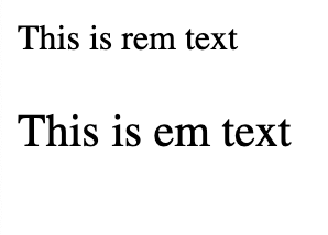
Take the following elements for example:
<div style="font-size: 21px">
  <p style="font-size: 1rem">This is rem text</p>
  <p style="font-size: 1em">This is em text</p>
</div>
Assuming that the document’s root has a font size of 16px, then our first paragraph will display at 16px, while our second paragraph will display at 21px.
The above markup will render in the browser like this:So why did I choose to use ems for the icon sizing?
This was something that I learned from the Every Layout e-book. Using ems can be a particularly handy trick if you plan on accompanying your icons with text. As we saw in the above example, the second paragraph’s font size is relative to the font size inherited from its parent. This is a handy way of ensuring that two closely-tied elements’ grow and shrink in tandem.
You can see this in action by writing the following component:
export class A2kTextIcon extends LitElement {
  static styles = css`
    :host {
      font-size: 24px;
    }
  `;

  render() {
    return html`
      <div>
        <a2k-icon icon="help"></a2k-icon>
        <p>Help</p>
      </div>
    `;
  }
}
All we’re doing is creating a new component that renders our pre-existing icon component but adds some accompanying text. The use of em within the a2k-icon component coupled with the explicit font-size: 24px in the A2kTextIcon’s style property, means that both the paragraph and the icon will scale relative to its parent’s size.
If you’re not interested in coupling your icon with text, then you can either set the size of the icon explicitly or have the icon take up the entire width of its container. Either is a valid option for certain use cases, but beyond the scope of this article.
If you’d like to learn more about composing resilient icon layouts, the Every Layout book is a wonderful resource. It covers a lot of interesting ground, like vertically aligning your icons, perceptually matching height with text, and using logical properties to apply spacing.
import.meta
So now that we’ve created the a2k-icons.svg file, it’s important that we can reference it correctly.
You’ll find that referencing a static file via a relative URL like so…
<use href="../../svg-icons.svg" />…won’t work.
This is because paths in web components are relative to the root document, so you’ll need to create an absolute path directly to the static file.
The wonderful folks at Modern Web dive a little deeper into this behaviour, and they recommend referencing reusable assets with import.meta.url.
So here’s how we use it in our A2kIcon component:
const url = new URL('../../a2k-icons.svg', import.meta.url).href;To understand what’s going on here let’s break this statement into three sections:
import.meta.url../../a2k-icons.svgnew URL(...).href
Firstly, import.meta.url returns the absolute URL of the current ES module, in this case, A2kIcon.ts.
If you run a dev server, and log import.meta.url, you’ll see something like this:
http://localhost:3000/@fs/Users/Repos/andricos-2000/packages/icons/lib/src/A2kIcon.js
Secondly, we have ../../a2k-icons.svg which is the relative path of the file we want to access. This path is relative to where A2kIcon lives in the file system.
Finally, we can use the URL() constructor to generate an absolute path to our target file, the a2k-icons.svg file.
The first argument we’ll pass to URL() is the relative path of the target file. The second argument is our base URL, which we get from import.meta.url.
The following expression:
const url = new URL('../../a2k-icons.svg', import.meta.url).href;…gives us the absolute URL for a2k-icons.svg:
http://localhost:3000/@fs/Users/Repos/andricos-2000/packages/icons/a2k-icons.svg
So this works fine when running our site on a local server, but does it work once the package is bundled?
I can’t speak on behalf of all bundlers, but Vite supports our call to URL() out of the box. It will ensure that the URL points to the correct location even after bundling and asset hashing. Unfortunately, this approach won’t work for components rendered on the server, and won’t work for generating URLs at runtime. To learn more about these limitations, have a look at the Vite docs.
There is a known issue with Vite’s use of import.meta, which will cause headaches for developers consuming your icon library. The way Vite optimises dependencies causes problems when running the development server, and the component no longer has access to its import.meta.url value. This will break any URLs generated using new URL(). If you come across this problem you’ll need to add the following to your vite.config.js
export default {
  optimizeDeps: {
    exclude: ['@a2000/icons'], // or whatever dependency you're having trouble with
  },
};
Is this a suitable approach?
At the beginning of the article, I shared the rationale for moving to this approach. To recap, they were:
- A simple API for a single component.
- End-users only need to register a single icon.
- All icons are served via a single file.
- Improved DX as we can guarantee the same constraints across all icons.
We achieved this through the use of some interesting browser concepts like:
- SVG’s
useelement - When to use
emsoverrems - Building absolute URLs using
import.meta
There are also drawbacks to our approach including:
- End-users will be downloading icons that they don’t use.
- The bundle size can grow large depending on the number of icons in our library. As we’ll discuss in part 2, some libraries have a total icon count of over 1,000.
- End-users can’t use their icon libraries with our icon component.
Depending on your library, these drawbacks may be trivial, or they could result in a degraded experience for your end-users. So, how do other libraries approach this problem and what are the drawbacks? We’ll cover this in part 2. Stay tuned.
If you have an icon library that takes a novel approach to managing your different icons, then please leave a comment, or reach out to me on Twitter. I’m building a list of icon libraries to compare for part 2, and would love to learn about any interesting approaches used out in the wild.
Experience Backlight today!
🐤 Check out Backlight’s starter kits, up to 3 users can collaborate for free!
💻 Book a demo to see Backlight in action
💬 Join the official Backlight Discord community
👋 Follow us on Twitter for latest updates
 Tweet
Tweet
 Linkedin