
Design Tokens and how a W3C specification will help going forward
-

- Name
- Joren
- @jorenbroekema
-

- Name
- Thaís
- @th4is_ds
In this blog, we will talk about design tokens and their usage. We will expand on how different tools work with them, including our tool: Backlight. Finally, we will discuss the W3C Draft Specification for Design Tokens and how this will change the Design Token landscape.
A first public editor’s draft of the spec was released on September 23rd, 2021, and there is now an open discussion on the draft, so make sure to join the conversation on GitHub!
Where it all started
The way digital products get designed and developed has changed dramatically over the years. Not long ago, designers would spend days making the perfect visual representation of a website or interface. Then, developers would spend the same amount of time - if not more - to break it down into code, based on what they could see in the image file the designer provided. Soon, the digital product industry realized this wasn’t an efficient way of working, and design tools began to better represent the designs in the development way of thinking. These new tools and ways of working made space for component libraries and design systems. We’re now at the next step of this evolution: design tokens.
What are Design Tokens?
With design systems, individual items on a screen - like a text input - turned into components: reusable elements that are built in one place and referenced in different parts of the product. Similarly, the most basic brand definitions like color, typography, spacing, etc., are turning into Design Tokens. These design decisions are “hard-coded” values, but with Design Tokens they are turned into a string that gets registered in one place - like a JSON file - and re-used everywhere in the interface, enabling an extra layer of consistency to an ever-evolving product. The advantage of the Design Tokens approach is the ability to store the design decisions generically. This information can then get translated into any technology or platform.
Design Tokens usage
We utilize Design Tokens to describe visual styles.
The most common examples are colors, typography, radii, spacing, sizing, and shadows.
However, the breakdown of each category is starting to grow.
For example, typography is used to define just a couple of design decisions, like the font-family and default font-sizes.
Nowadays, it makes sense to define every aspect of the typography as a token: line-height, font-weight, letter spacing, text case, and text-decoration.
Additionally, the abstraction layers in which we can define a “design decision” are also expanding.
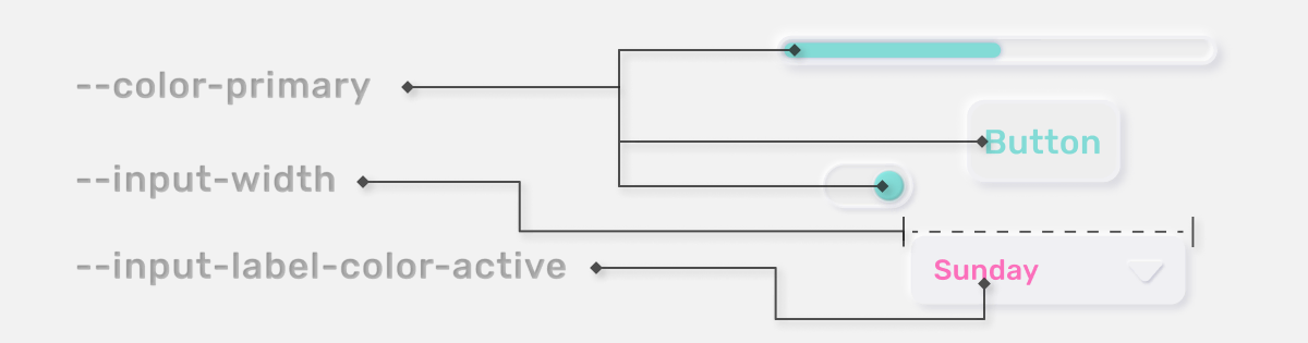
A basic example is expanding our main colors, for example, color-primary.
We can also describe a more component-specific token, like a button-background-color.
W3C Draft Specification for Design Tokens
Recently, a new W3C community group emerged specifically to standardize around Design Tokens: Design Tokens Community Group, this is their homepage. The Design Tokens Community Group’s goal is to provide standards upon which products and design tools can rely for sharing stylistic pieces of a design system at scale.
Here, we will focus on the design tools part, as Backlight is a tool for building design systems.
If you want to get more details on the design token spec, do check out the spec. Given how fast it is being iterated upon, this blog will get outdated quickly.
The reason a standard format for design tokens is important is that there’s a lot of tooling that gets involved with Design Tokens:
- creating design tokens
- maintaining and storing design tokens
- consuming the tokens, for example, in a design tool like Figma
- exporting tokens to different platforms, so coded components can use them. Think CSS variables, iOS/Android tokens, etc.
For these tools to be working together nicely, a standardized format for design tokens is necessary. Right now, the situation is that there are lots of slightly diverging formats for which transformers/converters need to be written and maintained over time.
One example of such converters is going from Style-Dictionary to Figma Tokens Plugin, for which we wrote a transformer which this article outlines. The maintainer of this Figma Tokens Plugin even wrote a transformer that essentially does the reverse operation.
In summary, a Design Token as specified by the draft looks like this:
{
  "tokenname": {
    "$value": "token value",
    "$type": "color",
    "$description": "Description of this token"
  }
}
Or a more realistic example:
{
  "colors": {
    "$type": "color",
    "accent": {
      "base": {
        "$value": "#F8C307",
        "$description": "Primary color of our brand"
      }
    }
  }
}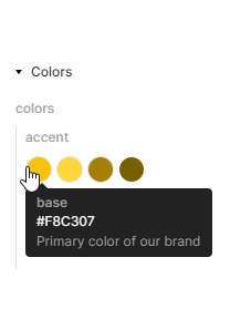
Here, you can see that tokens may be nested in groups and that a type can apply to a group and an individual token.
The spec is still very much work in progress, and there are many things that have yet to be specified or for which best practices still need to emerge. Therefore, tools still have some way to go in converging to this spec, but they’re making progress already. Examples are Style Dictionary and Figma Tokens Plugin.
Below are some examples that are either unspecified or still lack best practices.
We recommend reading Naming Tokens in Design Systems. It’s a great resource on how to name and compose tokens. Many of its conclusions are very similar to how we ended up authoring tokens after multiple iterations of struggling.
Composing Tokens
Let’s imagine for a minute that we have a tokenized input component.
input.tokens.json:
{
  "input": {
    "label": {
      "size": {
        "$value": "{font.base}"
      },
      "color": {
        "$value": "{color.gray.900}"
      }
    }
  }
}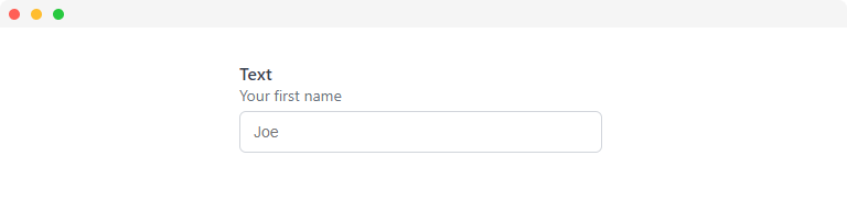
The upper property key is the name of the component, and its children are the different parts of the component:
- the label
- the input element itself
- a help text
- a feedback message
However, things quickly get more complicated, as you may have different variants of inputs. For inputs, this might not make a whole lot of sense. However, for a component like a button, variants like CTA, primary, outline, secondary, etc., are quite common. How do you go about grouping those in design tokens?
Then to make things more complicated, there are also states like hover, disabled, focused, etc.
It may make sense to group in this order: variants -> states -> parts -> etc., but this is not a trivial choice to make; it can be tricky representing a multi-dimensional matrix of variations into a JSON object.
Token explicitness
Continuing our example of a tokenized input component, let’s imagine an extension called input-amount, which has a fixed width of 200px.
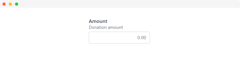
input-amount.tokens.json:
{
  "input-amount": {
    "label": {
      "size": {
        "$value": "{font.base}"
      },
      "color": {
        "$value": "{color.gray.900}"
      }
    },
    "width": {
      "$value": "200px"
    }
  }
}
The question to ask here is: “Why are we duplicating the label group if it’s identical to the one in our regular input tokens?“.
It’s a valid question, one that I asked on Twitter a while ago.
How explicit do you make your tokens when they are overrides from another existing token group?
There’s essentially a spectrum where on the one hand, you have minimal, and on the other hand, you have explicit.
Minimal
Explicit

If you choose explicitly, you get the token snippet above. If you go with a minimal approach, you get this:
input-amount.tokens.json:
{
  "input-amount": {
    "$extends": "{input}",
    "width": {
      "$value": "200px"
    }
  }
}
The
$extendsproperty I added here is just an idea and not part of the spec. Perhaps it helps tools understand that one token group is extending another.
The pro of using the minimal approach is a lot less maintenance of duplicated tokens, a lot less repeating ourselves.
The cons are that in terms of token consumption in CSS, it may require additional knowledge:
input-amount.css:
:host {
  width: var(--input-amount-width);
}

:host(label) {
  /* Using from input tokens instead of input-amount */
  font-size: var(--input-label-size);
  color: var(--input-label-color);
}
It may be counter-intuitive to the developer implementing the coded component that they are required to use the tokens from the base component in some areas and the tokens from the extension component in others.
Another con is that if the designer suddenly decides the input-amount is now different from the regular amount in terms of the label color, it requires a change in the CSS to activate that design change.
input-amount.css:
input {
  width: var(--input-amount-width);
}

label {
  font-size: var(--input-amount-label-size);
  color: var(--input-amount-label-color);
}
In the example above, we use explicit tokens, which means we get a lot of duplicate parts in our JSON, but at least it makes the CSS more stable for future change.
There’s a finite but large number of parameters that a designer can change in the future, requiring a CSS change. Are we going to parameterize every possible CSS property to be forward compatible with every potential change in the design?
For me, the answer is no, because that would create a huge CSS bloat, exponentially increasing for each variation of the component:
In this example, it’s just two variations, and we didn’t even cover nearly every relevant CSS property, so you can probably see how this would escalate quickly.
Therefore, my personal preference is to use a minimal approach for tokenizing, only overriding a token where needed. With some metadata, it should help tools understand the inheritance. Here’s another example where this might be useful:
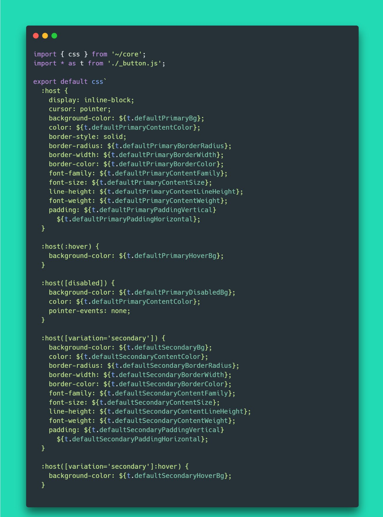
button.tokens.json:
{
"button": {
"variants": {
"base": {
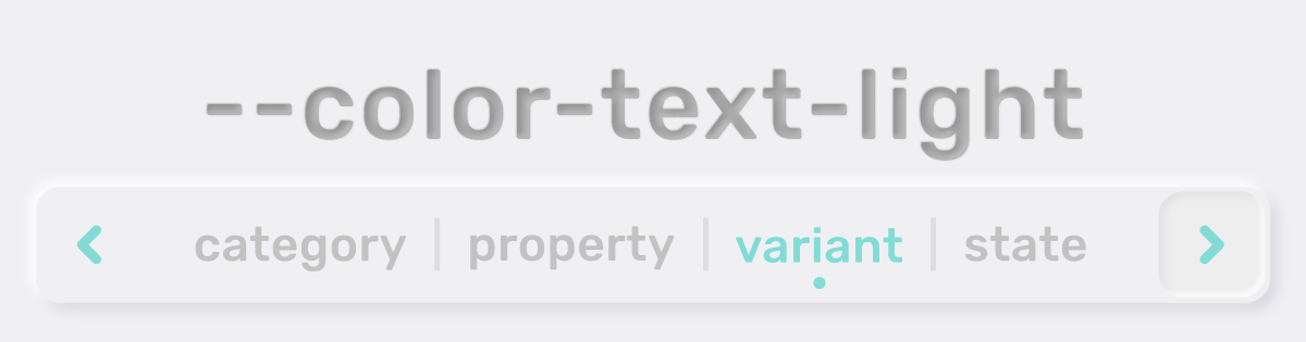
"bg": { "$value": "{colors.primary}" },
"color": { "$value": "{colors.text.light}" },
"border": {
"radius": { "$value": "{radii.sm}" }
},
"padding": {
"vertical": { "$value": "{spacing.s3}" },
"horizontal": { "$value": "{spacing.s4}" }
}
},
"secondary": {
"bg": { "$value": "{colors.secondary}" },
"color": { "$value": "{colors.text.light}" },
"$extends": "{button.variants.base}"
}
}
}
}Note: this
$extendsproperty is just an idea. It’s not part of the spec at the time of writing this.
Themes
There’s a big open question about dealing with themes inside design tokens. I will discuss some options I’ve seen thrown around.
First of all, what is theming exactly? The first response to that may be dark/light theme. However, answers can take a broader scope. What about high-contrast mode for users with impaired vision? What about a solarized version of your brand? What about changing just the luminosity of your default theme? What about entirely custom themes with different color palettes? What about a theme that increases space or font-size on your page? There are many things under the umbrella of a theme, far more than dark/light theme. It all depends on how much the author of an app wants to play into the customization desires of its users.
Separate token files for each theme
One approach to separate themes is using the exact same token structures but dividing them into different folders.
light/buttons.tokens.json:
{
  "button": {
    "variants": {
      "outline": {
        "bg": { "$value": "transparent" },
        "color": { "$value": "{colors.text.dark}" },
        "$extends": "{button.variants.base}"
      }
    }
  }
}dark/buttons.tokens.json:
{
  "button": {
    "variants": {
      "outline": {
        "bg": { "$value": "transparent" },
        "color": { "$value": "{colors.text.light}" },
        "$extends": "{button.variants.base}"
      }
    }
  }
}
Then when running something like style-dictionary, you could run two instances, one for each theme.
It’s a clear separation, but the downside is more duplicate token code, meaning if you restructure your tokens, you have to apply the same changes in all your themes.
Combining themes into a single group
Instead of the approach above, let’s try combining the different themes into a single token structure by using groups to differentiate.
buttons.tokens.json:
{
  "button": {
    "variants": {
      "base": {
        "themes": {
          "light": {
            "bg": { "$value": "{colors.primary}" },
            "color": { "$value": "{colors.text.light}" },
            "border": {
              "radius": { "$value": "{radii.sm}" }
            },
            "padding": {
              "vertical": { "$value": "{spacing.s3}" },
              "horizontal": { "$value": "{spacing.s4}" }
            }
          },
          "dark": {
            "$extends": "{button.variants.base.themes.light}"
          }
        }
      },
      "outline": {
        "themes": {
          "light": {
            "bg": { "$value": "transparent" },
            "color": { "$value": "{colors.text.dark}" },
            "$extends": "{button.variants.base.themes.light}"
          },
          "dark": {
            "color": { "$value": "{colors.text.light}" },
            "$extends": "{button.variants.outline.themes.light}"
          }
        }
      }
    }
  }
}
The hierarchy is perhaps a bit complex, but essentially there’s a base variant of the button, which looks the same for light and dark theme. Therefore, the dark theme extends the light theme.
The outline button has a transparent background. Therefore, the text color depends on the theme. Thus, the outline light theme extends the base light theme except with an override for the background and the text color. The dark theme then extends the light theme of the outline button but changes the text color to light to contrast on dark theme.
A big pro of this approach is that you’re combining into a single token structure rather than completely separating between themes which enables easier restructures/refactors because you essentially have less duplicate code going around.
A downside is that hierarchies and grouping can get pretty complicated to reason about. Having metadata present describing the hierarchies can help if tooling like autocomplete can interpret the metadata and assist the user using the tokens.
Combining themes into a single token
Instead of using groups to differentiate and deal with complicated references/hierarchies, let’s combine themes into a single token.
buttons.tokens.json:
{
  "button": {
    "variants": {
      "outline": {
        "bg": { "$value": "transparent" },
        "color": {
          "$value": {
            "light": "{colors.text.dark}",
            "dark": "{colors.text.light}"
          }
        },
        "$extends": "{button.variants.base}"
      }
    }
  }
}
In the above example, we make the $value of the token an object, which defines the different values for each theme.
A big upside of this is that it reduces duplicate code to an absolute minimum. Complicated nestings/hierarchies/groupings aren’t a problem. You only create $value objects if theming differences apply. Otherwise, it’s the same value for all themes.
Combining into a single token makes sense because even between vastly different themes when tokenizing everything about a component, you will still have more overlap than difference.
I don’t personally see a downside of this approach. It is my personal preference. It’s similar to an approach outlined by Daniel Banks, one of the maintainers of Style-Dictionary, he talks about it in a blogpost.
Future
Two things will probably happen:
- The Design Tokens specification will expand and improve and grow towards consensus, including the topics I discussed
- Tools will start to align and converge to the spec as the spec reaches maturity
As this happens, the experience for developers and design tool users will improve as a consequence of tools and platforms starting to achieve seamless integration. In the end, this is why this standardization is important. For us, it means that developers and designers can be better integrated inside a single workflow, solving current problems with design diverging from code.
A first public editor’s draft of the spec was released on September 23rd, 2021, and there is now an open discussion on the draft, so make sure to join the conversation on GitHub!
 Tweet
Tweet
 Linkedin