
5 Reasons to use web components in your design system
-

- Name
- Sonia Singla
- @soniasinglas
-

- Name
- Joren
- @jorenbroekema
The big question is: why are these IT powerhouses focused on web components? Are they really so important? During the last decade, the use of web components has skyrocketed, and they have become one of the most popular new web platform technologies. Web components prove to be quite valuable in a wide range of applications.
Web components are interchangeable between frameworks and libraries because of their compatibility with a variety of tech stacks. They offer cross-platform development and ensure brand consistency. Web components allow us to break up a complex web app into reusable pieces that will reliably look and function the same, regardless of what they share a page with. They offer a consistent approach to interfacing with them via their attributes, and they are mainly focused on doing one thing well. Another advantage of web components is that when built on top of browser APIs/standards rather than frameworks, the JavaScript footprint of the design system is way lighter, which is key for site performance.
Why build a design system using web components?
Easy to customize and standardize styles
One of the primary characteristics of web components is the ability to create customized pieces that may be adjusted and incorporated into the design system. Any design can be stylized and customized with web components. We can build a customizable UI component library using HTML/CSS/JS to meet brand standards.
Supported by modern browsers
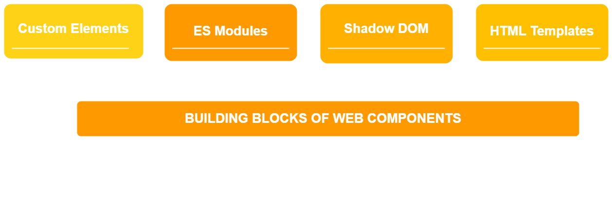
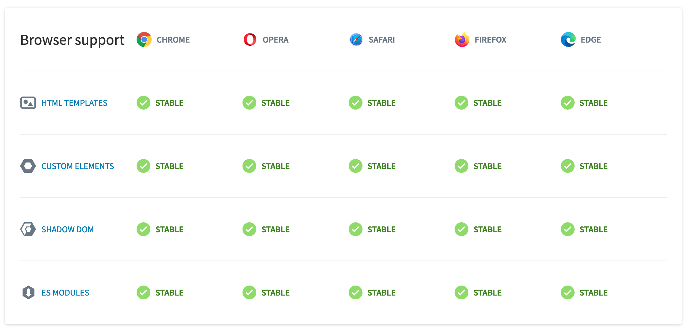
All evergreen browsers, Chrome, Opera, Safari, Firefox, and Edge, support web component standards. It implies that the APIs Custom Elements, HTML Templates, Shadow DOM and ES Modules are fully functional and provide full support with these browsers. It makes developers’ and designers’ lives easier since they can write on top of customizable HTML tags without worrying about the frameworks and libraries.
Framework-independent
In big companies, different teams contribute towards various areas of a project. These teams are primarily independent, which means that they build the applications using their own tools and frameworks. However, as a business, you would want to ensure that the user experience is consistent throughout the product, regardless of what each team decides to work with. It is advisable to create a library of web components, independent of any framework. In doing so, these components can be used interchangeably by the teams regardless of the framework they are using.
However, there are caveats of using with web components with some frameworks like React and Angular. The main problem while using React is React’s inability to bind the custom events from web components and its inability to pass rich data due to the lack of property binding into custom elements. The Angular framework, on the other hand, is reliant on their own web component library, which leads to plenty of issues when it comes to importing and configuring packages.
Accessibility
Web components can be made accessible. For a web component to be interactive, e.g. any UI control, it should be keyboard focusable. WAI-ARIA Authoring Practices can help with this. The states of interactive controls include focus, hover and active. They should all be easily visible and ideally, each has a distinct look.
The page when controlled by assistive technology helps users interact with web components using a keyboard, mouse, etc.
Another way to make custom elements more accessible is by using the proper aria attributes; all we have to do is follow the WAI-ARIA definitions. Let’s take a look at an example, an accessible slider component built using a web component:
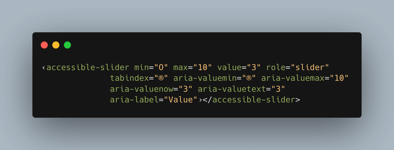
Accessible slider component built with web component
It’s not always the case that Shadow DOM will help in achieving accessibility, sometimes it can make things harder.
ARIA references through properties like aria-describedby and aria-labelledby have a value that represents the id of the element they describe or label. If there is a shadow boundary between the id and the element that references it through aria- , the reference is essentially broken and does not work. To work around that, you could project the element into the Light DOM instead, by using slots for example.
Another example is <form> and custom input elements. If there is a shadow boundary between the native form and the native input element that the custom element is wrapping, the input will not participate in the form. Form Participation API is meant to solve this problem, but has not been shipped by Firefox and Safari yet. For now, this can be solved in a similar manner as the previous issue, by projecting the native inputs into Light DOM.
💡 Take a look at all the ways to make a web component.
Encapsulation
All of the encapsulation of styles is provided by the Shadow DOM. It separates your components from the rest of your document by giving them their own DOM. This means that global styles (excluding CSS custom properties/variables and inherited styles) have no effect on it, and its own styles have no effect on other elements in the parent document. We won’t have to worry about CSS leaks or naming conventions anymore because the HTML and CSS code inside a shadow DOM isn’t visible to the main DOM. Exceptions are:
Shadow DOM has the opposite purpose of global stylesheets. If we are creating a reusable component that need to use a global stylesheet like Tailwind or Bootstrap, we can turn Shadow DOM off. Though, with encapsulation the developer has complete control over the API and which features are made available to its users. With Shadow DOM, developers can also open up DOM nodes to styling from outside by exposing them as shadow parts.
Web components offer more than the features mentioned above. They are production-ready as companies like GitHub are using open source web components. You can read more here. Writing accessible components from scratch is costly and not all companies can afford to do it. Thanks to web components, we can incorporate existing open source component libraries into our design system, or build our own using a white label-based layer like Lion. Here’s a curated selection of the most important open source component libraries that you can use as a foundation for your design system. Also, check out why you should use open source component libraries in your design system.

Experience Backlight today!
🐤 Check out Backlight’s starter kits
💬 Join the official Backlight Discord community
👋 Follow us on Twitter for the latest updates
 Tweet
Tweet
 Linkedin