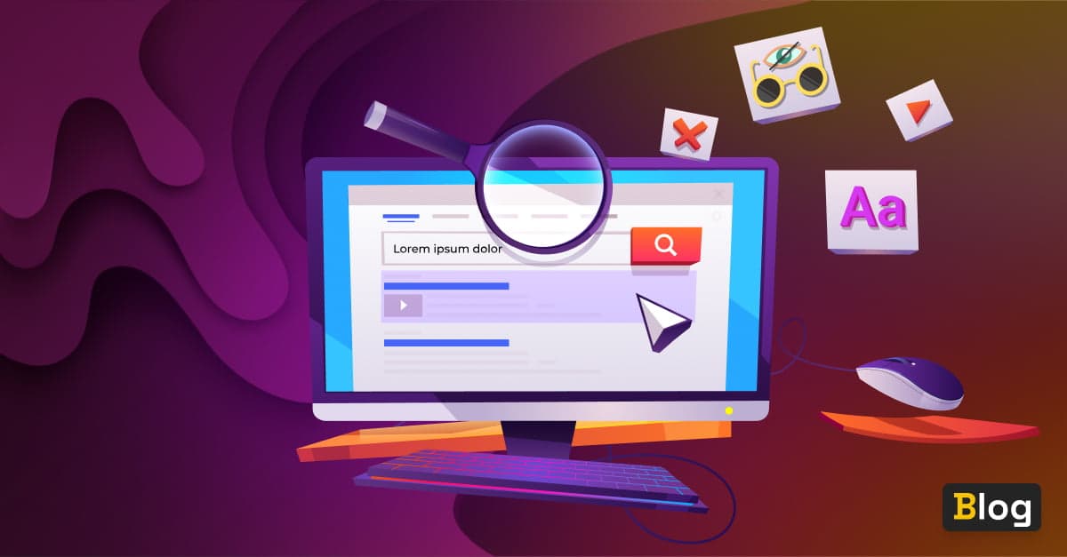
The importance of accessibility in design systems
-

- Name
- Thaís
- @th4is_ds
Weaving A11y into the fabric of your design system
In this article we’ll be taking a deep dive into accessibility and design systems. But let’s start with a story. Imagine, you were in an accident - nothing serious, probably something everyday around the home. As we all know, the home is like the jungle of hazardous environments. You have finally gotten around to changing all your light bulbs to eco-friendly ones. Problem is, you’ve fallen off the wonky stool you’d convinced yourself was stable enough to take your weight and landed awkwardly. You’ve damaged the fingers of your right hand and they’re swelling up. It’s a sprain, the doctor says. But you’ve got a presentation coming up at work and now you can’t use the mouse. Time to turn accidents into opportunity and try out one-handed keyboard navigation and screen readers.
Now you know how a large percentage of the population feels, with rising cases of repetitive sprain injury, carpal tunnel syndrome and many other chronic problems as well as the many disabilities that restrict how we use computers.
We all understand that these days a11y is no longer something just for people with disabilities. Our digital evolution needs to keep pace with our social evolution. A11y is in effect inclusivity, so how do you weave a11y into your design system fabric? In this article, we will first examine which parts of the design system need special attention for a11y. Next, we’ll look at which tools will help you as a designer, a developer or as a product owner on the way towards an accessible design system. Finally, we’ll question how to sell a11y to your organization. Why? Because for us a11y needs to be a team effort.
The parts
The focus here is on design systems. What we want when building an inclusive design system is to make components accessible right from the outset and following on from this, we need to make sure they remain accessible throughout the entire workflow, step by step, until they reach the users. To ensure this is the case, you need to be able to test if components are easily accessible at every stage of the process. So, what is a11y? And why is it important?
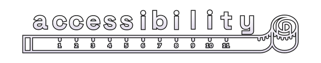
A11y is a feature of our daily work just as it is in our daily lives. For example, some people have a screen reader feature on their phones which turns text into speech. There are many browser extensions available to install if you have a11y issues. So let’s have a closer look at what it is and why it is written as ‘a-11-y’. The number ‘11’ stands for the 11 characters between ‘a’ and ‘y’. Representing the word in this way is itself a demonstration of a11y, as typing and reading the word becomes easier and therefore more accessible.. Making a11y a part of your website means everyone is able to use it.
Going back to our original story, that accident you were in, remember? You’re now unable to operate your smartphone as you used to because you can’t move your thumb. This is a temporary setback, which we all face at some point in our working lives. However, you may have a permanent disability, perhaps you have color vision deficiency, poor eyesight, or are visually impaired completely. Sure, listening to the sexy voice of Siri is nice, but it may not give you full functionality. Perhaps you have a physical disability. Have you ever tried scrolling through social media using only your keyboard?
Last but not least, you have probably been situationally affected. Have you ever tried watching a video in a very loud environment without headphones? At some point you have probably switched on the captions. Or maybe you’ve been out driving and had a sudden urge to listen to some death metal at high volume? Luckily you can switch your device to car mode, so the buttons are bigger and easier to press. There are a vast number of different kinds of keyboards and input devices available now. These are just some examples. As you can see, a11y is an intrinsic feature in everyone’s life, whether there’s a disability or not.
A11y is all about enabling everyone to use your application or website, in spite of any obstacles which come in their way, be they temporary, permanent or situational. How can you make your website easier to access no matter how your target user is or where they may find themselves?
To address these many different needs when creating an accessible website, it’s helpful to have an overview or checklist of important requirements. This is where the Web Content Accessibility Guidelines come into play. These guidelines were set up to make the web more accessible for everyone and have evolved to become legal standards. They involve everything from design to development to user experience. We’ll cover some examples later on. Most importantly, these guidelines have been tested by people with various disabilities, which is crucial in order to capture a full range of users’ needs.
The WCAG periodically publishes new updates, therefore guidelines are constantly under review and are often redefined. For example, only recently the guidelines on keyboard focus were updated, and now it includes that the indicator should appear in order to provide optimal a11y. Above all, this is an ongoing process. It is not just a vital part of design or of development, or of business, it is everything together and should be considered as early as possible. Your product can never be 100% accessible. Again, a11y is a process, so by definition is never fully correct. By starting to include a11y from the outset, you are providing more than most websites on the Internet right now. And all websites and design systems will need continual monitoring and updating for better a11y.
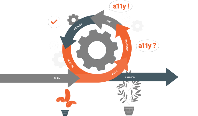
You may only become aware of a11y and design systems upon embarking on a redesign of your website. When analyzing the data from your old website, you suddenly discover the lack of a11y. Now both design systems and a11y start to play a huge role in your company. How accessible is your product? You may be going through a rebranding to revise the impression your company makes on your consumer. It is important to create an accessible, usable and inclusive place for everyone. A11y should be found throughout the whole process from designing to developing to actually using the website. You will need documentation to keep track of the design. Above all, it must contain your new branding. Using a design system ensures a more holistic approach. It has a better outcome for users and decisions on creating accessible components are made once. And these components can be reused among various projects and still stay accessible and consistent. As a direct result, design and development processes will speed up.
How to
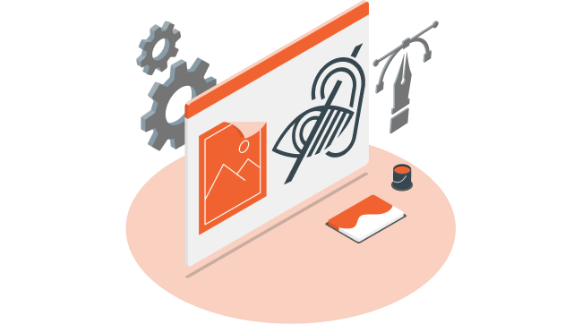
Now, to the fun part - let’s take a look at some of the tools of the trade. We’ll give you a step-by-step guide to a11y. You will learn how to make your colors accessible, how to choose the right typeface and what is important when using animations or images. Then we’ll consider the role of structure and hierarchy and guide you through accessible coding.
Colors
Let’s start with making the colors of existing projects accessible. A subtle interface might be pleasant to look at for some, but can make the screen quite tricky to view for others. The reason for that is a low contrast ratio. If two colors appear too similar, it may affect the legibility. Contrast ratio measures the difference in brightness between two colors. It is expressed as a ratio from 1:1 which is white on white, to 21:1 being black on white. AAA is for excellent contrast and legibility, AA for medium contrast and Fail when the contrast is not high enough, as defined by WCAG techniques.
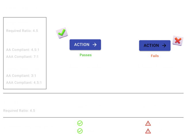
In Figma, there are several plugins which will measure the different contrast ratio of colors. There’s one that’s called A11y - Color Contrast Checker, for example. This plugin will validate the contrast ratio of a visible text and its the background color, pointing out whether it meets WCAG AA and or AAA requirement, within the design files. Be aware that in some checks the color might work on a larger text but it would fail on normal size text as the accessibility requirements are different. When it comes to typography and color contrast, make sure to test it thoroughly for every scenario your design system covers.
In the case of Sketch there’s the Accessibility Assistant plugin with similar features.
If you can’t find a plugin within the design tool that you like to work with, there are also website checkers available, like Color Contrast Checker. Not only it shows if the combination of color and contrast is good, it also highlights the different font sizes and if the contrast passes the different accessibility requirements.
Providing enough contrast through color and font size is not only important for the text used throughout the website copy, but it’s quite relevant when checking components like the alert messages. Therefore, it is important to validate it in the components of your design system.
Beyond text: iconography
Icons are essential as they provide additional information, reduce clutter, they give a clear overview and above all they are easy to understand. Icons can be faster at conveying meaning than written text, because the human brain can process images very quickly. Icons and images also stay in your memory longer than text. They will ideally make sense even if you don’t know how to read, nevermind understand the language in use. Also, they help get the message across in spite of color blindness. Different colors may look indistinguishable, so you must never rely on color alone. Your icon should encapsulate the meaning. Paradoxically. you have to make sure to provide AAA color contrast between icons and background in order for them to work. So, don’t forget to check the color contrast of your icons as well.

Dark theme
The latest trend is giving the option to view your website or application in a dark theme. Recently, designs with the Dark Mode option have become more popular. Nevertheless, switching themes isn’t as easy as it sounds. You should never reverse colors because it would differ from a physical, natural look. Lighter objects appear closer while darker objects appear farther away. Of course, this might be enhanced by additionally using a shadow when simply reversing colors of the same elements. Optical appearances may break and look unnatural. This will not only influence the design, but may also have an effect on the usability. Also, you should never use black, it becomes too harsh on the eyes when reading text for longer periods of time. Pure black reduces the amount of light, which is emitted from the screen, so your eyes need to be opened wider to get all the information, just like reading a book in the dark. This will not only exhaust your eyes but will also affect readability. Text will start blurring into the background after a while, especially when using thin or small typefaces. So instead, try using a slightly lighter color than pure black.
Font family
Consider the subtitle of this article - “Weaving A11y into the fabric of your design system”. It’s easy to misread A11y as ‘Ally’ and wonder, who is Ally? And why are they weaving her into anything, nevermind your design system?! It’s not just the way the word ‘accessibility’ is abbreviated that leads to the confusion, you also need to choose the right typeface for the job at hand.
It is useful to compare characters that appear similar, in order to optimize your choice of typeface. So let’s take a look at the number ‘1’ alongside the uppercase letter ‘I’, and the lowercase letter ‘l’ in some popular typefaces - Roboto, Poppins and Baskerville. Some typefaces do not make a great enough distinction between these three characters. When seeing them next to each other, it may lead to confusion because the readability suffers. An example to illustrate this would be in Poppins typeface where these characters are almost the same -’ 1Il’. Other typefaces do make a clear distinction between them, as you can see with Roboto or Baskerville - ‘1Il’ ‘1Il’.
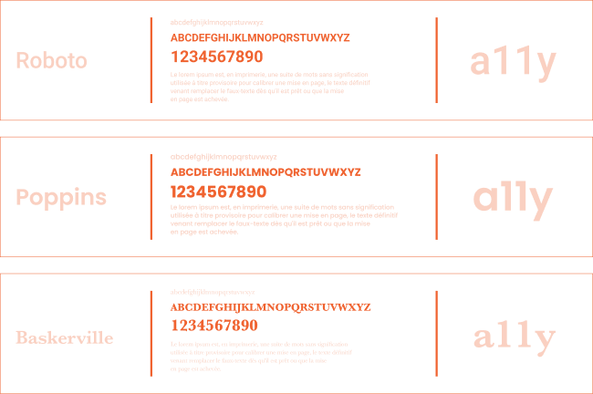
The correct choice of font and typeface is therefore a crucial part of ensuring a11y. When creating an accessible website, you must also make sure your font and typeface is selected for the particular surroundings. Ideally the font should have a medium to tall x-height, and enough contrast between stem and bar, depending on the size. Be careful though! Too much contrast may cause bad readability. Texts will start to flicker or blur when reading for longer periods of time.
For a speedier loading time, make sure to choose fewer typefaces. Depending on the usage and language, you might also need different kinds of fonts, ligatures and glyphs. Bonus tip - make sure your typeface has good kerning. You can test this by checking the space between the letters r, m and n. Write them down in your preferred typeface and check if they appear to meld together. If so, you can either increase the letter spacing or switch to another typeface.
The code side
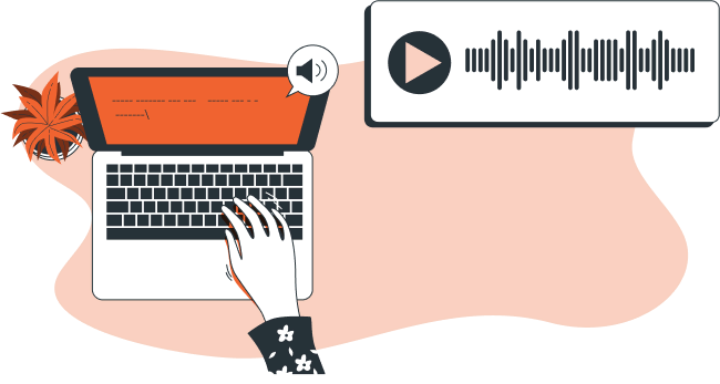
As we’ve learned before, people in general are using screen readers more and more. It is vital for screen readers to understand the structure and the hierarchy of your page. It’s important to order headline tags and levels semantically so that screen readers can navigate for the user, or with the user. There are various tools available to help you get the right heading level even inside nested components, such as React heading, for example, which is a small library. The next thing to consider is to add clear focus states to your designs, especially for keyboard-only users who use tabs to navigate as this may be their only means of knowing where they are on the page. It can be useful for your developers and designers to work collaboratively and put together some prototypes of the components semantically with the HTML5 tags, so you can visualize if that makes sense in practice. After that you can really concentrate on developing the components.

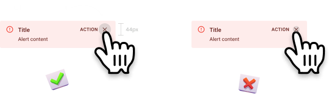
The naming of buttons and links needs to be really clear and precise to sound meaningful coming from the screen reader. What does a link that is labeled ‘read more’ mean? When read aloud by your screen reader, this can sound like an order, not an invitation. This is not meaningful to a screen reader user. To have a link called ‘read more about accessibility here’ is really helpful and meaningful to the screen reader user. We also need to choose the right size for clickable objects. A11y guidelines advise the use of 44 x 44 CSS pixels for the target size.
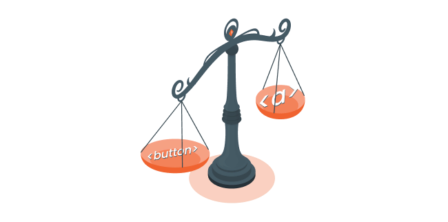
There has been an ongoing debate as to what precisely constitutes a button or a link and so far what we have settled on as an industry is that buttons are for actions like registering, logging out or submitting data and links are for navigation - like going from a home page to a product detail page. Buttons and links should be visually distinguishable. Links are underlined for this reason.
For keyboard-only users, buttons are triggered by either a <Space> key or an <Enter> key, but links are only triggered by an <Enter> key. Sometimes a developer may create a link tag that looks like a button whereas in fact, technically, it’s a link. For the keyboard user who encounters this and tries to trigger it via the <Space> key, nothing will happen. The only fix is to use a button element for a button and <a> tag for links.
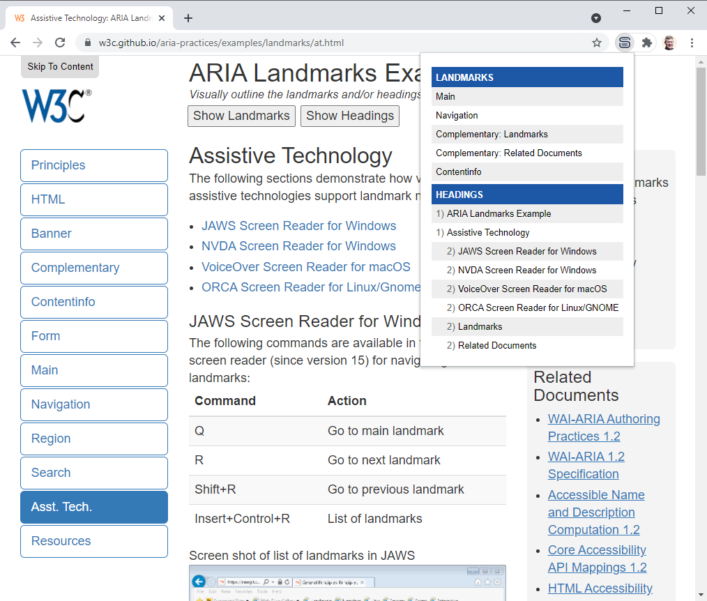
There are many tools that you can use to check the hierarchy instructions on your website. There’s a Chrome plug-in called Headings Map and when you click on it, you immediately get the outline of your headings visualized on screen so you can check whether the outline makes sense to you or not. You should never skip heading levels, they should always appear in order so that the screen reader user will click through them in a way that makes sense when read aloud to the user.
Other helpful tools are, for example, the ARIA: landmark roles that you can use to visualize how the screen reader sees your site. There are eight different roles, such as banner - maybe your company logo, navigation - a menu or list and the main landmark which is the main content of that page. Adding the different roles allows the screen reader to jump between sections or blocks of content.
What should you do when you have a navigational Call To Action (CTA)? You might have navigational CTAs on a home page with a link to your product detail page. Clearly you’re navigating, so it is a link, but then again, we want people to click on it to do something with it. So we style it like a button and there is this word ‘action’ in it. So it is a button, right? To increase your conversions, the CTAs on your page should look like buttons most of the time. Buttons are more attractive to your potential customer. It’s important to know what the users expect to help distinguish if a navigational CTA as something other than a button or a link. The action implied by the button is preferable to the more administrative feel of the underlined link. After all, you need to increase those actions!

When considering accessible code, you should aim to use frameworks and libraries that foster a11y best practices. We made a curated list of the best accessible component libraries. These come with components in which some aspects of a11y are already built-in, allowing you to focus on other important details of your design system. Also, build component APIs that foster best practices such as requiring old texts on images. Give good and complete examples in your code documentation to make it easy for people to onboard when they come to the project. You could also use a storybook a11y add-on for your storybooks and components catalog. But the most important thing again, is to use the HTML5 semantic elements. When you build your components use the <header>, <main>, <footer> landmarks. Use <button> for buttons, <a> tag for links and so on. And whenever this is not possible, try it another way. Maybe change the component. Think about the user case again, and if it still fails, you can use the ARIA tags to augment your code with relevant a11y data.
Testing
As a11y is an ongoing process, so too is testing. You can add a11y tests to your automated testing pipelines in Github actions, but you will only catch between at around 57 percent of a11y issues. It’s a low number and in practice, you may find automated testing does not catch the most relevant issues compared to manual a11y testing, so it’s important to keep up manual testing also. A11y is a process that only works if design, code and business work together. Why not promote ‘a11y Fridays’ in your company where people dedicate the day to working solely with a screen reader or keyboard to keep regularly testing your a11y.
Testing automation can help capture the unanticipated a11y impact on ready components after a small but relevant modification, like the change of color values. In the case of manual testing, it’s much easier fix the issues instantly when you’re able see and interact with the components in the same place where you have your code, in a platform like Backlight.dev 😉
Accessible components to help us all
Finally we come to how to sell a11y to your organization. It’s paramount that everyone’s on board, so that a11y is at the forefront of everyone’s mind throughout the design and development process. The number one selling point is that good a11y leads to a better overall user-experience. As we’ve seen, it’s not only people with disabilities that profit from accessible websites, although this demographic is a lot bigger than you may think. Life with some form of disability is not uncommon. The United Nations factsheet points out that around 15 percent of the worl’s population, or about a billion people, are in such condition. All of us at some point in our lives or in certain situations will profit from accessible websites. On top of this, a11y can really boost your search engine optimization ranking. Why? Because 96.8% of the world’s top one million home pages have detectable a11y guideline failures. If you can eliminate all the detected issues, this is a really big opportunity. The UX factor increases and the SEO factor increases - these are really low-hanging fruit. The earlier you get a11y into your product life-cycle, the more positive effects you have - cleaner code, better documentation across teams while generating learning opportunities to attract new people, which is also important in our industry. And in any case there are legal obligations to consider. The European Accessibility Act applies to all businesses in the European Union, with few exceptions.
Let’s recap and see if we have met your expectations. We spoke about which part of the design system needs attention for a11y. You’ve got a good and applicable overview of the most important aspects. We showed you some tools to help you as a designer, developer or product owner on the way towards an accessible design system. We discussed how to sell a11y to your organization. Baking a11y into your design system is an unending journey, you’ve got to keep working on it. Ultimately though, a11y is inclusivity. It’s just the right thing to do, and we can all relate to that, right?
 Tweet
Tweet
 Linkedin