Introducing Yogi - a Chakra UI Design System
-

- Name
- Pierrick
- @S3kelman1
-

- Name
- Georges
- @georges_gomes
-

- Name
- Mihai
- @mihai_veres
YOGI is a React Design System starter-kit for Backlight, based on Chakra UI. Building a Design System from scratch is a really hard and tedious task and as we love the Developers’ community we made our mission to built starter-kits for every possible technology, so we built YOGI: you can now start your React Design System based on Chakra UI in Backlight!
YOGI features:
- ♻️ Open source
- 🤘 Based on Chakra UI’s components
- 🔥 Design Tokens in System-UI
- 🧩 40+ accessible components
- 📚 Interactive documentation
- 🎨 Figma library
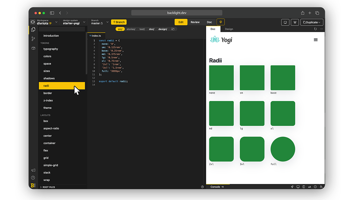
Design Tokens
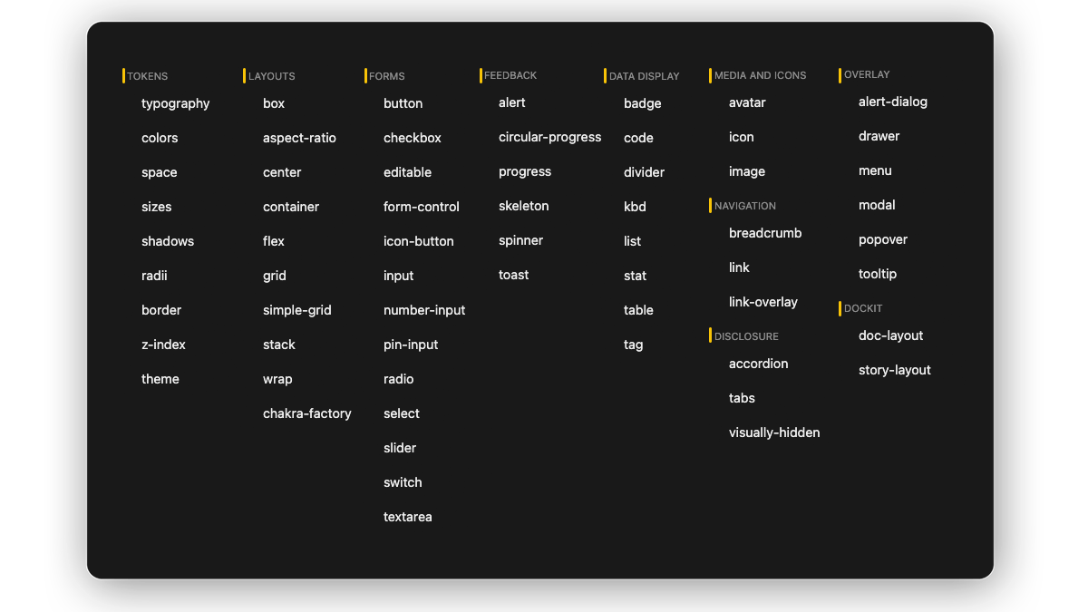
The starter kit is built around nine main tokens: Colors, Typography, Size, Space, Shadows, Radii, Border, Z-index and Theme
Components
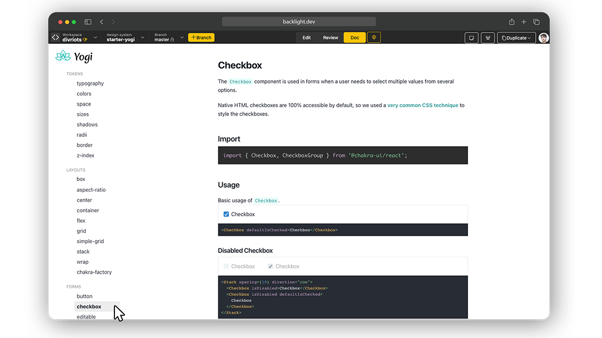
YOGI comes with 40+ components to get started: menu, dialog, buttons , checkbox, cards, everything to cover the basics and more.
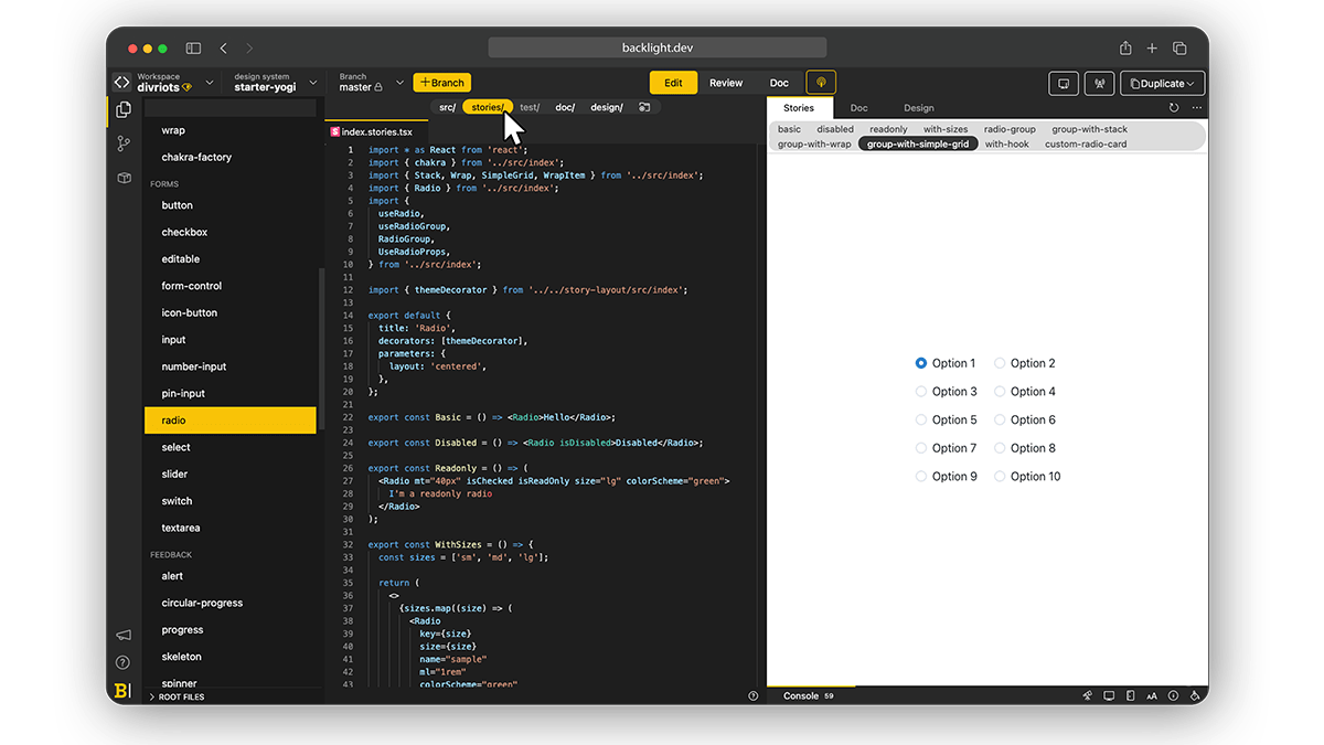
Stories
CSF Stories are available for every component allowing you to code your components in isolation and check all variations.
Documentation
Written in MDX, the documentation is available next to the code to ensure a shallow learning curve as well as an easy onboarding for anyone joining the project. The documentation includes interactive playgrounds.
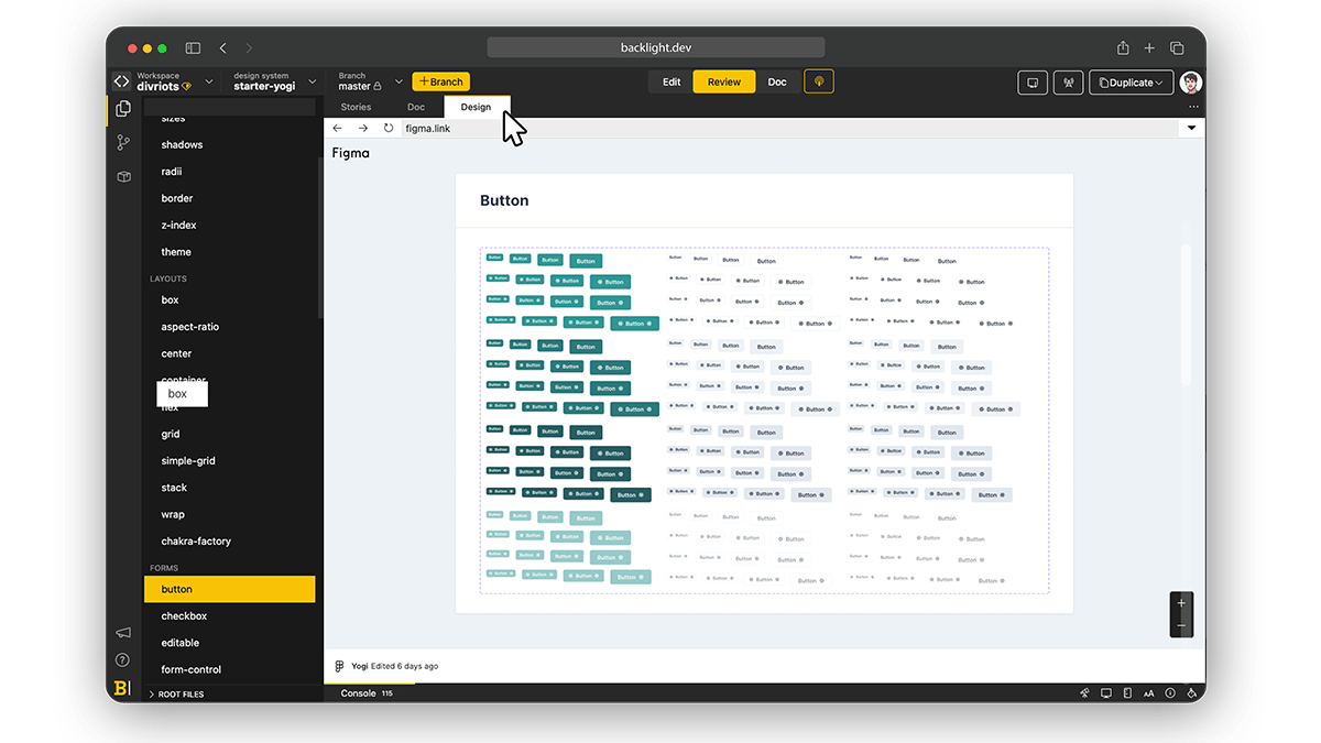
FIGMA integration
YOGI Figma library is available next to the code to ensure Developers-Designers alignment. We built the library based on Chakra UI Figma Kit
Links
- ▶️ Explore YOGI now on Backlight.dev
- 👩💻 Source code available on Backlight and GitHub
- 📦 npm package [missing link] to try YOGI unchanged.
Further reading
Check all other Backlight’s starter kits.
 Tweet
Tweet
 Linkedin