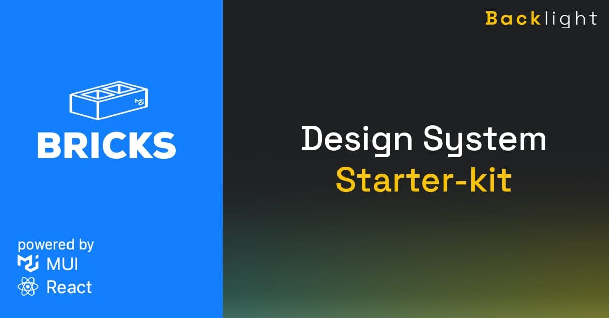
Introducing BRICKS - a Design System based on MUI
-

- Name
- Pierrick
- @S3kelman1
-

- Name
- Mihai
- @mihai_veres
BRICKS is a design system starter-kit based on MUI, a react UI library providing customizable and accessible components.
BRICKS features:
- ♻️ Open source
- 🧱 Based on MUI
- 🧩 50+ accessible components
- 📚 Interactive documentation
- 🌗 Dark mode out of the box
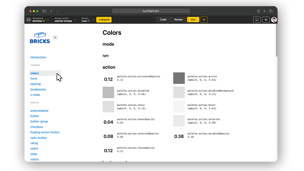
Design Tokens
The starter kit is built around six main tokens: Colors, Font, Spacing, Breakpoints, z-index, theme.
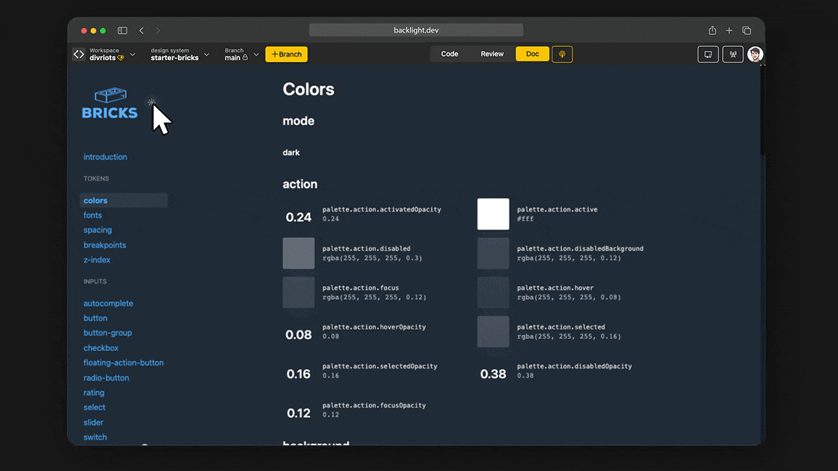
Dark mode
Dark and Light themes are supported out-of-the-box. You can test it directly on any doc page.
Components
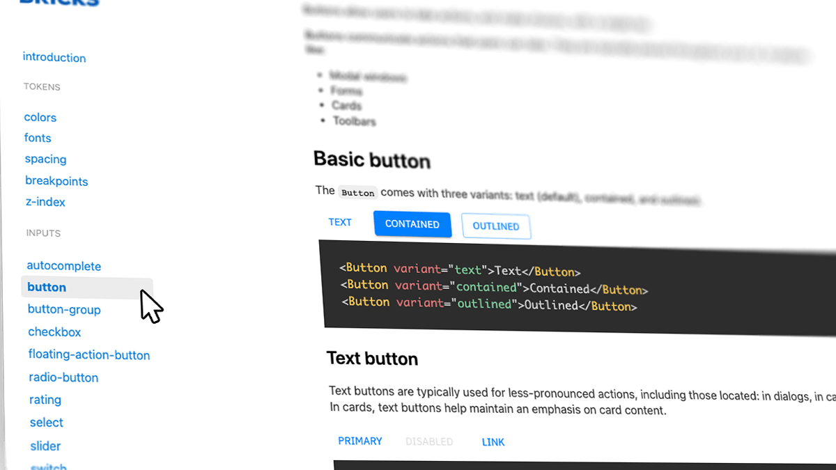
BRICKS comes with 50+ components to get started: menu, dialog, buttons , checkbox, cards, everything to cover the basics and more.
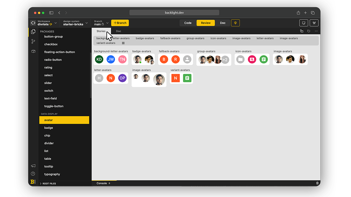
Stories
CSF Stories are available for every component allowing you to code your components in isolation and check all variations.
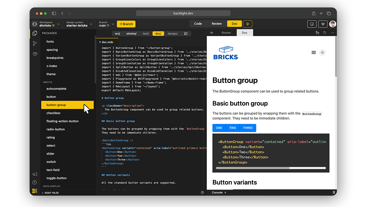
Documentation
The documentation, Written in MDX, is displayed next to the code to ensure a smooth learning curve and quick onboarding for anyone joining the project.
The documentation also includes interactive playgrounds.
Links
- ▶️ Explore BRICKS now on Backlight.dev
- 👩💻 Source code available on Backlight and GitHub
Further reading
Check all other Backlight’s starter kits.
 Tweet
Tweet
 Linkedin