Interactive Stories with CSF Play and User-Events
-

- Name
- m4dz
- @m4d_z
Did you hear about Storybook? Well, if you’re in Front-end development for the last years, you probably had a look at it at some point. Storybook is a very nice tool when it comes to providing your teammates with visual demos. A cool thing, at least for me, is the ability to display several versions of the same components, allowing to preview different states, for real.
import React from 'react';
import { Button } from '~/button';
import { storyLayout } from '~/layout';

export default storyLayout;

const styles = {
  button: {
    margin: '.25rem',
  },
};

export const outlined = () => (
  <>
    <Button style={styles.button} mode="outlined">
      Outlined
    </Button>
    <Button style={styles.button} mode="outlined" icon="camera">
      Outlined
    </Button>
    <Button style={styles.button} mode="outlined" loading={true}>
      Outlined
    </Button>
  </>
);
Well, if giving visual feedback on differents states is cool, what about giving interactions feedback right in the Story? Sounds nice? Welcome to the new Component Story Format 3.0! Let’s play with it!
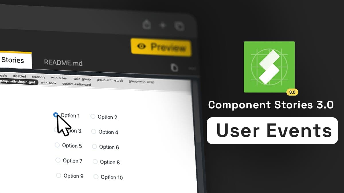
Play Like No One Do
A few weeks ago, Storybook released their new Component Story Format 3.0. CSF is a kind of DSL imagined and maintained by the Storybook’s team around the concept of Story. They’re ESM files for their roots, allowing any frontend developer to add and maintain new stories. Because the format is widely used by any industry leaders using Storybook, it became a de-facto standard.
A shiny thing wanted by the Storybook’s community is not to lock anyone to the Storybook API or tools with CSF. The format is totally decoupled from any technical aspect. On the ‹div›RIOTS side, it makes things even simpler, because supporting CSF was mandatory at first in our plans. We did for a while, and we now support new features introduced by the CSF v3 too!
Among them, one caught our attention, the one-more-thing stuff: the totally new play function. Acting like a small snippet of code executed at rendering, they’re designed to perform scripted actions. One of the most frustrating caveats of the previous version was the inability to preview real-life interactions and rendering in our components. What is happening when a user successfully submits a login form? Or when the registration failed? We could have a preview of the final state, but any transition was impossible to render and control. This is the play function role.
The demo code in the CSF v3 introduction blog post heavily rely on the @testing-library/user-event module, and that’s exactly what we had in mind:
// CSF 3.0
import userEvent from '@testing-library/user-event';

export default { component: AccountForm }

export const Empty = {};

export const EmptyError = {
  ...Empty,
  play: () => userEvent.click(screen.getByText('Submit'));
}

export const Filled = {
  ...Empty,
  play: () => {
    userEvent.type(screen.getById('user'), 'shilman@example.com');
    userEvent.type(screen.getById('password'), 'blahblahblah');
  }
}
The Testing Library Family
World of testing is similar to any other computer programming field: we’ve got a bunch of tools, all of them better at one thing than others. In this peculiar area of making tests, there’s a lot of candidates. But one of them is focusing on users interactions simulation yet: the Testing Library Family. It helps you to test your UI the way your users use it.
The library exposes two core concepts: querying a DOM representation of you UI, then acting with it:
<template>
  <div>
    <p>Times clicked: {{ count }}</p>
    <button @click="increment">increment</button>
  </div>
</template>

<script>
  export default {
    data: () => ({
      count: 0,
    }),

    methods: {
      increment() {
        this.count++;
      },
    },
  };
</script>
import { render, fireEvent } from '@testing-library/vue';
import Component from '../src/Counter.vue';
test('increments value on click', async () => {
// The render method returns a collection of utilities
// to query your component.
const { getByText } = render(Component);
// getByText returns the first matching node for the provided text, and
// throws an error if no elements match or if more than one match is found.
getByText('Times clicked: 0');
const button = getByText('increment');
// Dispatch a native click event to our button element.
await fireEvent.click(button);
await fireEvent.click(button);
getByText('Times clicked: 2');
});Example code from: https://testing-library.com/docs/vue-testing-library/examples
The Testing Library Family offers a lot of wrappers to handle the rendering process: DOM, React, Preact, Vue, Svelte, etc. Because they’re dealing with a representation of a DOM, the Testing Library also offer a nice and lightweight abstraction on it, offering advanced patterns to query elements in a user-friendly way: getByText, getByDisplayValue, and so on. This abstraction allows you to scripts interactions the way the user does, regardless of the technical aspect of your testing runtime. You’re free to use any framework of your choice. The library is here to provide you with the top-level UI interactions you need.
What Does User Do?
The Testing Library core brings the fireEvent method, but this one is sometimes too low-level to simulate real-world examples. So exists the user-event module. Along with simple actions like click or dblClick, it also carries advanced features in users’ interactions simulation, like hover, paste, type, keyboard, etc. Still compatible with all rendering components of the core library.
The user-event companion was used as a proof-of-concept by the Storybook’s team for the play function. Taking a look at their demo code, they use it both to fill the sign-in form, and to click the submit button:
export const EmptyError = {
  ...Empty,
  play: () => userEvent.click(screen.getByText('Submit'));
}

export const Filled = {
  ...Empty,
  play: () => {
    userEvent.type(screen.getById('user'), 'shilman@example.com');
    userEvent.type(screen.getById('password'), 'blahblahblah');
  }
}
It means that you can now embed in your Stories any kind of advanced user’s scripted interactions in the play function, showing instantly the result right in the rendered view!
Because ‹div›RIOTERS are also pranky people, we made a small experiment around this play/user-event couple. @gluck imagined a custom wrapper to the user-event library, ready to be used in the Story’s play function:
-
It declares a WebComponent that mimic the user’s cursor
-
It decorates the
click,dblClick,hover, andtypemethods from the original library -
When those methods are called, the wrapper then simulate the cursor’s move to visually see the interaction:
export const playDemo = {
  render() {
    return <Demo placeholder="Show me!" />;
  },
  play: async () => {
    const input = screen.getByPlaceholderText('Show me!');
    const arrow = input.parentElement.nextElementSibling;
    const loop = async () => {
      await userEvent.type(input, 'Hello Rioters!');
      tlUserEvent.clear(input);
      await userEvent.type(input, 'Play with CSF 🤘');
      await userEvent.click(arrow);
      setTimeout(() => {
        tlUserEvent.clear(input);
        loop();
      }, 2000);
    };

    loop();
  },
};
Sounds fun? Well, it is 🤓 ! Take a look at the live demo and play with it at Components.studio.
Why Visual Interactions Matters
If you can’t explain it simply, you don’t understand it well enough.
Albert Einstein
Documentation is an essential part of the good developer journey. Producing a code of quality means that one should be able to well understand what it does, and simply explain it to any other. This way, you make it easier to maintain.
That said, sometimes a picture speaks a thousand words. As well-done a documentation could be, explaining UI interactions could be complex, hard to retrieve, and lack context. Having a visual representation of what is intended in terms of animations and rendering could be really worth it.
Along with the funny thing of making a wrapper for the users’ interactions, it also brings a lot more to your play scenarios as anyone could see what is happening from the user’s perspective. So bring the wow effect to your projects right now by adding played user events in your Design Systems components, in Backlight.dev 🎉 !
 Tweet
Tweet
 Linkedin